From our humble beginnings in 2014, we’ve come a long way. Back then, it was just four of us. Today, we’re a team of 78 amazing professionals covering everything from engineering and design to marketing, sales, and more.
Then, in 2022, we kicked off a cool adventure—a rebranding! But hey, we didn’t go at it alone. We teamed up with branding consultants, and together, our design squad, marketing team, and these awesome consultants worked their magic in this nine-month transformation.
Curious to know the nitty-gritty of our rebranding journey and the shiny new identity we’ve got? Keep reading, and we’ll spill the details!
KAIZEN: OUR GUIDING PHILOSOPHY
Our evolution, deeply rooted in the principles of Kaizen, mirrors our commitment to continuous improvement and a workplace culture that thrives on collaboration and team empowerment.
Kaizen, a Japanese term embodying “continuous improvement” or “striving for positive change”, is the heartbeat of our philosophy. This concept have their roots in Japan and are widely embraced in business, manufacturing, lean practices, and Total Quality Management (TQM).
At the core of Kaizen is the practice of making small, gradual enhancements— whether in processes, products, or systems—to amplify efficiency, quality, and overall performance over time. Our rebranding journey echoes this ethos, an ode to constant improvement, telling the story of our growth and our commitment to transforming client experiences.
OUR REBRAND GOALS
Diving deeper into our rebranding journey, a central mission emerged: to artfully articulate our value proposition and amplify our commitment to continuous improvement. But let’s zoom in on what truly sets us apart—the beating heart of Kaizen Softworks: our culture.
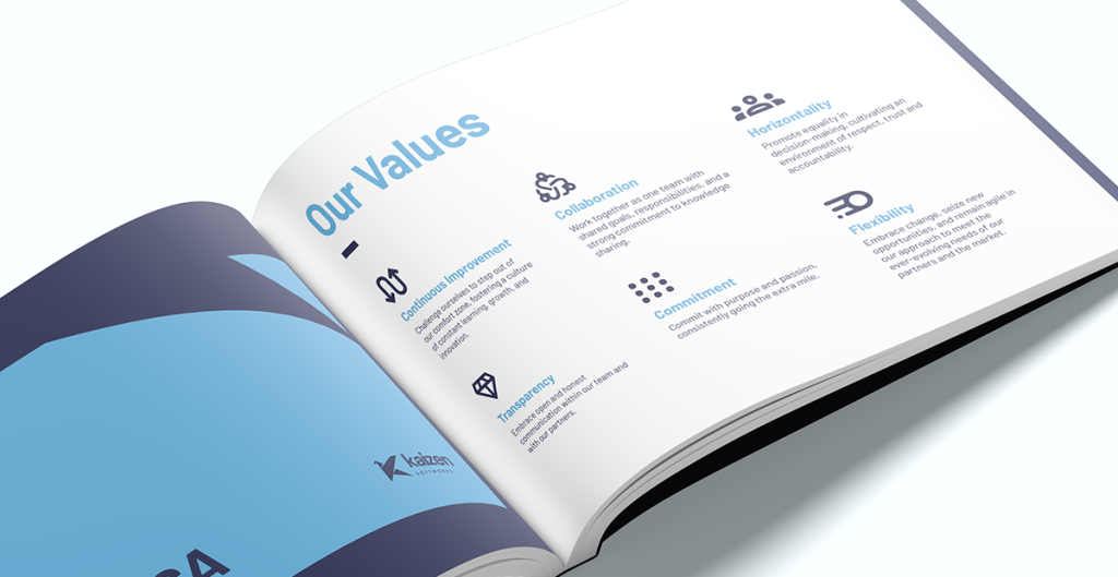
Our culture is not just a side note; it’s our signature, a genuine game-changer. What makes us different? It’s the camaraderie, the shared commitment to growth, and the belief that everyone’s voice matters.
In this dynamic workplace, we don’t just talk about teamwork; we live it. Team contributions are not only valued; they’re celebrated. Our work management structure isn’t a top-down hierarchy—it’s horizontal, empowering each of us to actively participate in decisions that shape our collective future.
And here’s the clincher: our clients aren’t just clients; they’re partners in our journey. We don’t merely deliver projects; we build relationships. It’s a partnership approach that extends beyond immediate solutions, creating a collaborative bridge that spans years.
So, as we share our unique culture, we’re not just putting it under the spotlight; we’re illuminating the very essence that binds us together. Because, after all, our culture isn’t just a part of Kaizen Softworks; it’s the soul of who we are and the driving force behind everything we do.
So, summing up, our rebrand goals were:
- Better communicate our unique culture
- Modernize our look
- Strengthen client partnerships
OUR REBRANDING PROCESS
Phase 1: “Brand Assessment”
We did a comprehensive evaluation of our existing brand assets and digital presence. We also checked out what’s happening in our industry with a competitive landscape analysis. In simple terms, we wanted to get the lay of the land before rolling up our sleeves.
We needed to figure out where we stood, what we were great at, and where there was room for improvement. This groundwork helped us map out a path for our rebranding journey that was both inspiring and doable.
Phase 2: “Listening to our Team”
In the next phase, we had chats with team members from different areas. We wanted to hear what they thought about working at Kaizen, what makes them tick, and their unique perspectives on our company. These talks gave us a firsthand view of what brings us together.
Phase 3: “Crafting Our Brand”
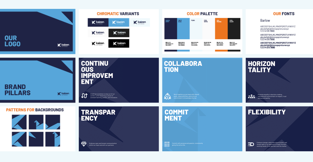
The third phase was all about shaping our brand. We used a brand wheel, a visual tool that proved instrumental in refining and arranging the components of our existing brand. While the essence remained true to its origin, the brand wheel allowed us to update and organize key elements such as purpose, values, and personality, resulting in a cohesive brand strategy.
At this point, we realized something big: we’re not just a software service provider; we’re trusted partners. We’re all about helping our clients succeed in business through custom software solutions.
This realization led us to define our brand tagline, “Building Partnerships, Crafting Solutions”:
- Building Partnerships:
- This part emphasizes our commitment to establishing strong and enduring relationships with our clients and team members.
- It goes beyond the traditional client-provider dynamic, with a more collaborative and long-term engagement.
- Our focus is on creating partnerships that extend beyond immediate projects, fostering trust and mutual growth.
- Crafting Solutions:
- “Crafting” reflects our thoughtful and skillful approach, akin to the precision of an artisan creating something unique and tailored to our clients’ needs.
Simultaneously, we established the foundation for our communication strategy – a tone that radiates empathy, approachability, clarity, directness, and fosters the building of robust, trustworthy relationships.
Phase 4: “Designing Our Visual Identity”
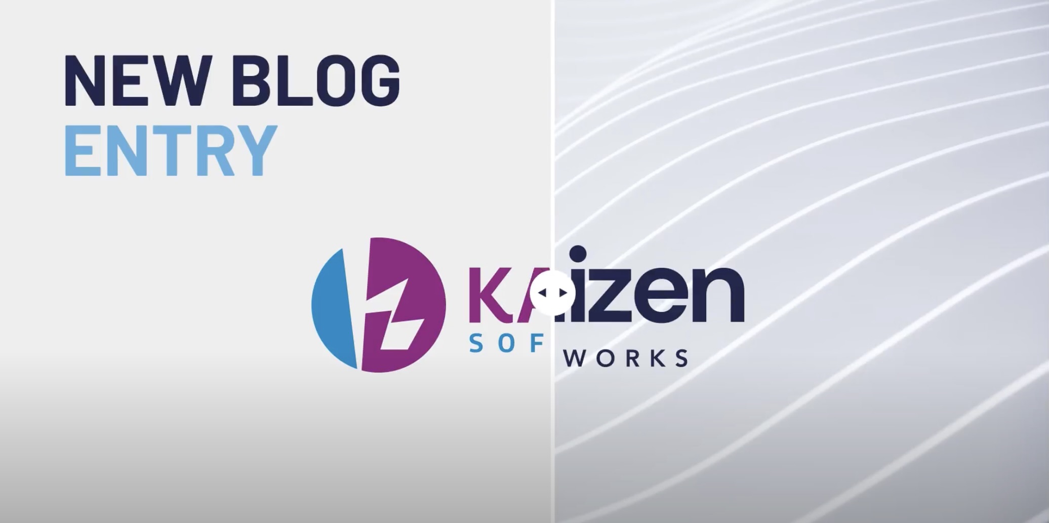
In this stage, we worked on our visual identity. Our logo is special. The origami, with its intricate folds and careful craftsmanship, perfectly symbolizes our dedication to customization. Just like each piece of origami is uniquely crafted through precise folding, we take a similar personalized approach in crafting our solutions and adapting to our clients’ unique needs. Our aim isn’t just functionality; it’s about creating beautifully designed solutions, reflecting the elegance and precision associated with origami artistry.
By embracing origami in our visual identity, we highlight our commitment to personalized, well-crafted software solutions, perfectly aligning with our mission to provide unique digital experiences that make a lasting impact on our clients and their customers.
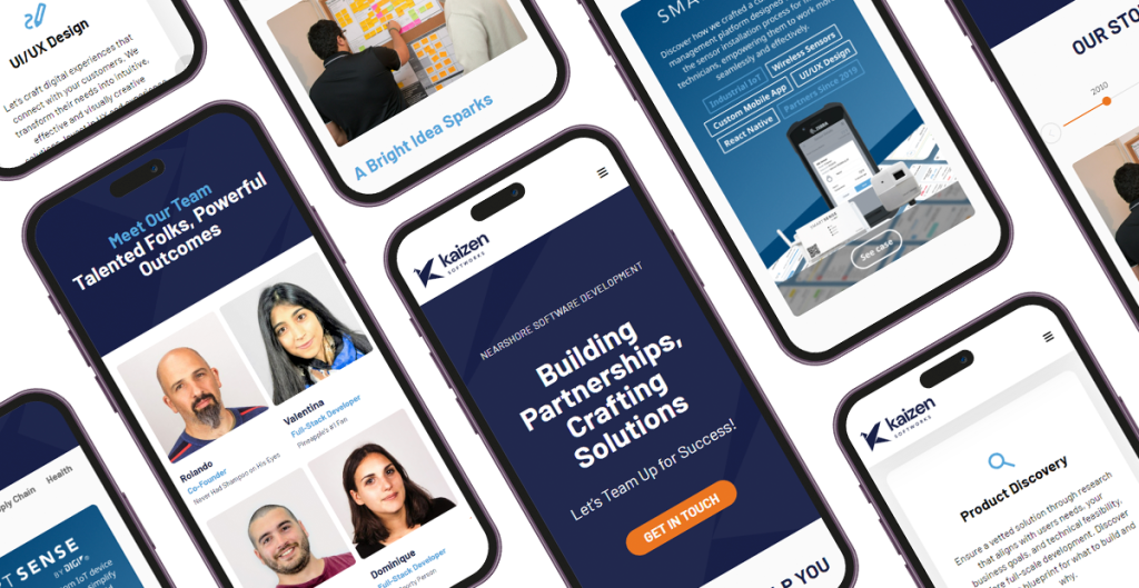
Phase 5: “Enhancing Our Online Presence”
After the visual facelift, we turned our attention to our online home – our website. With our new logo and colors, it needed an upgrade. We wanted it to reflect our fresh brand while providing a smooth and engaging experience for users. Our goal was to showcase our services, our commitment to customization and continuous improvement that defines our culture.
Phase 6: “Brand Management”
As the final touch, we conclude by releasing a comprehensive Kaizen brand manual. This ensures the uniformity and coherence of all our external messaging.
CONCLUSION
We extend our sincere gratitude to our dedicated team for their tireless efforts and commitment throughout this transformative process. Additionally, a heartfelt thank you to our valued clients for entrusting us with the opportunity to innovate and grow together.
As our rebranding journey unfolds, we invite you to explore the results of our hard work, creativity, and dedication on our new and improved website. It’s the digital gateway to the exciting changes we’ve made, reflecting the values and vision we hold dear.
Discover how we’re crafting digital experiences and forging strong partnerships.