



Generative UI: what it is, how it works, and when to use it
Generative UI lets AI build the screen each user needs, in real time. What it is, how it works, the trade-offs, and two working demos we built.

12 min read
Read more
Insights, stories, and experiments from our team.
AI
UX Design
Generative UI lets AI build the screen each user needs, in real time. What it is, how it works, the trade-offs, and two working demos we built.

Santiago Chiappa
·

Jul 17, 2026
·
12 min read
Generative UI is a full-stack architecture that lets AI create, modify, and render user interfaces in real time, based on what each user needs at that exact moment. Instead of static, predefined screens, the interface assembles itself on the fly: a bar chart, a table, a comparison card when you're comparing things.
We've been building proofs of concept with it for the past few weeks. Most of what's written about generative UI is either too abstract or too exciting, so this is our attempt at neither: what it is, how it works, where it helps, where it doesn't, and what we learned from two demos we built.
Generative UI is a full-stack architecture: the backend talks to the LLM, decides what the answer should look like, and picks the components, while the frontend renders them and handles how the user interacts with what’s on screen.
Compare that with how interfaces have always worked. A designer decides what goes on each screen, a developer builds it, and every user sees the same thing. Forever, or until the next redesign.
Generative UI flips that. The interface becomes dynamic and personal instead of static and universal. The AI doesn't just answer your question, it designs the screen that answers your question.
Dashboards and reporting are the most common use cases, but they're far from the only one. The same pattern works for dynamic forms, onboarding flows, and customer support, as it takes input just as easily as it presents output. It can even adjust font size, contrast, or layout for users with low vision, color blindness, or cognitive load.
There are three levels of generative UI, from most constrained to most open (Google Cloud, 2026):
Most production systems today use the declarative approach, and that's what this post assumes from here on. The AI isn't writing HTML or CSS freestyle. It selects components, fills in pre-designed widgets, and composes them into the right screen.
Generative UI works by turning a user request into structured data that describes an interface, then rendering that data as real components. The flow looks like this:
To the user, the result feels like magic. Behind the scenes, it's structured data flowing through a well-defined pipeline. We prefer the second description. It's the one you can build on.
Generative UI trades real personalization and faster development for added latency, inference costs, and less predictable layouts. That's the honest version. Here are the details.
None of these are dealbreakers. There are known techniques to mitigate each one.
We built two demos. One with fictional data, one on top of a tool we use every day.
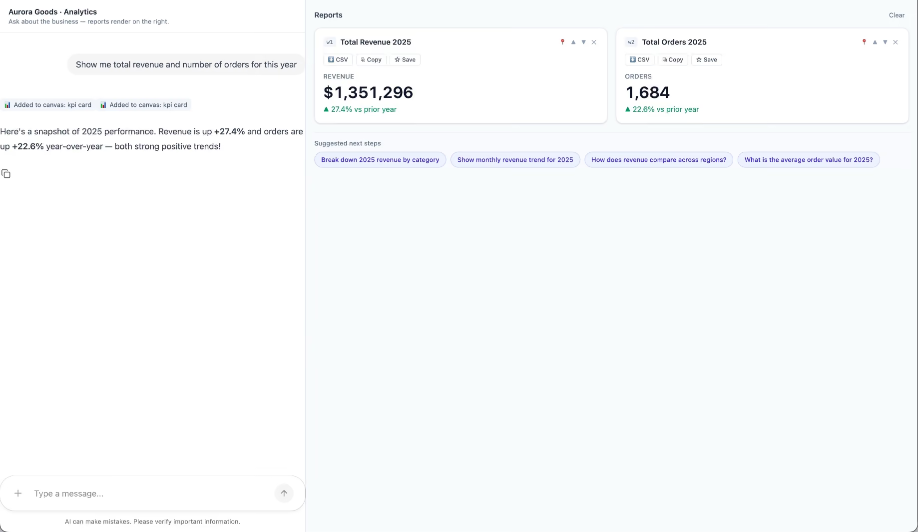
Aurora Goods is a fictional consumer e-commerce platform we created for the demo. The interface is simple: chat on the left, canvas on the right. You ask about the business, the LLM figures out what you need, pulls the data, and renders it visually.
Ask about 2025 sales and it shows the numbers on cards, with a short note on anything relevant. Ask it to break that down by region and it extends the same view instead of starting over, because it understands the second question builds on the first. This part took us a while to get right, and it's what makes the whole thing feel like a conversation rather than a search box.
The canvas isn't output-only either. You can click into any element and drill down: revenue by category, then inside electronics, then which products sold most.
You configure the widgets once. The system combines them and adds relevant commentary on the spot.
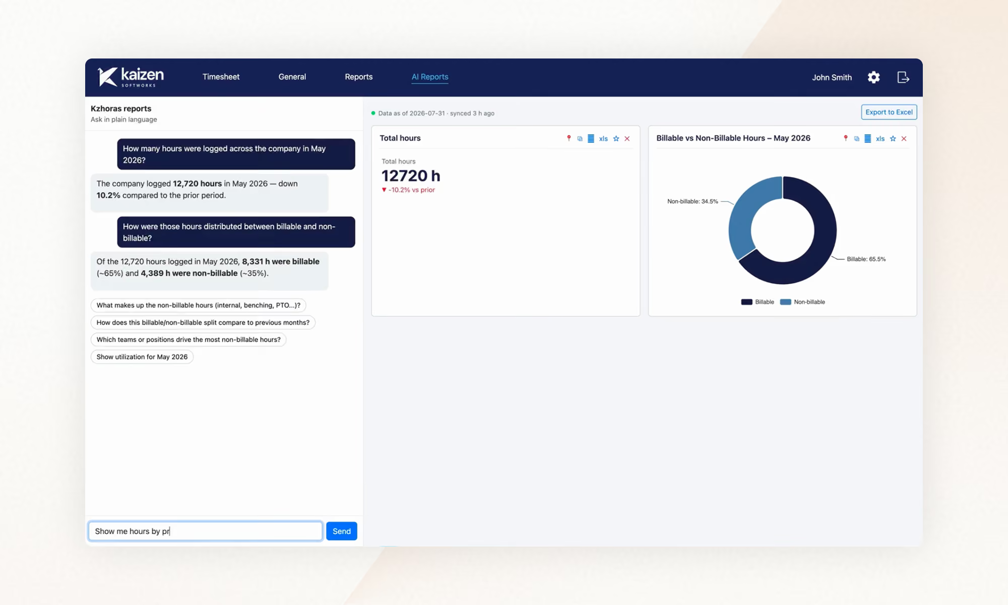
The second demo is closer to home: a generative reporting layer on top of the time-tracking tool we use every day at Kaizen. The questions in this demo are questions someone here has actually asked.
Instead of building dozens of hyper-specific reports, a small amount of code now handles virtually unlimited queries. How many hours were logged in May? Which anomalies showed up in April? How do billable and non-billable hours compare across two months? Who worked on a given project last month, and for how long? Each answer arrives as the right visualization: cards, lists, bar charts, plus a short summary that's easy to scan.
Two details won us over. The LLM suggests next steps, so exploring the data becomes a conversation. And when it's not sure, it asks instead of assuming. Ask for the hours of someone named Alex and, since we have more than one Alex on the team, it asks which one before answering.
Generative UI is a complement, not a replacement. Standard interfaces still win for stable, repetitive workflows where consistency matters. Nobody wants their checkout button to be creative. Generative UI wins where the workflow is complex and the questions are unpredictable.
It also changes what design systems are for. Beyond designing components and screens, teams will need to define semantic rules: how the AI should react to uncertainty, which interfaces match which intentions, and the guardrails that keep generated screens functional and safe.
That's a new kind of design work. And it's already starting.
We build working proofs of concept in two weeks. Your data, your workflows, a real thing you can click.
Generative UI lets AI build the screen each user needs, in real time. What it is, how it works, the trade-offs, and two working demos we built.
12 min read
AI
Business

·
Sep 25, 2026
AI made custom software cheaper to build and SaaS more expensive. How to decide whether to build or buy, and what to validate before committing.
12 read time
You've said it in a meeting recently. "With AI, could we just build this ourselves?" It's a fair question. And for the first time in a long time, the answer might be yes, but not for the reasons most people think.
AI has changed the cost equation in two ways: custom software is faster and cheaper to build, and teams can test an idea earlier before committing to a full production build. Together, those shifts make building worth reconsidering in situations where it would have been dismissed a few years ago.
AI made custom software faster and cheaper to build. Projects that used to take six months can now take weeks, at half the cost.
It also made it much cheaper to test an idea, get feedback, and refine what you need before committing to a production system.
Together, those changes open the build vs. buy decision to more companies. The most common mistake is still the same: committing too early, in either direction, before you've tested the problem and the path you're considering.
For most of the 2000s and 2010s, the standard advice was simple: when in doubt, buy.
Building custom software meant a technical team, months of development, and an upfront investment, typically $100,000 or more, without knowing whether the result would solve the problem. SaaS subscriptions were cheaper, faster, and someone else's problem to maintain. For commodity workflows like payroll, email, accounting, and basic CRM, the math almost never favored building.
This logic was sound. And it still is, for those categories. Mature SaaS tools in commodity categories come with ecosystem value: documentation, integrations, training resources, community support. Building your own payroll system doesn't create competitive advantage. It creates infrastructure you have to maintain.
The problem is that companies applied this rule too broadly, including to the workflows that determine how they compete. The cost of building made that feel reasonable. It wasn't worth it.
For many mid-sized companies, that left an uncomfortable gap: generic tools were no longer enough for the way they operated, but custom software still looked like an enterprise-level investment.
That assumption deserves a second look.
Most of the conversation around AI and software has focused on one thing: building got faster and cheaper. That's true, but incomplete.
The cost of building dropped. A development project that took six to twelve months can now be completed in six to ten weeks. Costs that ran $100,000 or more have come down to $30,000-50,000 for comparable scope, and in some cases less. At Kaizen, our development teams work two to four times faster than before AI-assisted development became part of our process. The cost of the AI is marginal when teams work with clear requirements and structured context. When they iterate without direction, costs add up, but that's a process problem, not a technology one.
The cost of buying is going up. This part gets less attention, but it matters just as much. SaaS companies are embedding AI capabilities into their products and charging for them, separately. A platform that cost $12,000 per year is now $30,000-40,000 once you add the AI tier, the analytics add-on, and the integrations your operations need. For niche tools serving specialized industries, the pricing was already high and the functionality already limited. Add AI tiers on top and the three-year cost comparison starts to look different than it did when you last ran the numbers.
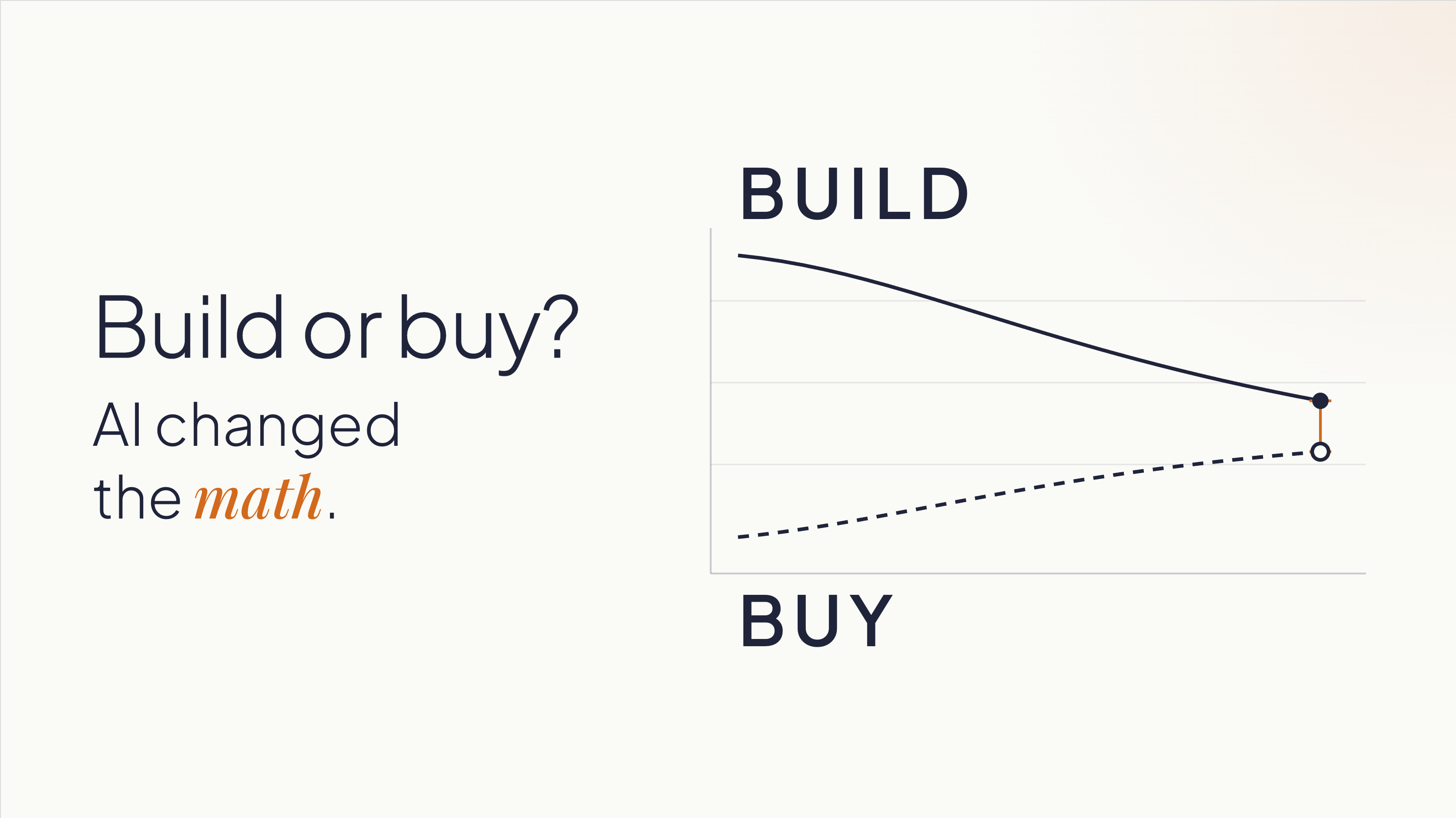
The result is that the two lines are crossing. Custom software is getting cheaper. SaaS, especially for complex or industry-specific use cases, is getting more expensive.
Most companies are still making this decision based on what building cost three years ago.
There's one more thing AI changed that doesn't get enough credit. It lowered the cost of being wrong early. A functional prototype that used to take weeks of development time can now be assembled in days.
That gives teams something concrete to react to, learn from, and change before deciding whether a full build makes sense.
The conditions for building have shifted, but the logic hasn't changed entirely. Building still makes most sense when two things are true:
That second condition doesn't mean having every requirement figured out upfront. It means knowing the business and the process well enough to test assumptions, get feedback, and make increasingly specific decisions.
Companies that start building without that understanding can build the wrong thing faster. The speed advantage AI creates doesn't help if it's pointed in the wrong direction.
Some indicators that a workflow is worth owning:
You're working around your SaaS tools. Spreadsheets patching gaps in a platform. Manual re-entry because two systems don't talk. A Zapier automation that everyone is afraid to touch. These are signals that the tool is containing your problem, not solving it. You're paying the SaaS subscription and building a workaround on top of it. At that point, you're paying twice.
The workflow is where your competitive advantage lives. A logistics company with a particular, high-complexity routing and load assignment process is in a different situation than one that needs basic route planning. The first company's process is their edge, and owning that software means no vendor can change the pricing, pivot the product, or get acquired and leave them exposed. A standard CRM, by contrast, is rarely where a sales organization wins. Salesforce's roadmap reflects the priorities of thousands of customers. If your competitive advantage depends on a process that no SaaS vendor will prioritize, you can't buy your way there.
You shouldn't be adapting your processes to fit a tool. The tool should fit your processes. This is a signal for building: when a company has spent years reshaping how it operates around what a SaaS product can and can't do. That's the opposite of what software is supposed to accomplish. Custom software eliminates that inversion. It's built on domain expertise: knowledge of how your business operates. The software adapts to you.
Vendor dependency is a strategic risk. If a price increase, product pivot, or acquisition could disrupt your operations, you're already exposed. Ownership changes that exposure. It also changes your negotiating position if you stay with a vendor: companies that can credibly leave get better terms.
None of this makes custom software the default answer.
For commodity workflows, buying is still faster and lower-risk. Payroll, basic CRM, email, project management, accounting: these categories have mature tools with strong ecosystems. Build a custom solution here and you've committed to recreating the documentation, integrations, training, and community support that already exist in the products you'd replace. That's rarely worth it.
When your process is still maturing, buying can teach you. A company implementing HubSpot is also adopting a structured methodology for sales, one they can refine as they learn. If you don't know what your ideal process looks like yet, building locks you into one version of it before you've earned the right opinions. Sometimes the right move is to buy, learn, and build later with better information.
When you can't realistically own what you'd build, buying is still the right answer. Custom software is an asset with ongoing maintenance requirements: security patches, library updates, performance monitoring, and someone accountable when things break. If your organization doesn't have that capacity internally, or doesn't have a committed external partner, a build will depreciate without upkeep. Be honest about this before you start.
Two things remain constant, and underestimating either one is expensive.
A prototype is not a production system. AI makes it possible to build a working one in days, but its value is simpler than most people assume: it gives your team something concrete to react to, and those reactions reveal what you need.
One of the most expensive problems in software projects is teams discovering, weeks or months in, that they never agreed on what they were building. Everyone had a mental model. Nobody had tested whether those models matched each other. Show someone a working screen and they'll tell you five things they didn't know they thought until they saw it. That conversation, the one that surfaces the implicit assumptions, the disagreements, the things everyone knew but nobody said, is what the prototype is for.
Building from the requirements that come out of those conversations is a different project than building from initial assumptions. The prototype's purpose is to get you to better requirements faster. Production is a separate project, built from what you learned.
What AI doesn't do is replace the expertise required to architect a system that's secure, scalable, and maintainable over time. Security, data structure, integration design, and long-term ownership decisions don't go away because a prototype came together quickly. A fast prototype that moves to production without rethinking those decisions can accumulate technical debt that costs more than the original development savings. Moving fast into the wrong architecture isn't a win.
AI still needs context. Most teams carry knowledge that's never been written down: how things work, why a decision was made three years ago, what the exception to the rule is. AI doesn't pick that up. Neither does a development partner who starts building without asking the right questions. Explicit requirements matter more now, not less, because the tools that execute on those requirements are faster.
Before committing to either direction, three questions are worth working through.
1. Is this process differentiating, and do you know it well enough to define it?
If your answer to the first part is yes, make sure your answer to the second part is honest.
You don't need every requirement upfront. But you do need enough domain knowledge to describe the process, identify what makes it different, and use prototypes or other forms of validation to refine what the system needs to do.
If the answer is "we know how it works but we've never written it down," that work comes first, regardless of whether you build or buy.
2. What does the cost comparison look like over three years?
Include SaaS licensing at realistic price growth (most contracts escalate), implementation, training, integrations, and the cost of the workarounds your team already maintains. Then include the cost to build, plus what realistic ongoing maintenance looks like. The gap is usually narrower than the initial subscription price implies. If you've never run this comparison for your situation, you're deciding without the information you need.
3. Do you have the capacity to own what you'd build?
This means a specific person or team is accountable for what happens after launch, not "we'll figure it out" or "the vendor will handle it." If that accountability isn't concrete and named, the risk profile of building shifts, and buying may still be the right answer even if the cost comparison favors building.
You don’t need to start building to find out whether building is the right path.
An AI Validation Sprint helps you evaluate the problem, the workflow, and the options before committing significant time or budget. Depending on what you already have, that might include reviewing your current process, comparing existing products, testing key assumptions, or building a lightweight prototype where seeing the workflow in action would help answer an open question.
The goal is to answer questions like:
Sometimes the answer is to build. Sometimes it’s to buy. We’ve recommended products like Shopify when an existing platform was the better fit, even when custom development was an option.
And if you already have an AI-built prototype, the same process can assess what’s solid, what only works under demo conditions, and what would need to change before it could become a production system.
The goal is not to justify a build. It’s to give you enough evidence to choose the path that makes sense for your business.
Ready to evaluate your options? Start with an AI Validation Sprint.
About Us
Project Management

·
Sep 23, 2026
Developer turnover costs capacity for weeks and context for months. What software teams lose, how to measure it, and four questions to ask any partner.
12 read time
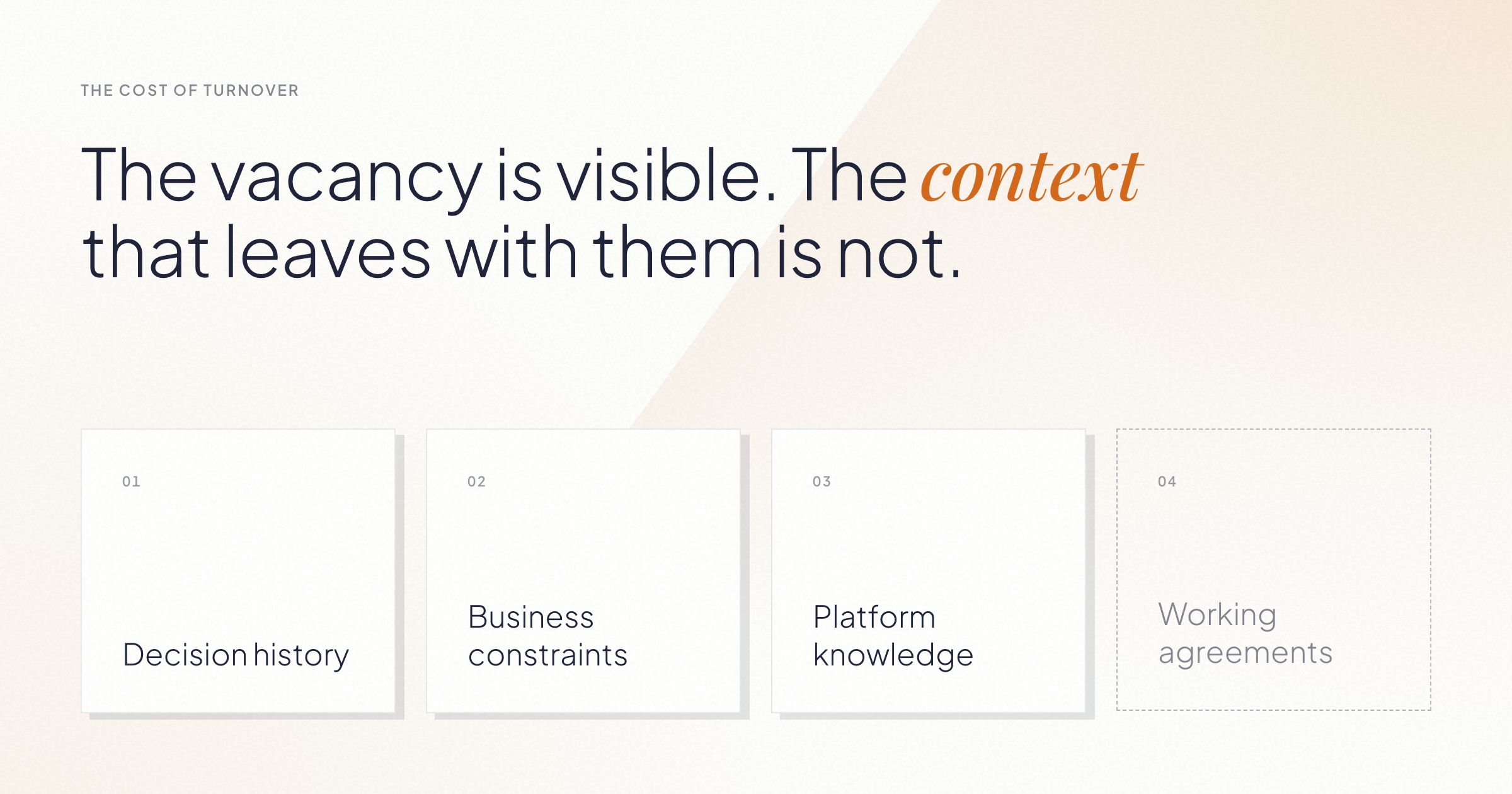
When an engineer leaves a software team, the visible cost is a vacancy. The expensive cost is invisible: the context that leaves with them, and the months the rest of the team spends rebuilding it.
We've seen this play out across client projects for years. This post covers what walks out the door when someone leaves, how to think about the real cost, and a simple framework for making better decisions when it happens, whether you work with us or not.
The short version
A software team loses two things when someone leaves: capacity and context. Capacity is visible and replaceable. Context is neither.
Context sounds abstract, so let's make it concrete. It comes in four forms:
A new hire can match the departed engineer's skills on day one. The four things above take months to rebuild, and while they're being rebuilt, the whole team pays: meetings run longer, settled decisions get relitigated, and senior people spend their time explaining instead of building.
The cost of developer turnover is the ramp-up period multiplied across the team, not the recruiting fee. The math works like this:
The replacement operates below full productivity for months while they absorb the four types of context above. During that same period, the existing team diverts hours to onboarding, re-explaining, and reviewing more carefully than usual. So the cost is one person's ramp-up plus a productivity tax on everyone around them, at exactly the moment the project needed continuity.
This is why turnover gets underestimated. On the day someone resigns, it looks like an operational issue: fill the seat, keep moving. The bill arrives over the following two quarters, itemized as slower delivery, longer meetings, and decisions that used to be obvious.
The first thought is to backfill with an identical hire. Sometimes that's right. But the skill that is left with that person may be easier to replace than the context they gained: the client relationship, the platform history, and the judgment behind past decisions.
Someone already on the team may be able to learn a specific skill faster than a new specialist can learn the client, the platform, and the history behind the work. For a real example and four questions to ask before starting a search, see “Why adding people doesn't always fix a struggling team.”
If you work with an external team, their turnover becomes your turnover. Four questions tell you most of what you need to know, and any serious partner should answer them with numbers:
What's your team retention rate? Ours has averaged 96% in recent years. Whatever the number, ask how it's measured and over what period.
How do you know people want to stay? Retention tells you what happened. An engagement measure tells you what's coming. Our eNPS (employee Net Promoter Score) is +83.
How do you spread context across the team? One person holding all the context is a risk with a name: bus factor. Ask how knowledge gets documented and shared, so continuity doesn't depend on any single individual.
Do you prepare capacity before it's needed? On some projects, we bring people up to speed on the business and the platform before there's an immediate need. When the project needs more capacity, nobody starts from zero.
These questions work on any vendor, including us. That's the point.
AI
Project Management

·
Sep 21, 2026
AI coding agents give Product and Engineering more autonomy, plus a new coordination problem. See how a two-cycle model keeps both moving.
12 read time
AI has changed what Product Managers can do.
A PM can now go from an idea to working software in hours. They can build a flow, put it in front of a customer, learn from it, change it, and test again without waiting for every iteration to go through Engineering.
That creates an opportunity for product teams. It also creates a new challenge.
Just because a PM can build something doesn’t mean that thing is ready to become production software.
If we don’t rethink how Product and Engineering work together, faster prototyping can become more code for Engineering to untangle, more unclear ownership, and more pressure to turn experiments into production features.
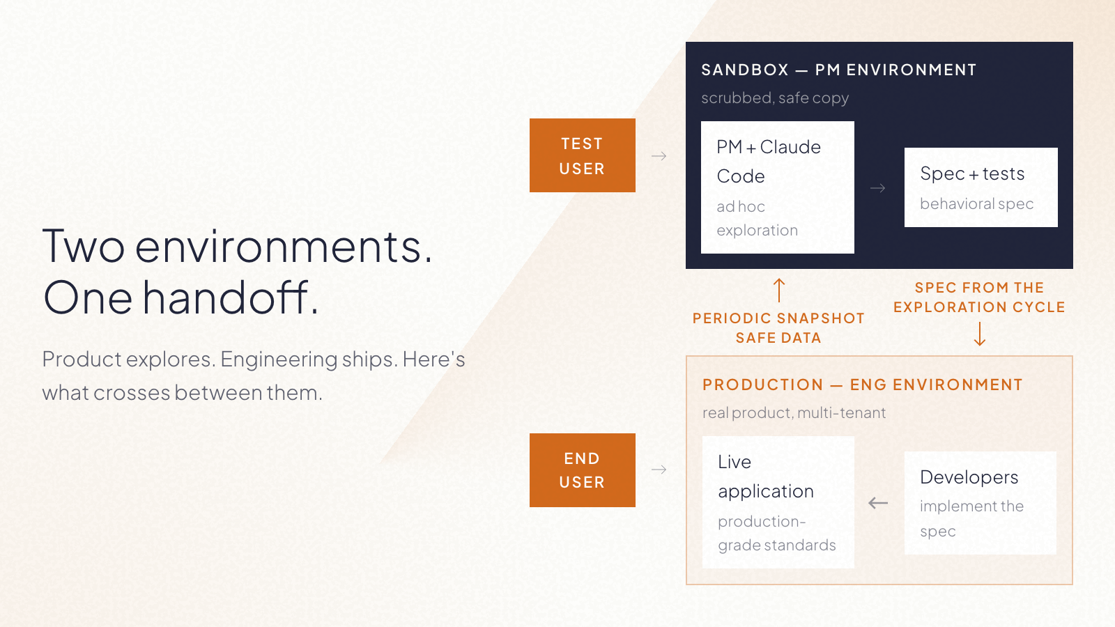
The answer is to separate exploration from construction.
During product discovery, the PM is trying to answer: Should we build this?
That means testing assumptions, changing direction quickly, throwing things away, and getting something real enough in front of a customer to learn from it.
Engineering is solving a different problem: How do we build this correctly?
That means thinking about architecture, security, maintainability, performance, edge cases, and everything else required for software that has to live in production.
Both need AI. But they don’t need the same working conditions.
Exploration benefits from speed, autonomy, and low friction. Construction needs stronger guarantees and guardrails. Trying to optimize the same environment for both creates tension.
So instead of asking how PMs can safely contribute code to the production codebase, there’s a more useful question: What if PMs had their own space to build and validate ideas?
A PM working with an AI coding agent can build functional versions of new ideas. Not a Figma screen. Not a ticket describing what something might do.
Working software that can be used to test the product experience. The important part is that this environment is separate from production.
That boundary gives the PM freedom to experiment without requiring the same controls we’d expect from production software. The environment can be designed so experiments can’t affect the live product or access things they shouldn’t.
Now the PM’s workflow can look more like:
Idea → build → test with users → learn → iterate
Engineering doesn’t need to be pulled into every cycle. Engineering still matters. It gets brought in once Product has stronger evidence about what’s worth building.
This is where things can go wrong.
If a PM spends two days building something with AI and then gives the repository to Engineering saying, “It mostly works, can you finish it?”, we haven’t improved the product development process. We may have just moved the mess downstream.
The prototype should help answer product questions. It shouldn’t make technical decisions on Engineering’s behalf.
What Engineering needs from exploration is intent.
That becomes the handoff.
At Kaizen, we’ve been exploring a model where the bridge between the two cycles is a behavioral specification and a test plan, supported by the working prototype as a reference. The implementation itself stays behind.
What crosses into construction is the spec: a behavioral description, a test plan, and a link to the prototype as reference. The prototype itself stays where it was built.
In simple terms:
Product owns the what. Engineering owns the how.
That distinction matters even more now that AI makes it so easy for both sides to generate code.
A PM starts with a product hypothesis. Instead of immediately turning it into a backlog item, they use AI to build enough of the experience to test it. They put it in front of users. They discover that part of the original idea was wrong. So they change it. They test again.
Once the problem and desired behavior are clear enough, the PM closes the exploration cycle with a clear specification and acceptance criteria.
Engineering then starts from that understanding, not from the PM’s experimental code only. They decide how the feature fits into the architecture, how it should be implemented, what needs to be verified, and how it reaches production.
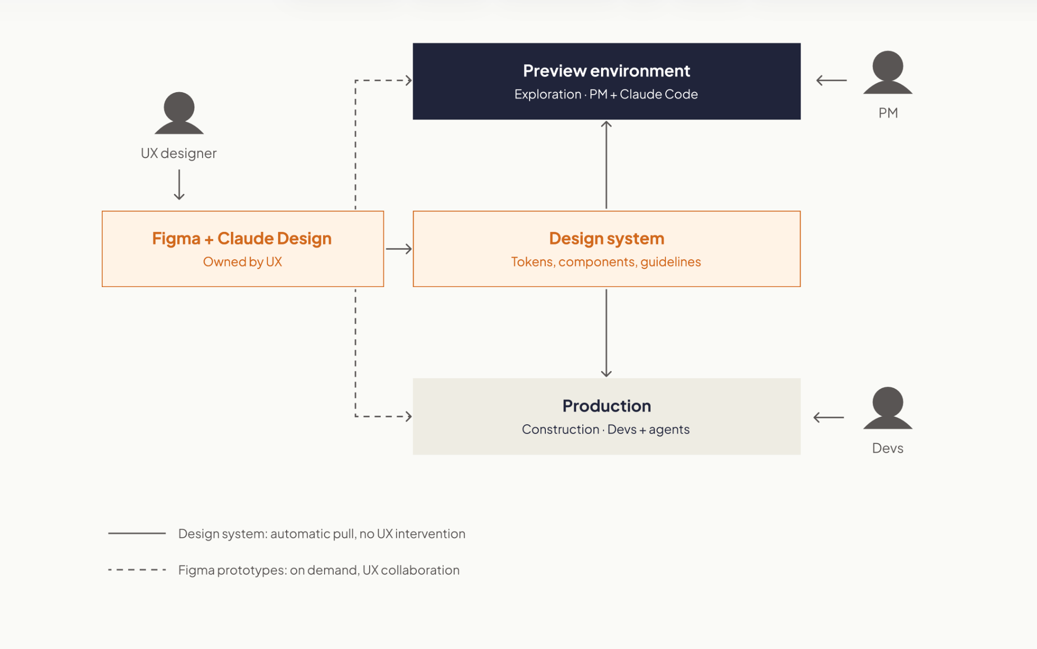
The result is two parallel forms of autonomy:
More autonomy doesn’t have to mean less ownership.
A lot of the conversation around AI in software teams is still about developer productivity. How much faster can we write code? How much implementation can an agent take on?
Those questions matter. But for Product, there may be an even bigger opportunity upstream. AI can shorten the distance between having an idea and learning whether that idea is any good.
That changes what PMs can bring to an engineering team. Instead of: “We think customers want this.” They can increasingly say: “We tested this behavior with customers. Here’s what worked, what didn’t, and exactly what we now need the product to do.”
That’s a much better starting point for building production software.
If you have a prototype and want to take the idea into production, we can help you determine what needs to happen next.
Events
·
Aug 28, 2026
Everything to know about Catalyst 26: dates, price, who attends, both keynote recaps, and when the next Catalyst event is.
12 read time
Catalyst 26 was Partnership Leaders' fifth annual conference for partnership, ecosystem, and go-to-market professionals. It took place August 25 and 26, 2026, at the Marriott Hotel at the Brooklyn Bridge in New York, with more than 1,000 attendees and 70-plus speakers from companies including Anthropic, OpenAI, Google, Microsoft, IBM, BCG, and Siemens.
Catalyst brought together people building and running partner programs across SaaS, AI, consulting, systems integration, agencies, and major cloud platforms.
Attendees included executives leading partnership organizations, and people working directly in alliances, partner sales, marketing, operations, strategy, and enablement.
You can look at the agenda before a conference and have a pretty good idea of what you'll find. Being there is different.
This year's theme was "Navigating Frontier Ecosystems". Anthropic's Head of Partnerships and one of OpenAI's partner program leads appeared on the same agenda as people from Oracle, Siemens, IBM, and BCG, companies that have run formal partner programs for two decades.
That mix was one of the most interesting parts of the conference. Newer AI companies were discussing partner tiers, co-selling, and joint delivery alongside companies where those models have been part of their business for years.
Catalyst 26 split its sessions into eight pillars:
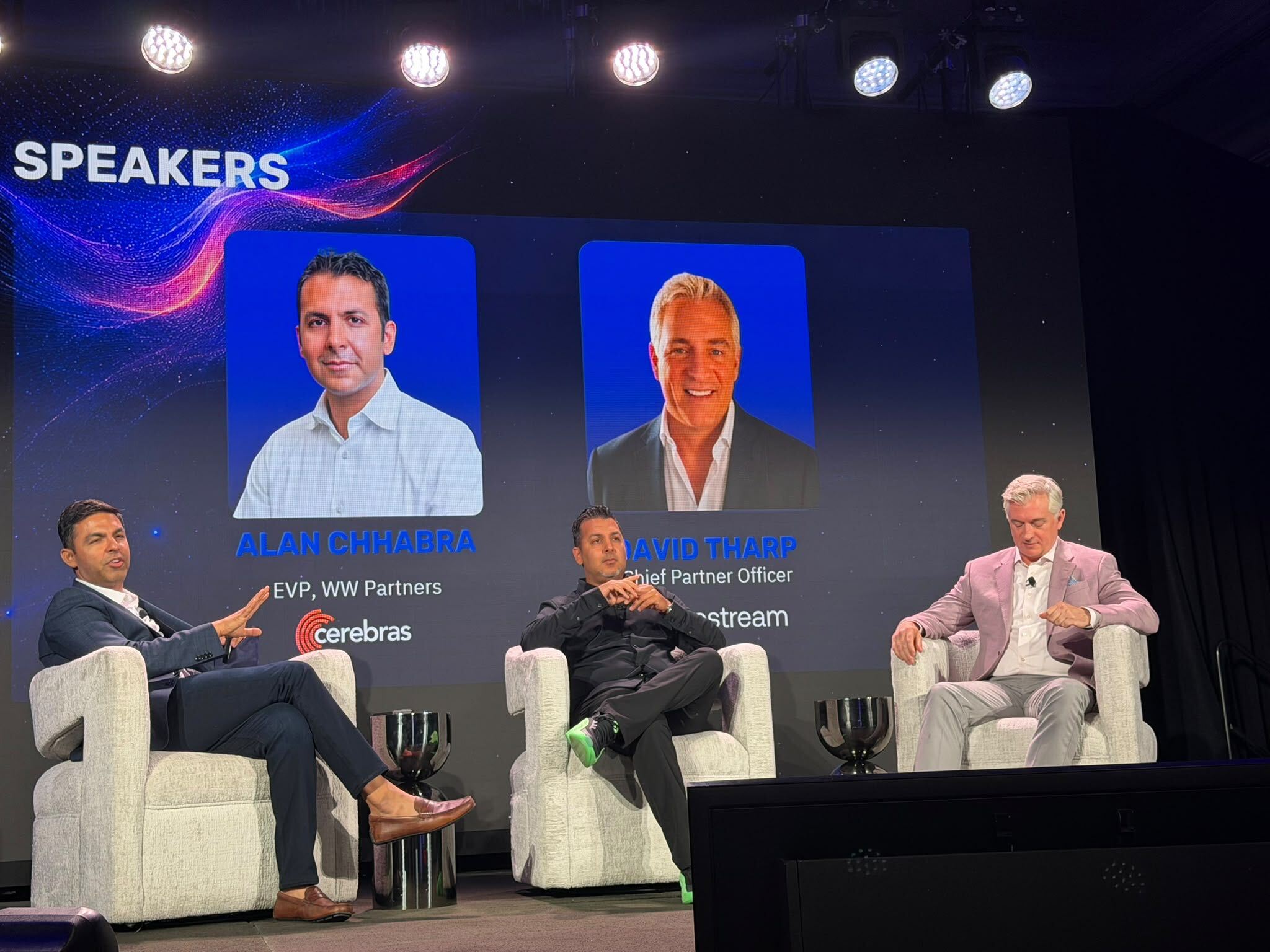
The Day 1 keynote brought together Partnership Leaders’ CEO Asher Mathew, Tribe AI’s Co-founder & CEO Jaclyn Rice Nelson, Anthropic’s Head of Partnerships Phil Samenuk, and Boomi’s Chairman & CEO Steve Lucas.
Their discussion focused on how companies are relying on partners to build, sell, and deliver products across AI, cloud, and enterprise software. A few points stood out:
The Day 2 keynote featured Ramp’s Lead Economist Ara Kharazian, Eliza’s Founder Brian Benedict, Siemens’ EVP Global Partner Ecosystem Dion Smith, and Oracle’s SVP, Partner Sales & Operations Strategy Leah Yomtovian.
A few points stood out:
The date and location of Catalyst 27 hasn’t been announced yet. In the meantime, you can check out the half-day Catalyst Summits in different cities:
Check Partnership Leaders’ events page for updates.
About Us
Project Management

·
Aug 26, 2026
Learn when a software team should hire, wait, reorganize, or build skills internally, and how to tell which option will actually help.
12 read time
When a client asks to hire someone new, a common reaction is to open a search. There's more work, more pressure, and new features to build. It seems like the obvious thing to do.
But in our experience working with software development teams, the problem often isn't a lack of people. The problem is knowledge concentrated in too few people, unclear team roles, slow onboarding, or temporary demand.
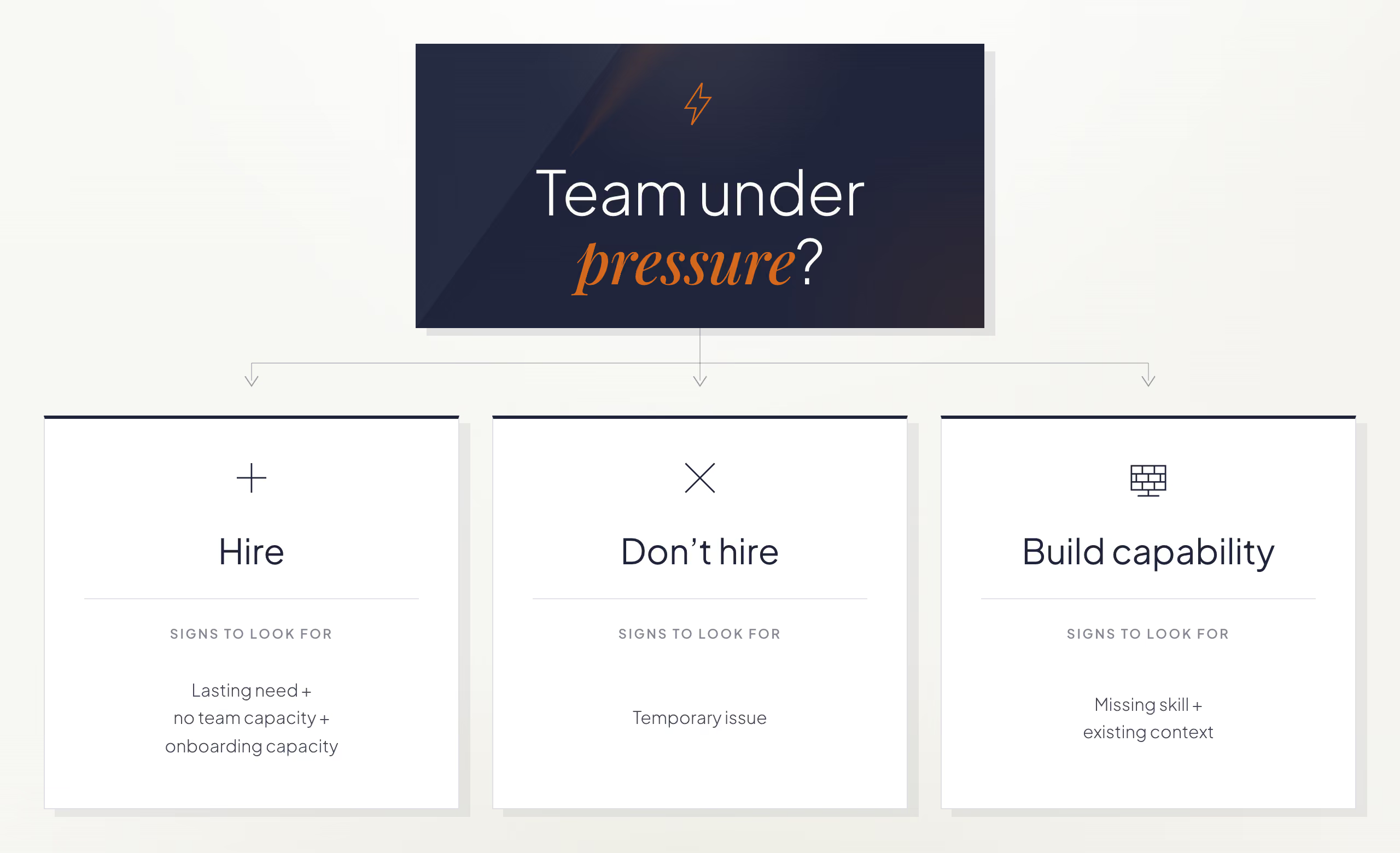
The question worth asking isn't who can fill the position, but what would help the team work better. That points to one of three answers: hire, don't hire, or build the capability from within. Figuring out which one applies, and why, is the real work before opening a search.
Hiring works when three conditions are met: the need will last, no one on the team has the capacity to take it on, and the team can onboard someone well. That last condition is easy to overlook. A team can have a real, lasting gap and still not be ready to bring someone in if no one has the time to guide them.
The risk comes from jumping straight from "there's more work" to "we need someone" without checking what's causing the pressure. It's easy to turn a request into a list of requirements (X years of experience, a specific technology, advanced English) and start the search. The real cause is often something else: a project that grew too fast, a tech lead with no time to onboard new hires, processes that stopped scaling, or a team that lost key people and needs to recover knowledge before adding headcount.
That's why, before thinking about who could fill the role, we ask these questions:
When the answers confirm the need will last, the current team can't cover it, and the team has the capacity to onboard someone, hiring is the right call: opening the search fills a gap the team can't close internally.
Not hiring is the right call when the problem behind the request is temporary, or when it will resolve before the new hire finishes onboarding. Recommending against a hire may sound unusual for a company that offers staff augmentation, but our job as a strategic partner is not to maximize every opportunity but to recommend the best decision for the client. Depending on what's actually going on, the fix can look like:
This happened on a project with a long onboarding period. The initial request seemed clear: hire a mid-level developer. There was work and budget available. But when we spoke with the team, we found that the workload increased because one team member had been temporarily reassigned to another sub-team. Before moving forward, we considered what would happen when that person came back.
The client's system was complex: any new hire needed several months to understand the business, the architecture, and the platform before they could contribute independently.
The problem justifying the hire was going to disappear, but the new hire wouldn't. By the time that person had enough context, the need that started the search would no longer exist.
We recommended against moving forward, even though there was budget to add someone. The client avoided an unnecessary hire and months of onboarding for a problem that was already resolving itself. Sometimes the best answer is to wait a few weeks; other times, it's reorganizing the team or developing internal talent.
Build capability internally when the team already has product context but lacks a specific skill. Developing that skill internally can be faster than waiting for someone new to reach the same level of context.
More people doesn't always mean more capacity. Onboarding a new hire takes time from the people already on the team: explaining the business and the architecture, reviewing their work, and building trust. That's why, during the first few weeks, a team can become less productive while it onboards someone new. Complex projects can include years of technical decisions and undocumented knowledge. New hires still need time to learn that context.
A client needed a senior SQL Server specialist. That niche skill set made the role difficult and expensive to fill. We started the search and interviewed candidates, but the deeper issue became clear quickly: the real challenge on the project wasn't SQL Server. It was understanding a product shaped by years of evolution, multiple applications, and complex business logic.
The right person to develop that expertise was already on the team. Instead of hiring someone with deep SQL Server expertise, the client supported that team member in building the SQL Server skills the project needed. That person had business knowledge, motivation, and a much shorter learning curve than an external hire would have had. An outside specialist provided targeted support when needed.
The team gained SQL Server expertise without losing months waiting for a new hire to learn the product first. The person who took on SQL Server gained a valuable new skill without stepping away from the other work they were doing on the project.
A team's capacity depends on how its people complement each other, what knowledge they share, and what autonomy they've developed, not just on headcount. A team of ten people who are aligned, with shared context and autonomy, can generate more value than a team of fifteen where much of the time goes into onboarding new hires.
Wait to open a search when the team can't define the problem, confirm the need will last, or support onboarding. Clarify those points first.
If you're weighing this decision with your own team, let's talk about whether to hire, reorganize, or develop someone already on the team.
AI
UX Design

·
Aug 14, 2026
A synthetic user research framework, turned into a Claude Code plugin that runs automated UX tests with AI agents, step by step.
12 read time
A synthetic user is a constrained AI decision agent defined by twelve fields, from functional role and context to assumptions and abandonment rules.
In the previous post I built an early, working implementation, and the next question was whether the same rules could hold up in a repeatable, automated test.
This post is that next step: how I turned the framework into a Claude Code plugin, and the technical decisions behind adapting methods designed for people into something an AI can execute without cheating.
Give a model a URL and ask it to “find the usability issues.” It works halfway. And the “halfway” is the interesting part, It gives you a generic list, correct in the abstract, useless in practice.
A usability issue matters because of who encounters it and under what conditions.
Using an app from bed is not the same as using it on a factory floor. Urgency changes, lighting changes, attention changes, previous knowledge changes. The same confusing button can be irrelevant to a power user and an abandonment point for an operator wearing gloves.
The whole design comes from that observation: the AI does not evaluate the interface. It acts as a specific person in front of the interface.
The person brings the context with them. And the context turns a list of defects into a list of priorities.
An orchestrator controls the browser through Playwright MCP. It reads each screen as an accessibility snapshot: text, roles, states, no guessing pixels. Then it acts on specific elements.
The decision on each screen is made by an isolated subagent, which returns a JSON for each step:
{
"action": "...",
"clarityLevel": "High|Medium|Low",
"doubtDetected": true,
"reason": "...",
"abandoned": false,
"estimatedTimeSeconds": 40,
"emotionalState": "...",
"memory": "..."
}
Two rules make this look more like a person and less like an oracle.
The evaluator receives one screen at a time, without knowing how many are left or what comes next in the flow.
If the interface leaves room for a mistake, the synthetic user makes the mistake. It clicks where a person would click, not where it is convenient to click in order to complete the test. This is where the framework’s forbidden assumptions live. The agent cannot assume backend logic or mentally complete what the screen does not show.
The memory field travels from one step to the next. The emotional state is inherited and accumulates. A frustration +1 persists. This detects something that is structurally invisible to any test that evaluates screens separately.
Screen five does not necessarily fail because of screen five. It fails because the user gets there with accumulated frustration.
Evaluated alone, that screen passes. Evaluated by someone carrying three doubts and one broken promise, it triggers abandonment. In the first post, I wrote that doubt is not failure. It is the signal that reveals structural friction.
Emotional memory is that idea turned into architecture.
Each subagent gets a clean context. It knows the minimum required to do its job.
That ignorance is deliberate.
The agent acting as the user does not know what the orchestrator knows. It cannot compensate for bad design with knowledge a real person would not have.
Subagent
What it does
| Subagent | What it does |
|---|---|
| synthetic-screen-evaluator | Acts as the user on one screen and returns the JSON for that step |
| synthetic-flow-synthesizer | Reads the complete run and writes the report. It never simulates again |
| synthetic-profile-generator | Generates a complete profile from an approved spec, choosing from a controlled vocabulary |
| synthetic-autopilot-synthesizer | Consolidates N runs and classifies findings by convergence across users |
| heuristic-persona-generator | Creates the 3 persona raters based on the business being evaluated |
| heuristic-expert-evaluator | Detects violations of the 10 heuristics using forced enumeration |
| heuristic-persona-rater | Scores each finding from the experience of ONE persona. It runs ×3 |
| heuristic-report-synthesizer | Builds the final report using the already computed numbers |
A textbook heuristic evaluation uses three to five human evaluators because each human finds different problems.
My first experiment was literal, and it went meh.
I iterated until I reached two synthetic detection runs with different agents, coverage was extremely high, but it exposed another problem: an unmanageable list. Dozens of valid issues, very few important ones.
The final design separates those two jobs.
Based on Nielsen’s literature, an expert goes through each screen and is forced to produce a verdict for every heuristic:
Each verdict includes textual evidence from the snapshot, forced enumeration breaks the habit of reporting only the things that stand out.
Three synthetic personas are generated according to the business being evaluated:
They score the findings without seeing the expert’s conclusions. The same issue can matter very differently depending on what each persona brings to it.
The formula is business impact × usability impact, with agreement between personas as the tiebreaker.
This keeps issue detection and user impact as separate jobs: the expert identifies the violations, and the personas help determine which ones deserve attention first.
The plugin currently has three modes.
simulation-run (custom)
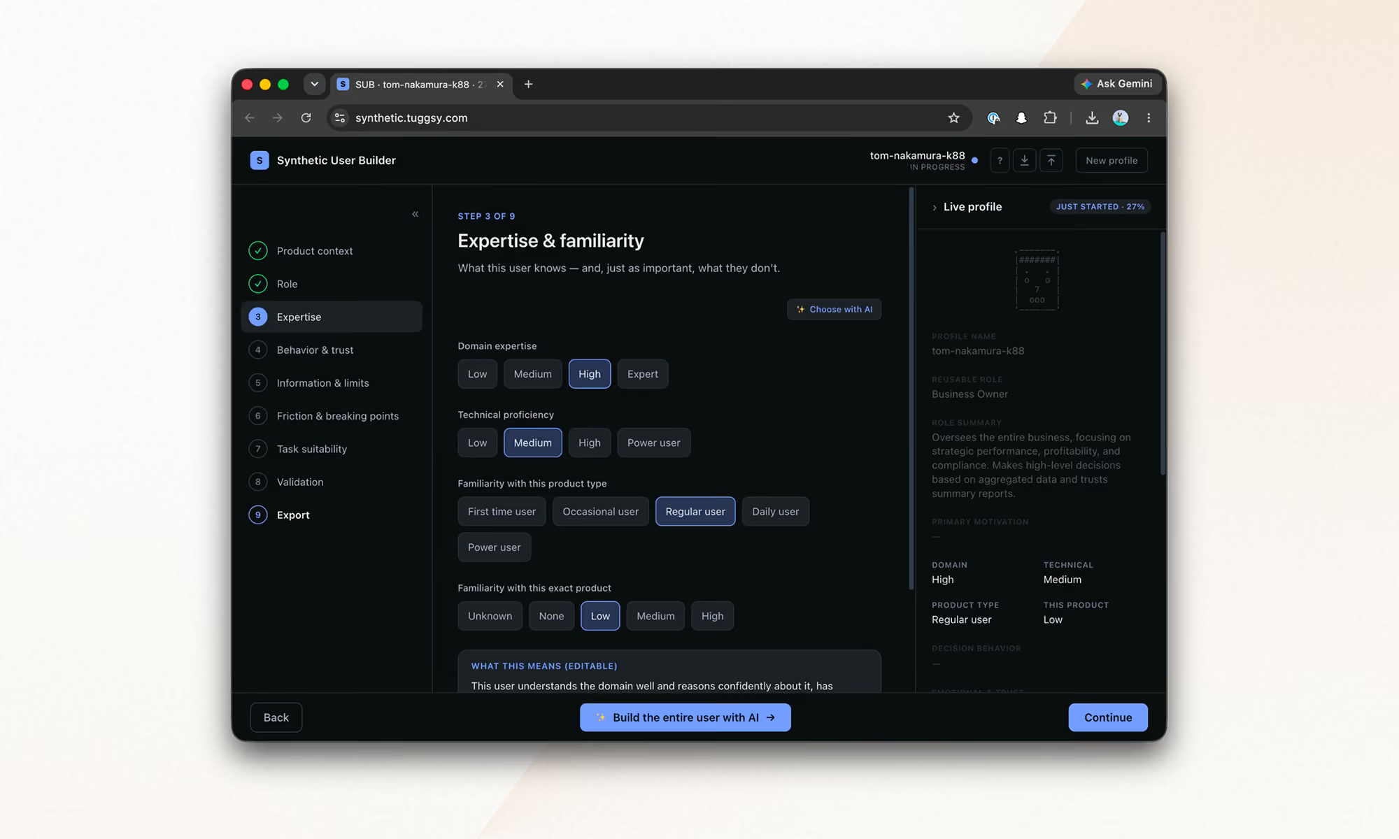
You build a profile field by field in the Synthetic User Builder, the tool I built to materialize the framework.
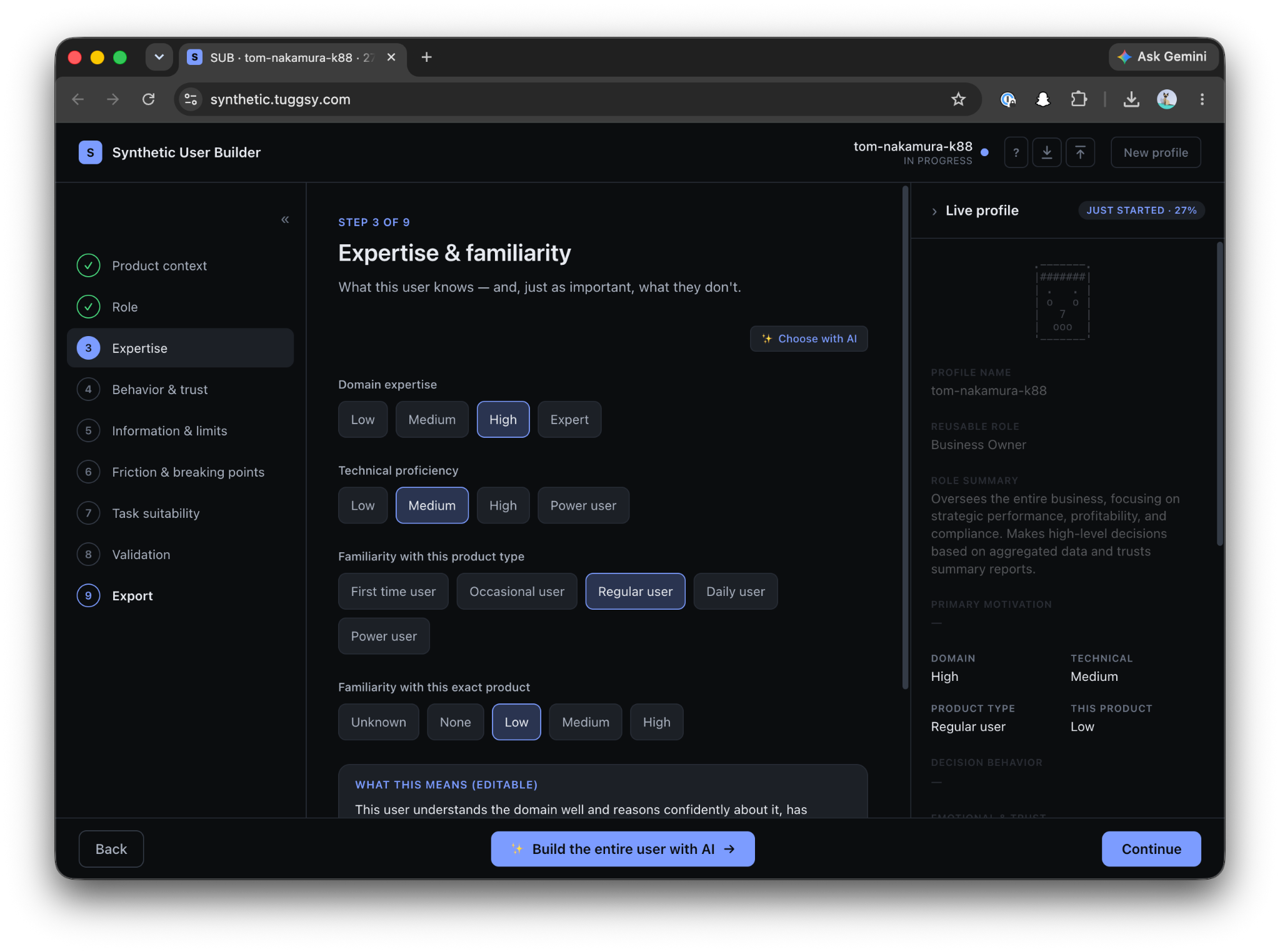
First come the attributes:
Only after that, and separately, comes the task.
The profile describes how someone decides, never what they have to do. That is why the same profile can be reused across tests.
simulation-auto (inferred)
You only give it the URL.
It researches the business, infers the typical roles, proposes users with tasks, and you adjust that proposal in natural language before anything runs.
heuristic-test (inspection)
The heuristic test described above, for one screen, one flow, or the entire site.
Every run leaves Markdown artifacts inside the project:
user-simulation-tests/
├── simulation/
│ ├── profiles/ ← users: the .md used for simulation + a .builder.json
│ │ that can be imported back into the Builder and edited manually
│ └── results/ ← one report per run + the consolidated report from auto mode
└── heuristic/
├── personas/ ← the 3 raters + business research, reused across runs
└── results/ ← reports with the prioritized findings table
Simulation reports include the full step by step flow, the emotional arc, risks, and a single “Fix this first.”
The consolidated report classifies findings by convergence: did one user suffer from this, or did all of them?
The decision to keep everything as accumulating .md files is strategic.
These are different runs, using different lenses, that can be analyzed together later, crossing heuristic violations with simulated emotions answers something no individual test gives us:
Of everything that is wrong, what actually matters?
What worked for me for the synthesis subagents:
A complete run consumes between 100k and 400k tokens, depending on the model and mode, in around 20 minutes.
That is the cost of a test that previously required coordinating the schedules of three professionals, and that can now run against every iteration of the product.
Here's a complete run against our site, kzsoftworks.com: a skeptical "Business Leader" profile, five live browser steps, and a full Markdown audit in under three minutes that names the exact moment the executive persona lost trust.
Every rule in the framework became an architectural constraint: clean context, one screen at a time, emotional memory, forbidden assumptions.
The plugin is open source: github.com/PabloManzoni/user-simulation.
Three commands, and the inferred mode only needs your URL.
If you try it and your synthetic user abandons on screen three, you already know what it means:
It is not failure. It is the signal.
AI
UX Design
·
Aug 14, 2026
Generative UI can adapt interfaces to each user, but it adds risks around reliability, latency, cost, security, and accessibility. Learn the architecture that keeps those risks under control.
12 read time
Generative UI assembles the interface around what each user is trying to do, instead of showing everyone the same fixed screen. That flexibility comes with real considerations: keeping the experience consistent, secure, and easy to support once it's live. This post covers what generative UI is worth building for, what it costs, and how teams keep it under control.
Generative UI works best when the experience is dynamic, but the system behind it stays tightly controlled.
Start by defining which parts of the interface can change, which cannot, and what must be validated before anything reaches the user.
The interface can adapt to what a person is trying to do instead of relying only on a persona defined at design time. Steps can reorder or disappear based on intent. It can change how much information it shows and what it emphasizes. Copy can adapt to the user's locale and context instead of relying on literal translation.
A small set of components can support many variations without designing each screen separately. The system can also support workflows the team did not design as individual screens, as long as the required components and actions already exist.
The interface can hide controls a task does not need, reducing the number of steps required to complete it. Generative UI can also help teams test different ways of presenting the same task. Whether that improves completion or conversion depends on the workflow.
When layouts change between users or sessions, they can break muscle memory and make support harder. They can also drift from the design system or disrupt accessibility patterns that depend on consistent structure.
The system should not trust model output by default. A model can render a button that does nothing, display fabricated data in a component, or produce a state the team never tested. Prompt injection can push it toward components, content, or actions the system should not allow. Weak controls can expose sensitive data or allow actions and interface states the product should block.
A generative interface also inherits the model layer's latency, cost, and availability risks. Waiting on an LLM to generate a layout adds delay before a page renders. Each generation uses processing resources, and hosted models usually add usage-based cost. Relying on one provider also exposes your product to outages, API changes, price increases, and deprecations.
Standard analytics often assume a fixed set of screens. Heatmaps and funnels become harder to compare when users see different layouts. Reproducing a bug also gets harder when you cannot reopen the exact screen the user saw.
Prompts can reduce unwanted behavior, but they cannot enforce which components the system may render or which actions it may allow. Those limits need to be enforced in the architecture around the model.
Keep global navigation, account and security controls, primary actions, critical transaction controls, and accessibility-critical structure fixed. Let the model modify only the content and controls that benefit from adaptation.
Fixed navigation preserves familiar interaction patterns. A stable structure also makes accessibility testing, branding, and support more predictable.
Do not let the model generate arbitrary UI code. Have it return structured configuration instead. The schema should specify the component, its data, and its position. Validate that output against a closed catalog before rendering it.
The model should not write HTML, CSS, or JavaScript or choose anything outside that catalog. This reduces invalid layouts and unsupported combinations. This is the declarative approach we covered in Part 1.
Treat model output as untrusted input. Validate it against the schema and component allowlist, sanitize content, and keep authorization outside the model.
Add content security policies and prompt-injection defenses based on what the model can access and what actions it can trigger. Pay particular attention to user-provided content, privileged actions, sensitive data, and external tools.
Limit valid component combinations, then use visual regression and property-based tests to exercise unexpected inputs and edge cases.
Minimize sensitive data sent to the model. Mask or anonymize it before generation when the task does not require the original values.
Record enough context to reconstruct each generated interface. That includes detected intent, model version, generated configuration, rendered components, task completion, and errors, all tied to the session.
That record lets teams segment analytics by generated experience and reconstruct what a user saw during a specific session.
Cache reusable results where freshness and privacy allow. Show a skeleton layout immediately and stream the rest in. Route simpler requests to smaller or local models, and reserve larger ones for complex requests. Put providers behind the same integration layer so you can switch models or fall back to a static experience during an outage.
Keeping more of the interface fixed protects consistency but limits personalization. Limiting combinations makes the system easier to test but reduces how much it can vary. Caching lowers cost, but cached output can go stale.
Running models locally can reduce how much sensitive data leaves your infrastructure, but it adds systems your team has to operate and maintain. Detailed session logs can make support easier, but they also create storage, retention, and privacy requirements.
No architecture maximizes flexibility, reliability, privacy, performance, and cost at once. You need to decide which trade-offs matter most for each workflow and design around them.
AI
UX Design
·
Jul 17, 2026
Generative UI lets AI build the screen each user needs, in real time. What it is, how it works, the trade-offs, and two working demos we built.
12 read time
Generative UI is a full-stack architecture that lets AI create, modify, and render user interfaces in real time, based on what each user needs at that exact moment. Instead of static, predefined screens, the interface assembles itself on the fly: a bar chart, a table, a comparison card when you're comparing things.
We've been building proofs of concept with it for the past few weeks. Most of what's written about generative UI is either too abstract or too exciting, so this is our attempt at neither: what it is, how it works, where it helps, where it doesn't, and what we learned from two demos we built.
Generative UI is a full-stack architecture: the backend talks to the LLM, decides what the answer should look like, and picks the components, while the frontend renders them and handles how the user interacts with what’s on screen.
Compare that with how interfaces have always worked. A designer decides what goes on each screen, a developer builds it, and every user sees the same thing. Forever, or until the next redesign.
Generative UI flips that. The interface becomes dynamic and personal instead of static and universal. The AI doesn't just answer your question, it designs the screen that answers your question.
Dashboards and reporting are the most common use cases, but they're far from the only one. The same pattern works for dynamic forms, onboarding flows, and customer support, as it takes input just as easily as it presents output. It can even adjust font size, contrast, or layout for users with low vision, color blindness, or cognitive load.
There are three levels of generative UI, from most constrained to most open (Google Cloud, 2026):
Most production systems today use the declarative approach, and that's what this post assumes from here on. The AI isn't writing HTML or CSS freestyle. It selects components, fills in pre-designed widgets, and composes them into the right screen.
Generative UI works by turning a user request into structured data that describes an interface, then rendering that data as real components. The flow looks like this:
To the user, the result feels like magic. Behind the scenes, it's structured data flowing through a well-defined pipeline. We prefer the second description. It's the one you can build on.
Generative UI trades real personalization and faster development for added latency, inference costs, and less predictable layouts. That's the honest version. Here are the details.
None of these are dealbreakers. There are known techniques to mitigate each one.
We built two demos. One with fictional data, one on top of a tool we use every day.
Aurora Goods is a fictional consumer e-commerce platform we created for the demo. The interface is simple: chat on the left, canvas on the right. You ask about the business, the LLM figures out what you need, pulls the data, and renders it visually.
Ask about 2025 sales and it shows the numbers on cards, with a short note on anything relevant. Ask it to break that down by region and it extends the same view instead of starting over, because it understands the second question builds on the first. This part took us a while to get right, and it's what makes the whole thing feel like a conversation rather than a search box.
The canvas isn't output-only either. You can click into any element and drill down: revenue by category, then inside electronics, then which products sold most.
You configure the widgets once. The system combines them and adds relevant commentary on the spot.
The second demo is closer to home: a generative reporting layer on top of the time-tracking tool we use every day at Kaizen. The questions in this demo are questions someone here has actually asked.
Instead of building dozens of hyper-specific reports, a small amount of code now handles virtually unlimited queries. How many hours were logged in May? Which anomalies showed up in April? How do billable and non-billable hours compare across two months? Who worked on a given project last month, and for how long? Each answer arrives as the right visualization: cards, lists, bar charts, plus a short summary that's easy to scan.
Two details won us over. The LLM suggests next steps, so exploring the data becomes a conversation. And when it's not sure, it asks instead of assuming. Ask for the hours of someone named Alex and, since we have more than one Alex on the team, it asks which one before answering.
Generative UI is a complement, not a replacement. Standard interfaces still win for stable, repetitive workflows where consistency matters. Nobody wants their checkout button to be creative. Generative UI wins where the workflow is complex and the questions are unpredictable.
It also changes what design systems are for. Beyond designing components and screens, teams will need to define semantic rules: how the AI should react to uncertainty, which interfaces match which intentions, and the guardrails that keep generated screens functional and safe.
That's a new kind of design work. And it's already starting.
We build working proofs of concept in two weeks. Your data, your workflows, a real thing you can click.
AI

·
Jul 16, 2026
We built an internal dashboard to track how AI crawlers like ChatGPT, Perplexity, Claude, and Google read our website. Here’s what it revealed about AI visibility, analytics blind spots, and the new risks facing B2B companies.
12 read time
Somewhere between a prospect Googling your company and a prospect never visiting your site at all, a new kind of visitor showed up.
It doesn't click. It doesn't scroll. It doesn't show up in Google Analytics. But it scans your website, decides what matters, and quietly influences whether your business gets mentioned the next time someone asks ChatGPT, Perplexity, or Google's AI Overviews for a recommendation.
We had no real way to know what these AI bots were finding on our own site. So, before telling anyone else what to do about it, we built something to find out for ourselves.
Google Analytics tracks human sessions, not server-side crawler activity. That's the blind spot. A person searches, sees a list of links, clicks one, lands on your site; that's the journey it was designed to track.
That journey is changing. Fewer people start their research by typing a query into Google and scanning ten blue links. Most of them are asking an AI assistant directly: "who are good software partners for X," "what's the best tool for Y," and trusting the shortlist it hands back. To build that answer, the AI first sent something to read the web on its behalf: a bot with a name like GPTBot, PerplexityBot, or ClaudeBot, crawling pages much like search engines have for decades.
None of that shows up in your dashboards. Those bot visits don't count as sessions, don't trigger conversion tracking, and don't appear anywhere you're already looking. If your site is hard for those bots to read, poorly structured, or quietly blocking them without anyone realizing it, you're not losing a ranking position. You're being left out of a conversation you never knew was happening. It's a new kind of competitive risk. Not "we got outranked," but "we were never in the running, and nothing told us."
That's the gap we set out to close, starting with our own site.
Inside our Innovation Hub, the group that experiments with new tools and workflows before we bring them into client work, someone asked a simple question: are AI bots even visiting our site? And if they are, what are they actually able to see?
Nobody could answer that with confidence. Not because it's a hard problem to reason about, but because the tool to answer it didn't exist among the tools we already had. So instead of guessing, or buying something built for someone else's website, we built a small internal dashboard for our own.
The idea is simple, even if getting there wasn't: a small piece of code sits quietly in front of our website and notes every time a known AI bot stops by. It records which one it was, which page it looked at, whether it got a clean response or hit an error, and how deep into the site it went.
Right now we're tracking bots from OpenAI (the ones behind ChatGPT), Anthropic (Claude), Perplexity, Google, Microsoft's Bing, Meta, and Apple. That list will keep growing. New AI crawlers show up faster than anyone can keep a definitive catalog.
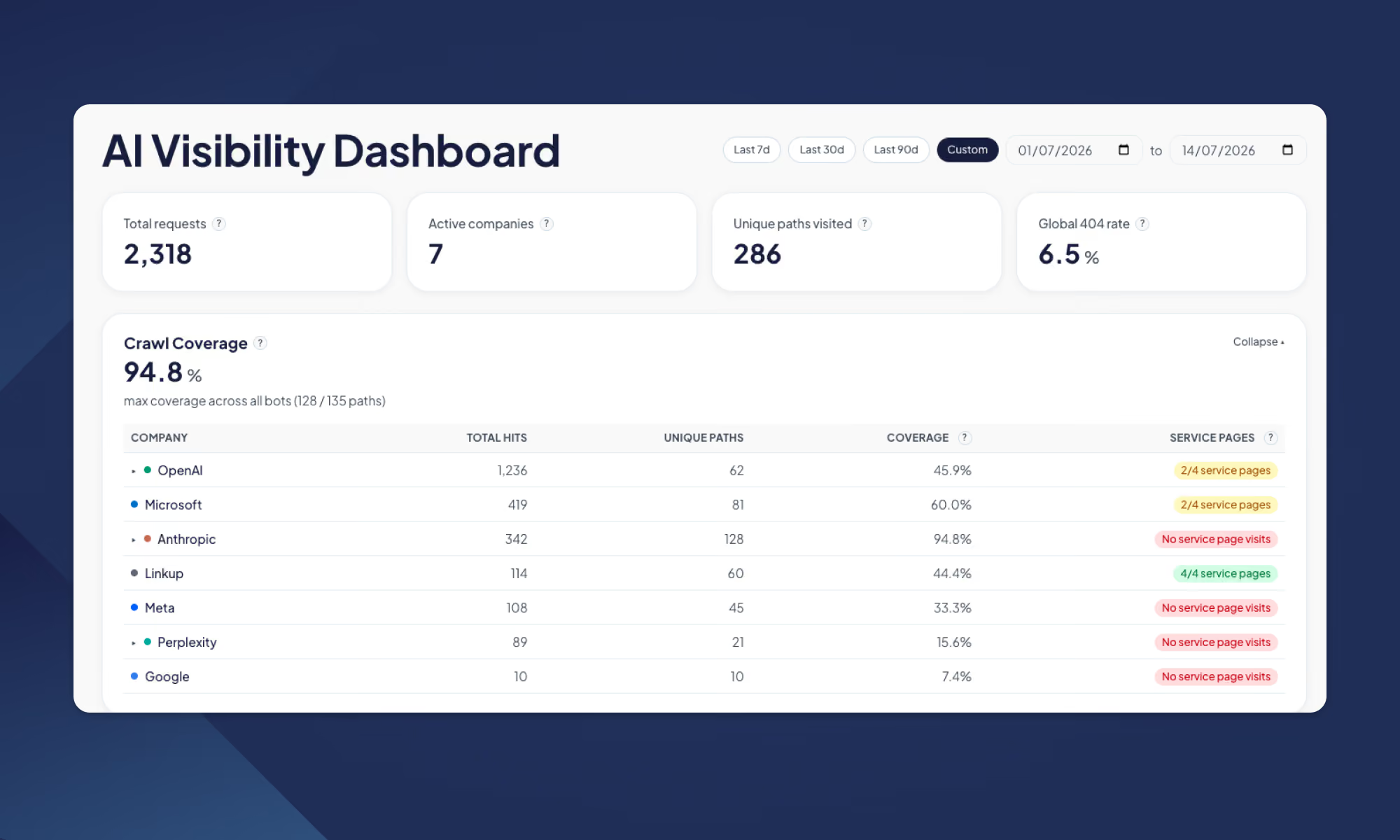
All of that gets pulled into a dashboard the team can check the same way we'd check any other business metric: how much of the site is actually getting crawled, where bots are hitting dead ends, whether they're respecting the instructions we leave for them, and how that changes over time.
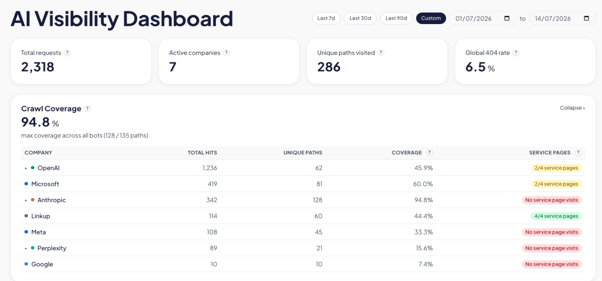
We didn't have to wait long to see the point of building this. Two things came up in the first few weeks alone.
An llms.txt is a simple file some AI models look for to understand what a site is about. Like a lot of sites getting ready for an AI-driven web, we added one, checked it was live, and moved on, assuming that box was checked.
The dashboard said otherwise. Weeks in, not a single bot had requested it.
So we went digging, and read that crawlers rely on robots.txt to know an llms.txt file exists in the first place, and ours didn't reference it. We added the missing line. Bots still weren't picking it up.
Third attempt: we added plain, visible links to the file in the site's header and footer, the same way we'd link to any other page. That's what did it. Two weeks of zero requests, and on the exact day we shipped that change, the file got six requests from five different AI companies.
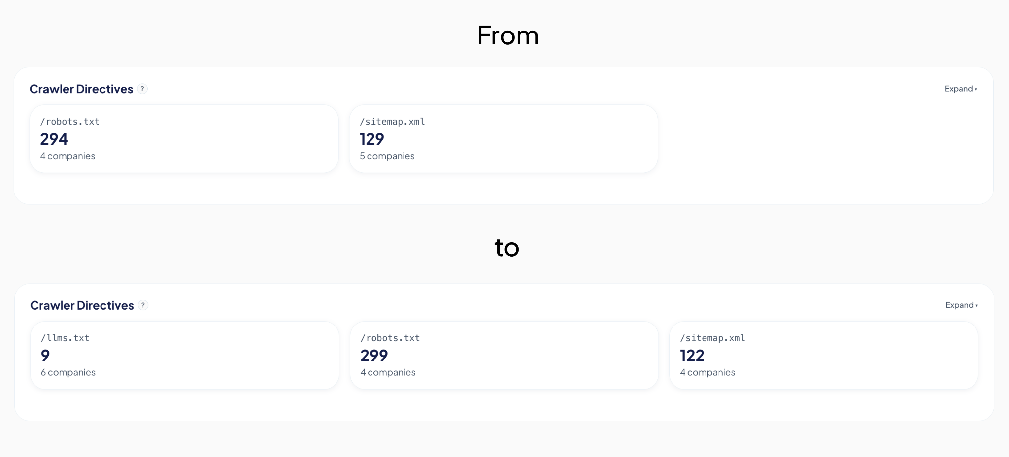
The detail we only noticed because the dashboard breaks bots down by type: those six requests were all from indexer and training bots, the ones that crawl the web to build a general picture of it, not yet from retrieval bots, the ones that fetch a page in real time to answer someone's specific question right now. That's a useful distinction. It's the difference between "we're now on the map" and "we're being pulled up live," and it tells us what to check for next.
None of that would have surfaced anywhere else. Not in Analytics, not in Search Console. We would have gone on believing the file was doing its job, simply because we remembered adding it.
The second finding was less comforting: several of our most important pages, the ones describing what we actually do, were barely being crawled at all. Not blocked, not broken. Just quietly skipped by many bots.
We built a graphic on the dashboard specifically for this: crawl coverage per bot, broken down page by page. Now, instead of assuming coverage is even across the site, we can see exactly which high-value pages each AI bot is actually reading, and which ones it's ignoring.
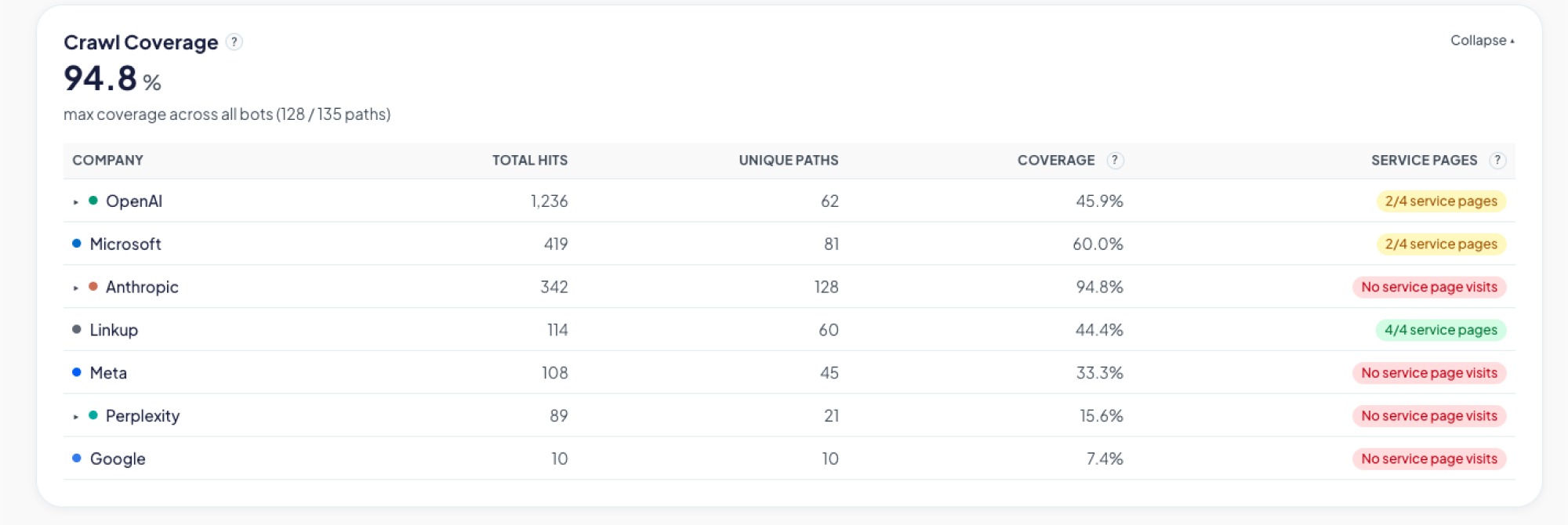
We're still working on closing that gap. The first fix we tried didn't move things the way we expected, so for now the coverage graphic itself is doing the real work: telling us, page by page and bot by bot, whether the next attempt actually helps instead of just hoping it does.
Neither of these was something we could have reasoned our way into. We only found them because we were finally looking.
It's tempting to jump straight to fixes: restructure content, add an llms.txt file, rewrite pages to be more "AI-friendly." We did some of that too. But our own llms.txt sat unused for weeks and we had no idea, because we had nothing telling us otherwise. Without a baseline, you can do all the "right" things and still have no idea whether any of them worked.
Our approach here mirrors how we tend to approach any technology problem: understand what's actually happening before deciding what to change. It's a small dashboard, built quickly, answering one honest question. It's already paid for itself twice over, and we're still early.
We'll keep sharing what we find as the picture gets clearer. If you're curious what your own numbers might look like, that's a conversation we're happy to have.
No blogs matched this category, try applying different filters.