Ape Together Strong: Team Collaboration Using Design Thinking
Published on
·
April 10, 2026
Last updated on
·
April 10, 2026
Time to read
·
12
Pablo Manzoni
UX Lead & Product Designer
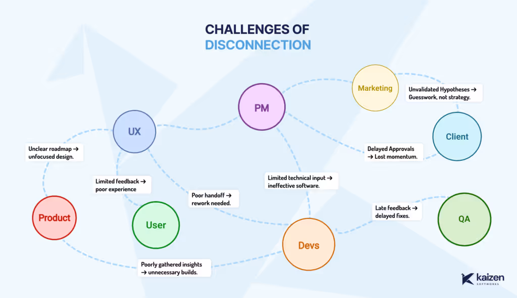
Keeping product, design, and development teams aligned can be challenging. Even with the best intentions, teams often have different goals, methods, and definitions of success, which can lead to disconnects that ultimately impact the product’s ability to meet user needs.
At Kaizen Softworks, I recently led a Design Thinking workshop focused on improving collaboration among cross-functional teams by aligning their goals and reducing misalignments. We used one of our client’s product teams as a case study to apply Design Thinking. Here’s a breakdown of how we approached each stage, with examples and takeaways.
Understanding the Challenge: Why Disconnects Happen
Cross-functional disconnects can arise from unclear roadmaps, limited technical input, and delayed feedback loops. Product may envision one outcome, design may prioritize another, and development faces technical constraints in between. To kick off, we discussed these challenges openly, exploring how they impact alignment, feature quality, and user experience.
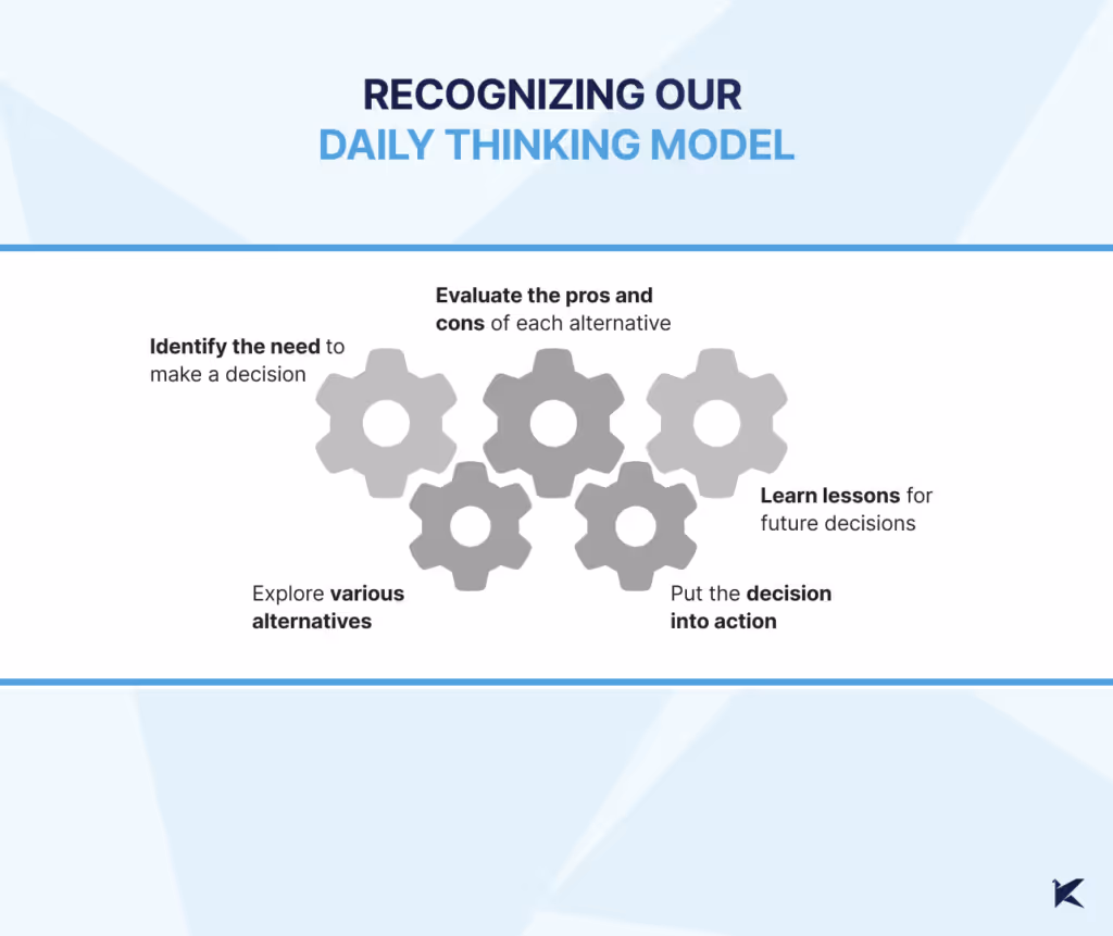
Recognizing Our Daily Thinking Mode
Every team member brings a unique thinking style to the table, shaped by their daily challenges and responsibilities: product might focus strategically, design zeros in on details, and development leans towards solution-oriented thinking. This awareness helps us understand each other’s perspectives
In this workshop, we each shared how we approach decision-making in our roles. This awareness helped us see where our natural modes might cause friction and allowed us to step into each other’s shoes, fostering empathy and a willingness to adapt our thinking for the collective goal.
Applying Design Thinking: Stage-by-Stage
Here’s how each stage played out in our client’s project
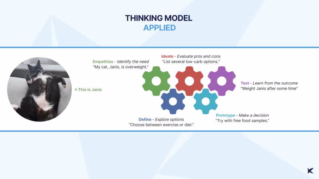
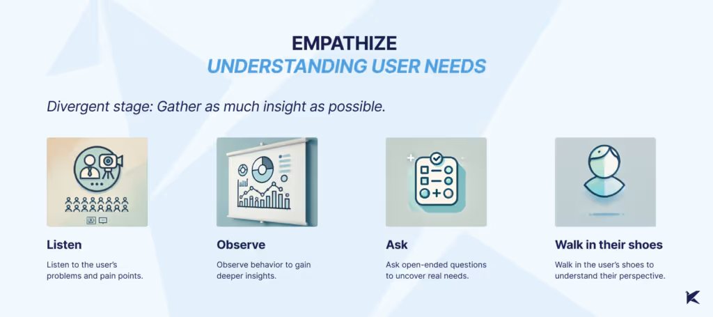
1- Empathize
What We Did: We started gathering data on device usage by app users, allowing the UX team to conduct a Design Review. This uncovered issues with the UI on smaller screens, which hadn’t been fully considered. The result? Usability problems and frustration for users who needed to complete tasks on smaller devices.
What Could Have Been Improved: Earlier metric analysis could have highlighted these usability issues sooner, leading to a more user-focused approach from the start.
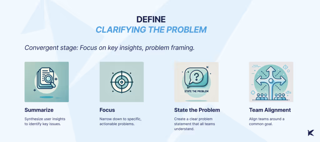
2- Define
What We Did: With a clearer view of user pain points, we pinpointed specific issues, such as tasks left incomplete on smaller screens, which resulted in penalties and manual fixes. We defined the problem as a need for a feature allowing managers to exclude certain tasks from reports—a clear problem statement that helped all teams align on a common purpose.
What Could Have Been Improved: Better communication across teams could have surfaced this problem earlier, minimizing the need for manual workarounds
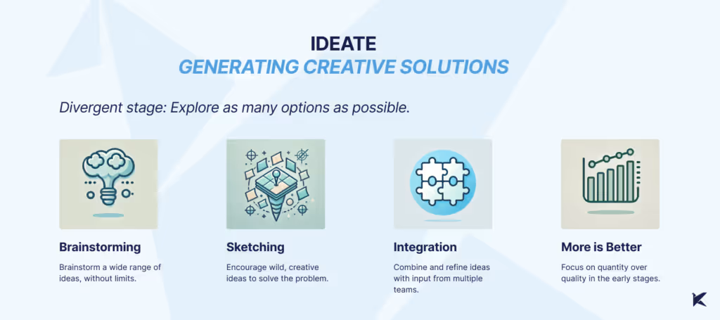
3- Ideate
What We Did: We used techniques like Crazy 8s and mind mapping to generate a wide array of ideas, fostering a creative environment where all perspectives were valued. By the end, we had a solid list of potential solutions and a better cross-team understanding.
What Could Have Been Improved: Gathering more user feedback at this stage could have helped us focus on user-centered ideas. Cross-team ideation sessions could have further enriched our perspectives.
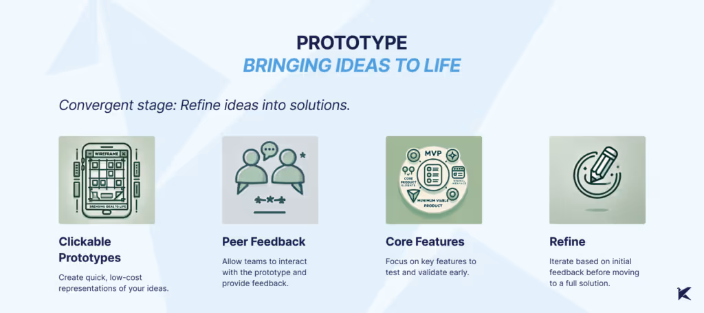
4- Prototype
What We Did: Our UX team created low-fidelity prototypes, enabling early testing and feedback without heavy resource commitment. This gave each team a tangible starting point to discuss and refine.
What Could Have Been Improved: Staying in low-fidelity longer could have allowed for more experimentation, helping us catch usability issues before moving to high-fidelity designs.
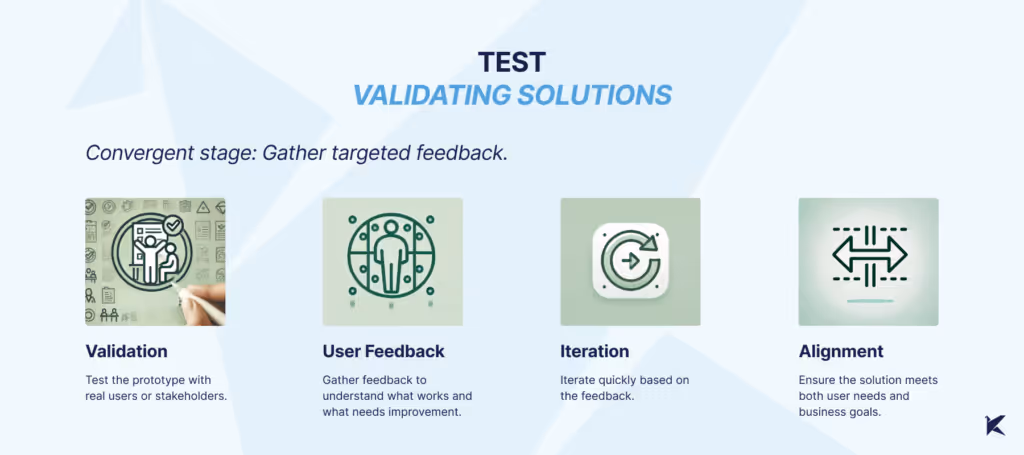
5- Test
What We Did: Finally, we tested our prototypes with users, which surfaced usability issues on smaller screens that might have otherwise gone unnoticed. This feedback was essential in fine-tuning the design to meet both user and technical requirements.
What Could Have Been Improved: More in-depth testing during the Empathize phase could have brought some of these issues to light earlier, leading to a more robust and user-friendly solution.
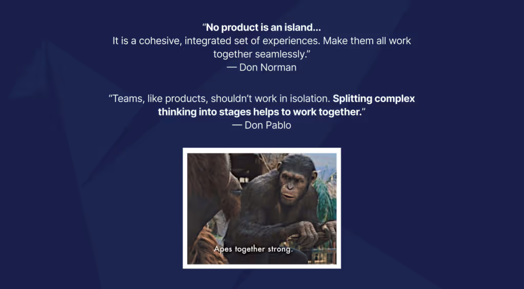
Reflection: Breaking Down Thinking to Work Better Together
The idea behind this workshop wasn’t just to solve a problem—it was to understand the structure of how we think. Thinking often feels automatic, something that happens so quickly we barely notice it. By breaking it down into clear, identifiable stages, we created a way to not only recognize our own thought processes but also align as a team.
Keeping product, design, and development teams aligned can be challenging. Even with the best intentions, teams often have different goals, methods, and definitions of success, which can lead to disconnects that ultimately impact the product’s ability to meet user needs.
At Kaizen Softworks, I recently led a Design Thinking workshop focused on improving collaboration among cross-functional teams by aligning their goals and reducing misalignments. We used one of our client’s product teams as a case study to apply Design Thinking. Here’s a breakdown of how we approached each stage, with examples and takeaways.
Understanding the Challenge: Why Disconnects Happen
Cross-functional disconnects can arise from unclear roadmaps, limited technical input, and delayed feedback loops. Product may envision one outcome, design may prioritize another, and development faces technical constraints in between. To kick off, we discussed these challenges openly, exploring how they impact alignment, feature quality, and user experience.
Recognizing Our Daily Thinking Mode
Every team member brings a unique thinking style to the table, shaped by their daily challenges and responsibilities: product might focus strategically, design zeros in on details, and development leans towards solution-oriented thinking. This awareness helps us understand each other’s perspectives
In this workshop, we each shared how we approach decision-making in our roles. This awareness helped us see where our natural modes might cause friction and allowed us to step into each other’s shoes, fostering empathy and a willingness to adapt our thinking for the collective goal.
Applying Design Thinking: Stage-by-Stage
Here’s how each stage played out in our client’s project
1- Empathize
What We Did: We started gathering data on device usage by app users, allowing the UX team to conduct a Design Review. This uncovered issues with the UI on smaller screens, which hadn’t been fully considered. The result? Usability problems and frustration for users who needed to complete tasks on smaller devices.
What Could Have Been Improved: Earlier metric analysis could have highlighted these usability issues sooner, leading to a more user-focused approach from the start.
2- Define
What We Did: With a clearer view of user pain points, we pinpointed specific issues, such as tasks left incomplete on smaller screens, which resulted in penalties and manual fixes. We defined the problem as a need for a feature allowing managers to exclude certain tasks from reports—a clear problem statement that helped all teams align on a common purpose.
What Could Have Been Improved: Better communication across teams could have surfaced this problem earlier, minimizing the need for manual workarounds
3- Ideate
What We Did: We used techniques like Crazy 8s and mind mapping to generate a wide array of ideas, fostering a creative environment where all perspectives were valued. By the end, we had a solid list of potential solutions and a better cross-team understanding.
What Could Have Been Improved: Gathering more user feedback at this stage could have helped us focus on user-centered ideas. Cross-team ideation sessions could have further enriched our perspectives.
4- Prototype
What We Did: Our UX team created low-fidelity prototypes, enabling early testing and feedback without heavy resource commitment. This gave each team a tangible starting point to discuss and refine.
What Could Have Been Improved: Staying in low-fidelity longer could have allowed for more experimentation, helping us catch usability issues before moving to high-fidelity designs.
5- Test
What We Did: Finally, we tested our prototypes with users, which surfaced usability issues on smaller screens that might have otherwise gone unnoticed. This feedback was essential in fine-tuning the design to meet both user and technical requirements.
What Could Have Been Improved: More in-depth testing during the Empathize phase could have brought some of these issues to light earlier, leading to a more robust and user-friendly solution.
Reflection: Breaking Down Thinking to Work Better Together
The idea behind this workshop wasn’t just to solve a problem—it was to understand the structure of how we think. Thinking often feels automatic, something that happens so quickly we barely notice it. By breaking it down into clear, identifiable stages, we created a way to not only recognize our own thought processes but also align as a team.
A while ago we noticed something pretty common: everyone wanted to share more knowledge internally, but nobody wanted another heavy corporate ritual.
Internal talks usually start with good intentions and slowly disappear. They take time, preparation, and energy. And at some point people start feeling like they need to be experts before presenting anything.
So we tried the opposite.
15 minute talks.
Small topics.
Low pressure.
And one important rule: every session had to leave something useful behind. A tool, a workflow, an idea, a shortcut, a new way to approach a problem. Something people could actually use after the talk ended.
We didn’t want theory that went nowhere.
Somehow, that ended up working much better than we expected.
The idea was to reduce friction
Screenshot of the shared topic pool
Tiny Knowledge Bytes is intentionally simple:
anyone can suggest topics
anyone can end up presenting
you don’t need to master the topic
talks can come from experiments, client problems, tools or random discoveries
sessions should leave something practical behind
if nobody volunteers, the system picks someone for us
The goal was making knowledge sharing feel lightweight instead of exhausting.
Some of the best talks start with:
“I tried this yesterday and it was weird.”
The topic pool started growing on its own
Over time, topics started coming from everywhere.
Sometimes someone took a course and used a Tiny Knowledge Byte as a way to give something back to the team. Other times, a client problem triggered research into new tools, workflows or AI approaches.
A lot of sessions start from curiosity or necessity more than planning.
And honestly, the mix is part of what makes it interesting.
Sometimes a UX session drifts into Computer Vision. Sometimes someone technical shares a visual workflow that half the design team ends up adopting later.
There’s not much curation. It behaves more like a constant exploration system.
Then another problem appeared: choosing who presents
And this is where things became unnecessarily dramatic.
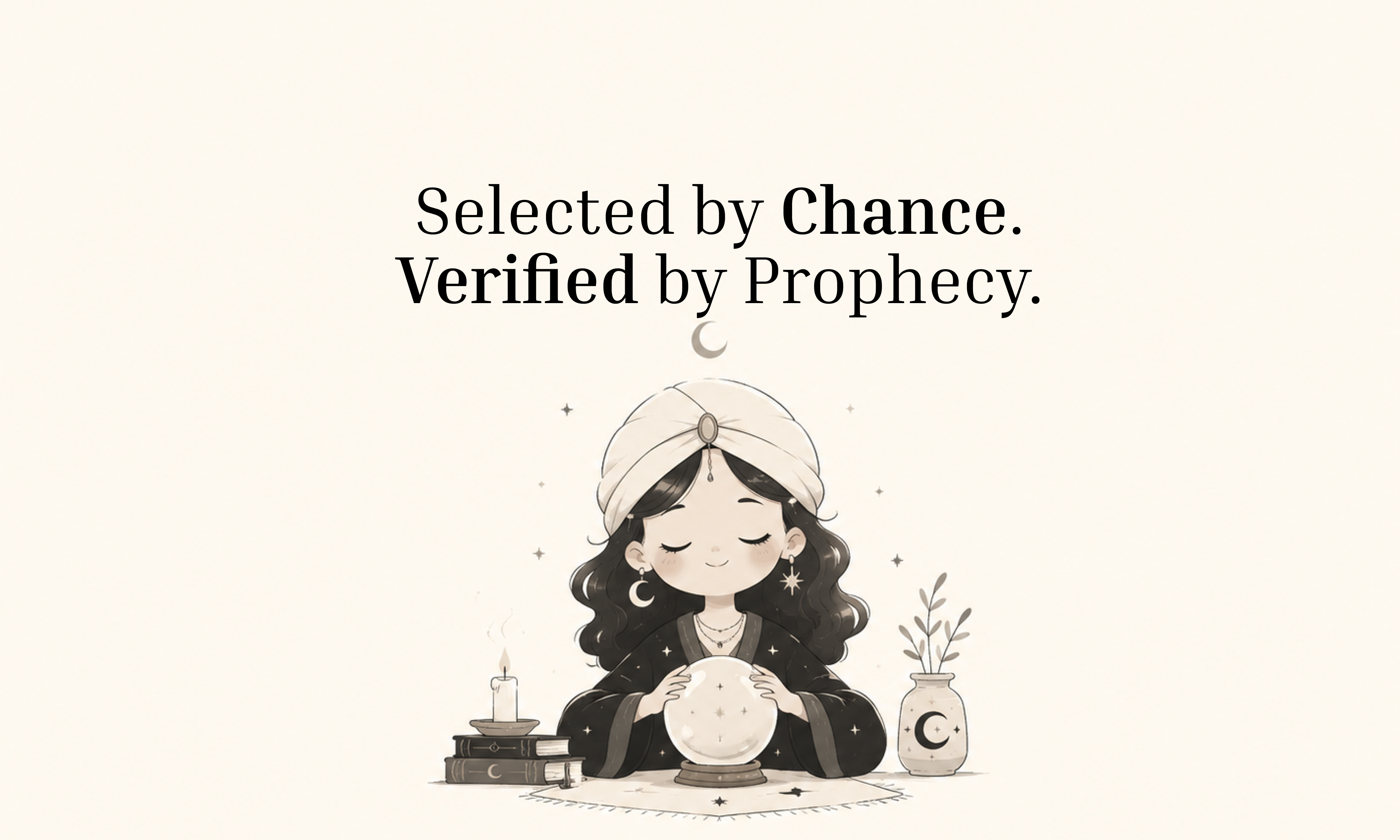
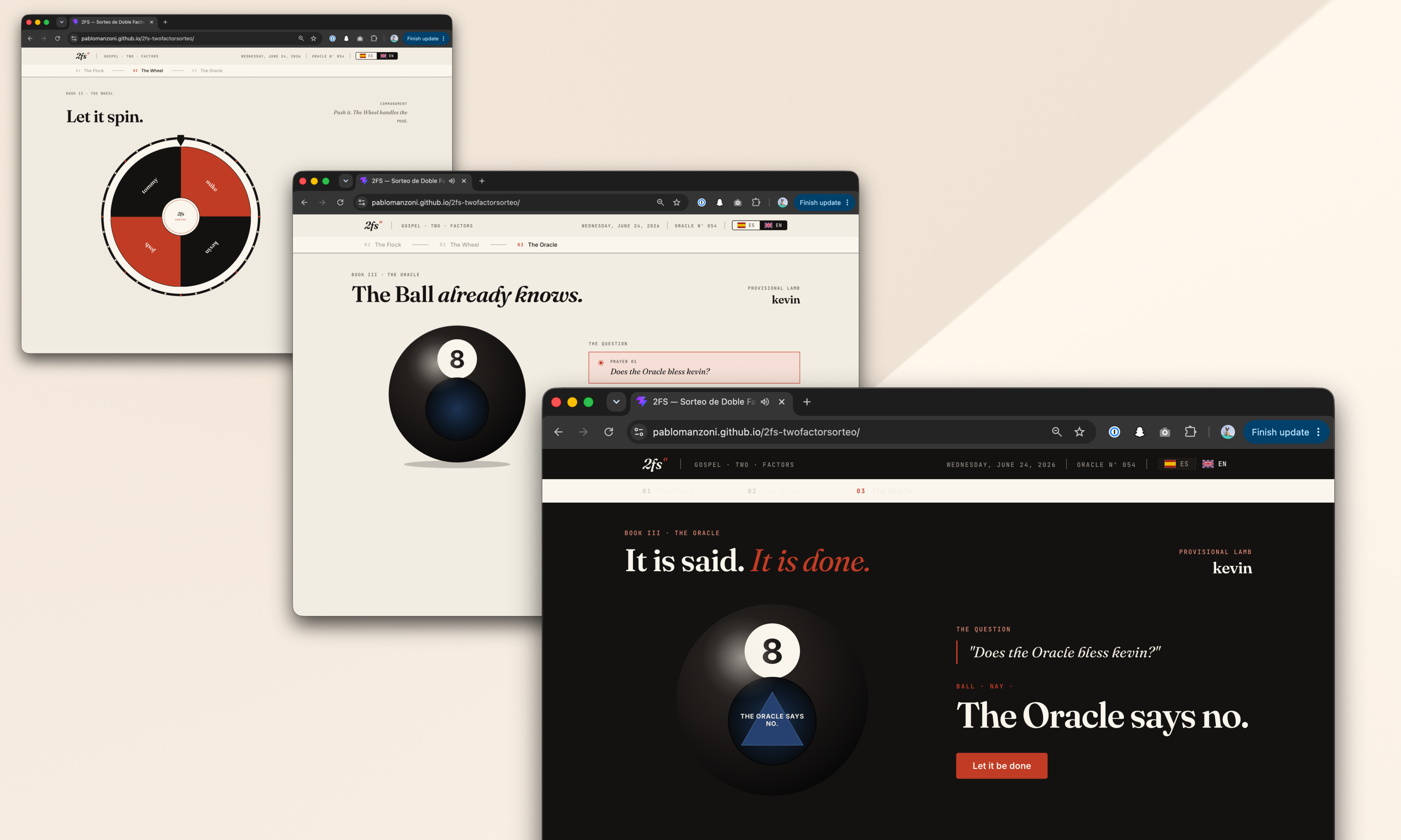
Nobody wanted to be “the person who chooses”. So we started adding absurd layers of randomness until we somehow ended up building a full internal app called 2FS.
Two Factor Sorteo.
Yes, it’s real.
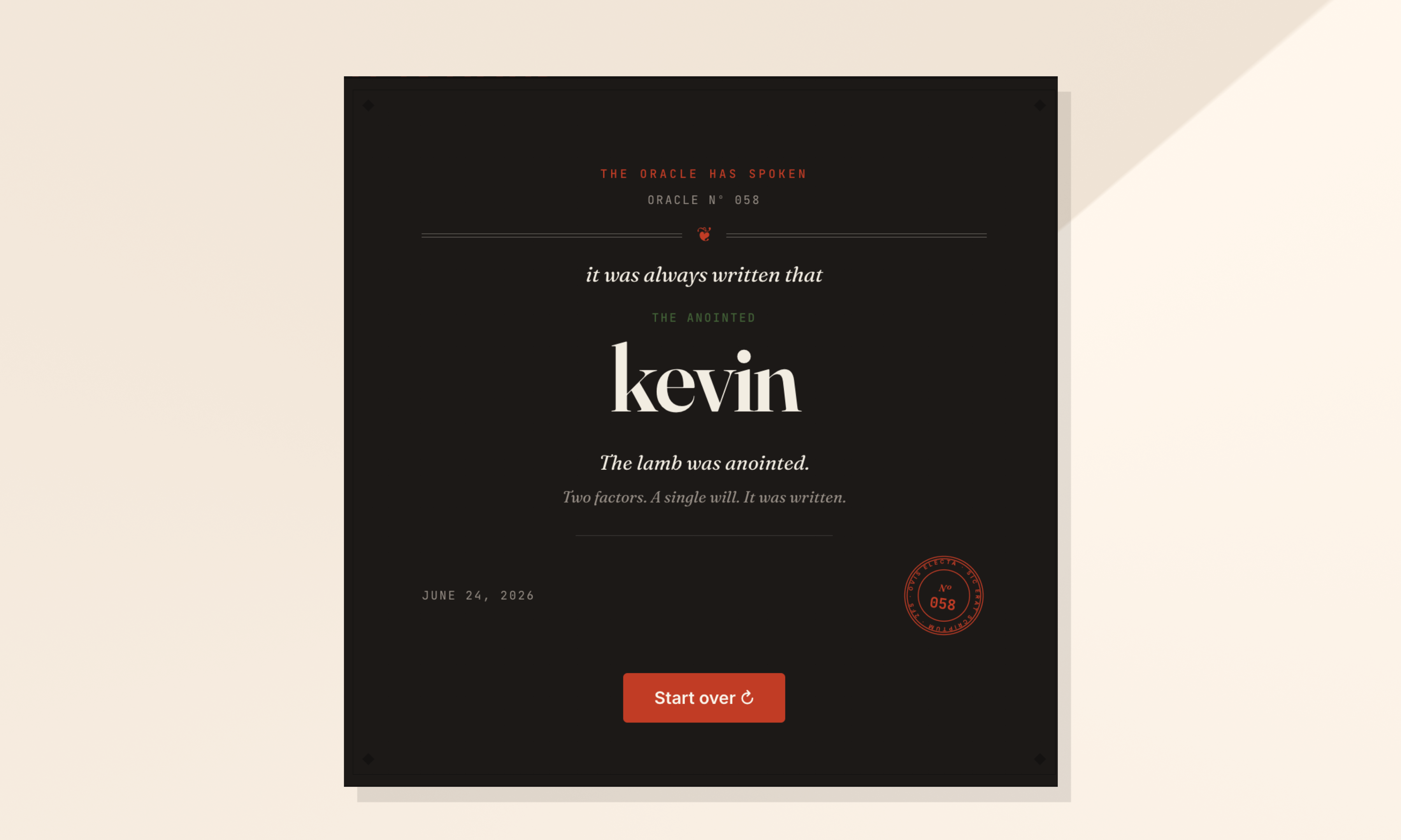
The wheel proposes. The oracle decides.
The logic is simple.
First, a wheel picks someone.
Then a Magic 8 Ball decides whether destiny approves the selection.
If the oracle rejects the person, the process starts again.
That’s it.
The app accidentally became part of the learning loop too
Apps developed for the Tiny Knowledge Bytes.
2FS originally started as an excuse to experiment with:
Claude Code
Claude Design
design systems
editorial interfaces
motion and microinteractions
Eventually those same explorations turned into future Tiny Knowledge Bytes.
The tool we used to select speakers started generating new topics itself.
The system started feeding itself
One of the most interesting side effects is that people started building things outside their usual role because of previous Tiny Knowledge Bytes.
2FS itself is a good example. A designer saw sessions about Claude tooling and AI workflows and thought:
“Maybe I can actually build this.”
What started as a ridiculous speaker selection tool became a real product experiment involving Claude Code, interface systems and interaction design.
Then it came back into the Tiny Knowledge Bytes circuit as a new talk.
That loop became surprisingly valuable:
someone learns something,
tries it,
builds something with it,
and eventually inspires someone else to do the same.
What ended up mattering most
Final Oracle Certificate.
Over time we realized knowledge sharing works much better when:
it doesn’t require huge preparation
it’s allowed to be imperfect
it mixes different disciplines
it leaves something practical behind
and somehow involves a mystical wheel connected to a Magic 8 Ball
At that point, it stops feeling like another internal obligation and starts feeling like something people genuinely want to keep alive.
Just this month, I built a full design system in about 20 hours.
What used to take weeks, sometimes months, is now dramatically faster. So… what actually changed? And more importantly: what didn’t?
Design systems take time. On complex platforms, they can take hundreds of hours.
We were working with a large and complex product where inconsistencies had started to pile up. Different modules had evolved in isolation, teams were making independent decisions, and there were no shared guidelines. The answer was clear: we needed a design system.
AI tools were just starting to emerge back then. They were mostly useful for simple tasks as they tended to hallucinate when things got complex. Developers had started using them earlier than designers, MCP didn't exist yet, and Figma plugins were the best automation we had.
But the context has changed. Fast.
The Manual Era
We did what most teams did. We stopped, and we built it. Manually.
Picture two designers, a mountain of inconsistencies, and no map. We had to cross-reference information manually, digging through the code, detecting what could be merged, agreeing on naming conventions, deciding how to name components. Hours and hours of discussion until we finally landed on a solution.
In the end, we got there. A cleaner system, faster workflows, and for the first time, both teams speaking the same visual language. Hard-won, but it worked.
But now every month a new AI model seems to be released. Design is finally catching up with what developers faced about two years ago. New tools arose, and with that, the scope of our work as designers completely changed.
The Human Factor
For an internal project, I used our Kaizen site as a reference, combined with documentation from industry leaders as a guideline.
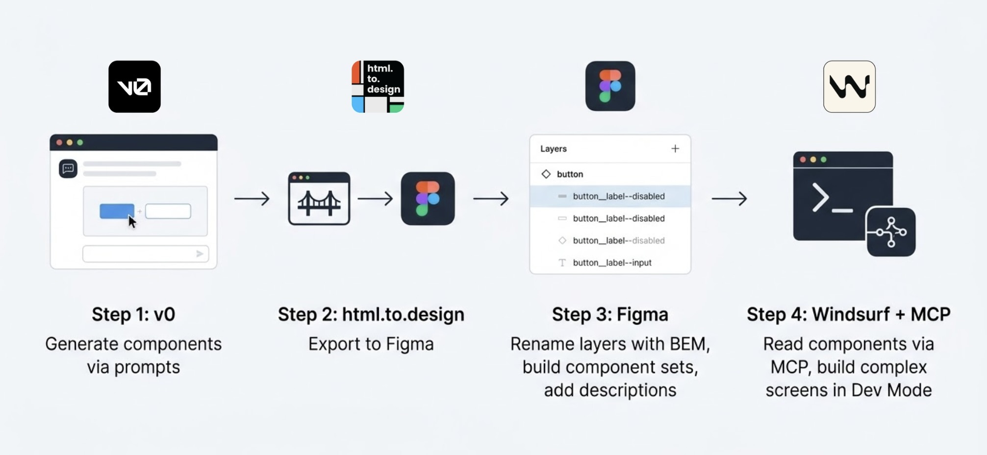
I started in v0, which is essentially a chat interface where you can generate UI components through prompts. I fed it the colors, typographies, and a reference image, and from there it was a back-and-forth: the AI generated, I reacted, adjusted, and pushed until the output matched what I had in my head. And just like that, I started prompting my way through a Design System.
Once a component was ready, I used the html.to.design plugin to bring it into Figma (yes, plugins are still alive!). Think of it as a bridge: the plugin exports designs directly from the browser into a Figma file.
Inside Figma, the intervention was more hands-on. First, I checked that everything was visually consistent with what was defined in v0: colors, typography, styles. Then I used Figma's built-in AI to rename all the component layers using BEM convention (something that would have taken a significant amount of time to do so manually).
BEM, which stands for Block Element Modifier, is a widely adopted naming convention in CSS. It structures layer names hierarchically and predictably, for example: button__label--disabled.
Using it keeps the code clean, readable, and consistent, especially when you're working alongside a developer who needs to understand what came out the other side.
Beyond naming, I also made sure the layer structure would generate the right properties when building component sets in Figma, so that all the variants would be correctly exposed and usable. My team also pointed out that adding descriptions to components and variants was key as context for any agent using them through an MCP.
The last step was connecting everything to Windsurf via MCP. With a frame selected in Dev Mode, Windsurf could read the Figma file and use the components to build more complex screens.
We worked closely with a developer throughout this phase. Not just for the technical knowledge, but because having someone who reads code fluently meant catching things we wouldn't have spotted otherwise. The design role here was direction and supervision: making sure the AI used the components correctly and didn't invent solutions where context was missing.
Every step of the process had a human decision behind it.
An Unexpected Discovery
At one point, before we had any of the naming conventions figured out, I selected a frame and asked Windsurf to build a form using the components inside it, styled to match a specific card. The developer next to me was skeptical until he saw the result, and then he was just as surprised as I was.
What we realized is that the MCP wasn't reading layer names to understand context. It was reading everything inside the frame, even the loose text sitting alongside the components. Good naming is still worth doing. But the MCP doesn't need it to understand what it's looking at.
Learning to Talk to an AI
The more specific and contained your prompt, the better the outcome. We started with the most atomic component: the button, and worked outward from there. Each approved component became context for the next one, so the system gradually picked up the visual language we were building.
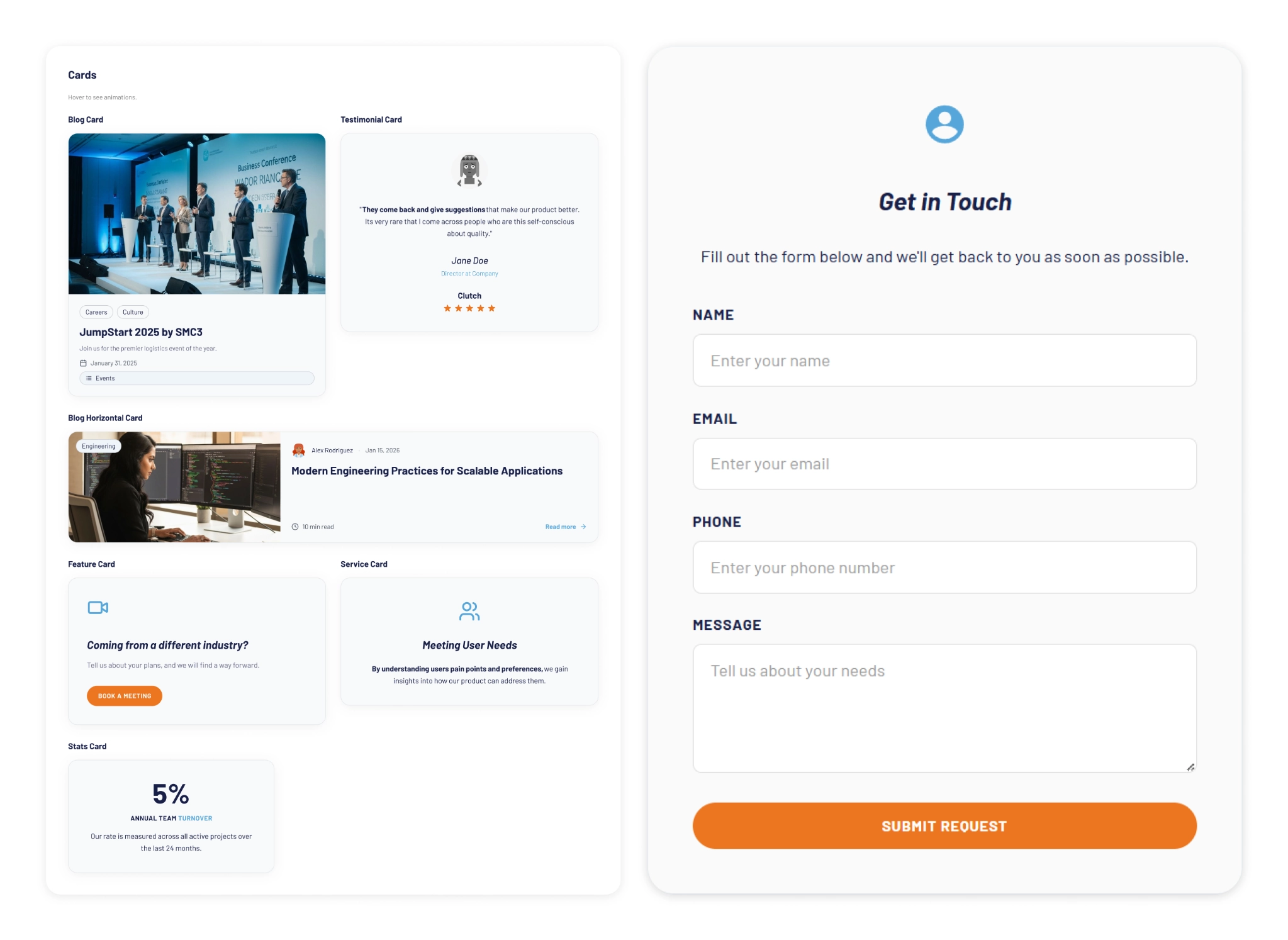
At some point I got ambitious and asked for five cards in a single prompt: blog card, service card, testimonial card, stats card, feature card… structures, states and all. The AI delivered.
Visually, everything looked fine. Then the developer looked at the code and pointed out that all five cards were independent components instead of variants of one. For a design system, that breaks everything.
One correction prompt fixed it. But it was a good reminder: the AI does exactly what you ask, not what you mean. And fixing it after the fact can cost more than getting it right from the start.
Some Things Learned Along the Way
Precision is key. Natural language is fine when you're asking for a cooking recipe, but when referring to a component, if you say things like "create" instead of "add", you'll probably end up with a whole new set of components instead of additional variants of an existing one.
The "Frame" is the context: MCPs can read everything inside the frame you select. This is a game-changer. It means the "naming conventions" debate might be shifting. If the AI understands the context visually and structurally, will we still spend hours discussing nomenclature in 2027?
No matter what happens, you can always roll back in less than 5 minutes and start over.
Work closely with a developer: they can help you understand MCPs and clear up any code-related doubts. Once you start to grasp their logic, you'll learn very quickly how to prompt in ways that AI actually understands.
There's nothing to lose by asking the AI to follow a specific naming convention for the code. It keeps everything clean and readable, and it takes no extra effort.
The AI covers roughly 80% of the work (generation, variations, exploration...), but the remaining 20% is where quality lives, and that part is not delegable. The AI executes. The judgment is still yours. And if you skip the review, you're not saving time: you'll spend it later.
Context matters more than tooling. What you don't define, the AI will invent. Small components may be resolved well, but large interfaces require more definition from the start. A well-defined system scales. An undefined one generates inconsistencies faster than you can fix them.
Figma is no longer the mandatory starting point. It's useful as a visual reference, a QA space, or a consolidation layer. But the AI doesn't need it. We still do.
There's no single right workflow yet. What you do depends on the project. We're in a transition moment where the tools change faster than the standards. The best thing you can do right now is experiment.
What AI Still Can’t Replace
Through all of this, a few things became very clear. These are the parts that didn’t change:
Knowing when something looks off. The AI generates, but it doesn't notice when the result doesn't feel right. That eye is yours.
Direction and supervision. The AI used the components we gave it, but without someone supervising it, it invents solutions where there is no context to work from.
The definition of done is still a human call, whether it's a conversation with a PO, a stakeholder, or just the designer's criteria. There's no prompt for that.
The context: knowing why certain decisions matter, what a component should communicate, what the user will actually feel. Business knowledge, stakeholder dynamics, unwritten rules, empathy for the end user. These take years to build and live in the people doing the work, not in the tools they use.
My Two Cents
The tools changed, and that gave me the chills, but throughout this experience I found that the designer's role is more alive than ever.
What once took a team weeks can now be prototyped in hours. That’s not a threat; it’s an invitation to get curious.
I'm still figuring a lot of this out, and I suspect most of us are. There's no right workflow yet, and honestly, that's fine. We are in a transition where tools change faster than standards. The best thing you can do is experiment. Don't wait for a "definitive" workflow, it might be obsolete by next month.
Go ahead, try prompting your way through a component. You might be surprised how fast the system starts to take shape.