Kaizen Teams

Dropdown

Table of Contents

Time to read

·

12

Published on

·

December 19, 2023

Last updated on

·

February 16, 2026

Valentina Ibinete, Marketing Lead at Kaizen Softworks

Valentina Ibinete

Travel magnet collector

Marketing Lead

Kaizen softworks: Our Rebranding Journey

Published on

·

February 23, 2026

Last updated on

·

February 16, 2026

Time to read

·

12

Valentina Ibinete, Marketing Lead at Kaizen Softworks

Valentina Ibinete

Marketing Lead

From our humble beginnings in 2014, we've come a long way. Back then, it was just four of us. Today, we're a team of 78 amazing professionals covering everything from engineering and design to marketing, sales, and more.

Then, in 2022, we kicked off a cool adventure—a rebranding! But hey, we didn't go at it alone. We teamed up with branding consultants, and together, our design squad, marketing team, and these awesome consultants worked their magic in this nine-month transformation.

Curious to know the nitty-gritty of our rebranding journey and the shiny new identity we've got? Keep reading, and we'll spill the details!

KAIZEN: OUR GUIDING PHILOSOPHY

Our evolution, deeply rooted in the principles of Kaizen, mirrors our commitment to continuous improvement and a workplace culture that thrives on collaboration and team empowerment.

Kaizen, a Japanese term embodying "continuous improvement" or "striving for positive change", is the heartbeat of our philosophy. This concept have their roots in Japan and are widely embraced in business, manufacturing, lean practices, and Total Quality Management (TQM).

At the core of Kaizen is the practice of making small, gradual enhancements— whether in processes, products, or systems—to amplify efficiency, quality, and overall performance over time. Our rebranding journey echoes this ethos, an ode to constant improvement, telling the story of our growth and our commitment to transforming client experiences.

OUR REBRAND GOALS

Diving deeper into our rebranding journey, a central mission emerged: to artfully articulate our value proposition and amplify our commitment to continuous improvement. But let's zoom in on what truly sets us apart—the beating heart of Kaizen Softworks: our culture.

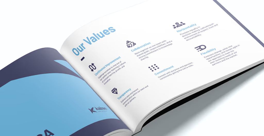
Snapshot of the Kaizen Softworks brand book, highlighting the company values in a visually appealing and organized format.

Our culture is not just a side note; it's our signature, a genuine game-changer. What makes us different? It's the camaraderie, the shared commitment to growth, and the belief that everyone's voice matters.

In this dynamic workplace, we don't just talk about teamwork; we live it. Team contributions are not only valued; they're celebrated. Our work management structure isn't a top-down hierarchy—it's horizontal, empowering each of us to actively participate in decisions that shape our collective future.

And here's the clincher: our clients aren't just clients; they're partners in our journey. We don't merely deliver projects; we build relationships. It's a partnership approach that extends beyond immediate solutions, creating a collaborative bridge that spans years.

So, as we share our unique culture, we're not just putting it under the spotlight; we're illuminating the very essence that binds us together. Because, after all, our culture isn't just a part of Kaizen Softworks; it's the soul of who we are and the driving force behind everything we do.

So, summing up, our rebrand goals were:

  1. Better communicate our unique culture
  2. Modernize our look
  3. Strengthen client partnerships

OUR REBRANDING PROCESS

Phase 1: "Brand Assessment" 

We did a comprehensive evaluation of our existing brand assets and digital presence. We also checked out what's happening in our industry with a competitive landscape analysis. In simple terms, we wanted to get the lay of the land before rolling up our sleeves. 

We needed to figure out where we stood, what we were great at, and where there was room for improvement. This groundwork helped us map out a path for our rebranding  journey that was both inspiring and doable.

Phase 2: "Listening to our Team" 

In the next phase, we had chats with team members from different areas. We wanted to hear what they thought about working at Kaizen, what makes them tick, and their unique perspectives on our company. These talks gave us a firsthand view of what brings us together.

Phase 3: “Crafting Our Brand”

The third phase was all about shaping our brand. We used a brand wheel, a visual tool that proved instrumental in refining and arranging the components of our existing brand. While the essence remained true to its origin, the brand wheel allowed us to update and organize key elements such as purpose, values, and personality, resulting in a cohesive brand strategy.

At this point, we realized something big: we're not just a software service provider; we're trusted partners. We're all about helping our clients succeed in business through custom software solutions. 

This realization led us to define our brand tagline, "Building Partnerships, Crafting Solutions":

  1. Building Partnerships:
    • This part emphasizes our commitment to establishing strong and enduring relationships with our clients and team members.
    • It goes beyond the traditional client-provider dynamic, with a more collaborative and long-term engagement.
    • Our focus is on creating partnerships that extend beyond immediate projects, fostering trust and mutual growth.
  2. Crafting Solutions:
    • "Crafting" reflects our thoughtful and skillful approach, akin to the precision of an artisan creating something unique and tailored to our clients' needs.

Simultaneously, we established the foundation for our communication strategy – a tone that radiates empathy, approachability, clarity, directness, and fosters the building of robust, trustworthy relationships.

Phase 4: “Designing Our Visual Identity”

In this stage, we worked on our visual identity. Our logo is special. The origami, with its intricate folds and careful craftsmanship, perfectly symbolizes our dedication to customization. Just like each piece of origami is uniquely crafted through precise folding, we take a similar personalized approach in crafting our solutions and adapting to our clients' unique needs. Our aim isn't just functionality; it's about creating beautifully designed solutions, reflecting the elegance and precision associated with origami artistry.

By embracing origami in our visual identity, we highlight our commitment to personalized, well-crafted software solutions, perfectly aligning with our mission to provide unique digital experiences that make a lasting impact on our clients and their customers.

Phase 5: "Enhancing Our Online Presence" 

After the visual facelift, we turned our attention to our online home – our website. With our new logo and colors, it needed an upgrade. We wanted it to reflect our fresh brand while providing a smooth and engaging experience for users. Our goal was to showcase our services, our commitment to customization and continuous improvement that defines our culture.

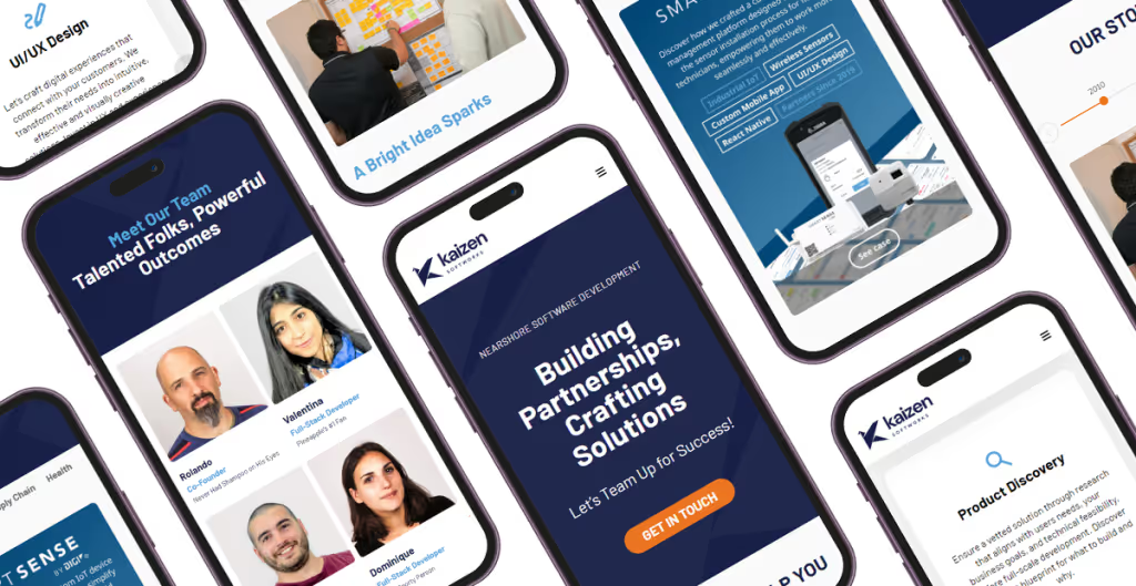
Collage of mobile screens displaying the redesigned Kaizen Softworks website, featuring snapshots of the homepage, 'Meet the Team,' and Success Cases sections.

Phase 6: "Brand Management" 

As the final touch, we conclude by releasing a comprehensive Kaizen brand manual. This ensures the uniformity and coherence of all our external messaging.

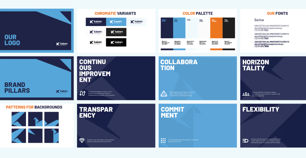
Kaizen Softworks brand book, showcasing the logo, color palette, fonts, and values.

CONCLUSION

We extend our sincere gratitude to our dedicated team for their tireless efforts and commitment throughout this transformative process. Additionally, a heartfelt thank you to our valued clients for entrusting us with the opportunity to innovate and grow together.

As our rebranding journey unfolds, we invite you to explore the results of our hard work, creativity, and dedication on our new and improved website. It's the digital gateway to the exciting changes we've made, reflecting the values and vision we hold dear. 

Discover how we're crafting digital experiences and forging strong partnerships.

From our humble beginnings in 2014, we've come a long way. Back then, it was just four of us. Today, we're a team of 78 amazing professionals covering everything from engineering and design to marketing, sales, and more.

Then, in 2022, we kicked off a cool adventure—a rebranding! But hey, we didn't go at it alone. We teamed up with branding consultants, and together, our design squad, marketing team, and these awesome consultants worked their magic in this nine-month transformation.

Curious to know the nitty-gritty of our rebranding journey and the shiny new identity we've got? Keep reading, and we'll spill the details!

KAIZEN: OUR GUIDING PHILOSOPHY

Our evolution, deeply rooted in the principles of Kaizen, mirrors our commitment to continuous improvement and a workplace culture that thrives on collaboration and team empowerment.

Kaizen, a Japanese term embodying "continuous improvement" or "striving for positive change", is the heartbeat of our philosophy. This concept have their roots in Japan and are widely embraced in business, manufacturing, lean practices, and Total Quality Management (TQM).

At the core of Kaizen is the practice of making small, gradual enhancements— whether in processes, products, or systems—to amplify efficiency, quality, and overall performance over time. Our rebranding journey echoes this ethos, an ode to constant improvement, telling the story of our growth and our commitment to transforming client experiences.

OUR REBRAND GOALS

Diving deeper into our rebranding journey, a central mission emerged: to artfully articulate our value proposition and amplify our commitment to continuous improvement. But let's zoom in on what truly sets us apart—the beating heart of Kaizen Softworks: our culture.

Snapshot of the Kaizen Softworks brand book, highlighting the company values in a visually appealing and organized format.

Our culture is not just a side note; it's our signature, a genuine game-changer. What makes us different? It's the camaraderie, the shared commitment to growth, and the belief that everyone's voice matters.

In this dynamic workplace, we don't just talk about teamwork; we live it. Team contributions are not only valued; they're celebrated. Our work management structure isn't a top-down hierarchy—it's horizontal, empowering each of us to actively participate in decisions that shape our collective future.

And here's the clincher: our clients aren't just clients; they're partners in our journey. We don't merely deliver projects; we build relationships. It's a partnership approach that extends beyond immediate solutions, creating a collaborative bridge that spans years.

So, as we share our unique culture, we're not just putting it under the spotlight; we're illuminating the very essence that binds us together. Because, after all, our culture isn't just a part of Kaizen Softworks; it's the soul of who we are and the driving force behind everything we do.

So, summing up, our rebrand goals were:

  1. Better communicate our unique culture
  2. Modernize our look
  3. Strengthen client partnerships

OUR REBRANDING PROCESS

Phase 1: "Brand Assessment" 

We did a comprehensive evaluation of our existing brand assets and digital presence. We also checked out what's happening in our industry with a competitive landscape analysis. In simple terms, we wanted to get the lay of the land before rolling up our sleeves. 

We needed to figure out where we stood, what we were great at, and where there was room for improvement. This groundwork helped us map out a path for our rebranding  journey that was both inspiring and doable.

Phase 2: "Listening to our Team" 

In the next phase, we had chats with team members from different areas. We wanted to hear what they thought about working at Kaizen, what makes them tick, and their unique perspectives on our company. These talks gave us a firsthand view of what brings us together.

Phase 3: “Crafting Our Brand”

The third phase was all about shaping our brand. We used a brand wheel, a visual tool that proved instrumental in refining and arranging the components of our existing brand. While the essence remained true to its origin, the brand wheel allowed us to update and organize key elements such as purpose, values, and personality, resulting in a cohesive brand strategy.

At this point, we realized something big: we're not just a software service provider; we're trusted partners. We're all about helping our clients succeed in business through custom software solutions. 

This realization led us to define our brand tagline, "Building Partnerships, Crafting Solutions":

  1. Building Partnerships:
    • This part emphasizes our commitment to establishing strong and enduring relationships with our clients and team members.
    • It goes beyond the traditional client-provider dynamic, with a more collaborative and long-term engagement.
    • Our focus is on creating partnerships that extend beyond immediate projects, fostering trust and mutual growth.
  2. Crafting Solutions:
    • "Crafting" reflects our thoughtful and skillful approach, akin to the precision of an artisan creating something unique and tailored to our clients' needs.

Simultaneously, we established the foundation for our communication strategy – a tone that radiates empathy, approachability, clarity, directness, and fosters the building of robust, trustworthy relationships.

Phase 4: “Designing Our Visual Identity”

In this stage, we worked on our visual identity. Our logo is special. The origami, with its intricate folds and careful craftsmanship, perfectly symbolizes our dedication to customization. Just like each piece of origami is uniquely crafted through precise folding, we take a similar personalized approach in crafting our solutions and adapting to our clients' unique needs. Our aim isn't just functionality; it's about creating beautifully designed solutions, reflecting the elegance and precision associated with origami artistry.

By embracing origami in our visual identity, we highlight our commitment to personalized, well-crafted software solutions, perfectly aligning with our mission to provide unique digital experiences that make a lasting impact on our clients and their customers.

Phase 5: "Enhancing Our Online Presence" 

After the visual facelift, we turned our attention to our online home – our website. With our new logo and colors, it needed an upgrade. We wanted it to reflect our fresh brand while providing a smooth and engaging experience for users. Our goal was to showcase our services, our commitment to customization and continuous improvement that defines our culture.

Collage of mobile screens displaying the redesigned Kaizen Softworks website, featuring snapshots of the homepage, 'Meet the Team,' and Success Cases sections.

Phase 6: "Brand Management" 

As the final touch, we conclude by releasing a comprehensive Kaizen brand manual. This ensures the uniformity and coherence of all our external messaging.

Kaizen Softworks brand book, showcasing the logo, color palette, fonts, and values.

CONCLUSION

We extend our sincere gratitude to our dedicated team for their tireless efforts and commitment throughout this transformative process. Additionally, a heartfelt thank you to our valued clients for entrusting us with the opportunity to innovate and grow together.

As our rebranding journey unfolds, we invite you to explore the results of our hard work, creativity, and dedication on our new and improved website. It's the digital gateway to the exciting changes we've made, reflecting the values and vision we hold dear. 

Discover how we're crafting digital experiences and forging strong partnerships.

Related Articles

·

Jun 29, 2026

The wheel proposes, the oracle decides

How we pick the next UX Tiny Knowledge Byte speaker, with a spinning wheel and a Magic 8 Ball.

12 read time

Read more

A while ago we noticed something pretty common: everyone wanted to share more knowledge internally, but nobody wanted another heavy corporate ritual.

Internal talks usually start with good intentions and slowly disappear. They take time, preparation, and energy. And at some point people start feeling like they need to be experts before presenting anything.

So we tried the opposite.

15 minute talks.

Small topics.

Low pressure.

And one important rule: every session had to leave something useful behind. A tool, a workflow, an idea, a shortcut, a new way to approach a problem. Something people could actually use after the talk ended.

We didn’t want theory that went nowhere.

Somehow, that ended up working much better than we expected.

The idea was to reduce friction

Screenshot of the shared topic pool

Tiny Knowledge Bytes is intentionally simple:

  • anyone can suggest topics
  • anyone can end up presenting
  • you don’t need to master the topic
  • talks can come from experiments, client problems, tools or random discoveries
  • sessions should leave something practical behind
  • if nobody volunteers, the system picks someone for us

The goal was making knowledge sharing feel lightweight instead of exhausting.

Some of the best talks start with:

“I tried this yesterday and it was weird.”

The topic pool started growing on its own

Over time, topics started coming from everywhere.

Sometimes someone took a course and used a Tiny Knowledge Byte as a way to give something back to the team. Other times, a client problem triggered research into new tools, workflows or AI approaches.

A lot of sessions start from curiosity or necessity more than planning.

The pool slowly filled up with things like:

  • Synthetic Users
  • Google AI Studio
  • Design.md
  • Computer Vision
  • MCP + Figma
  • V0 workflows
  • AI orchestration
  • Figma plugins
  • comparing AI tools using the same prompt

And honestly, the mix is part of what makes it interesting.

Sometimes a UX session drifts into Computer Vision. Sometimes someone technical shares a visual workflow that half the design team ends up adopting later.

There’s not much curation. It behaves more like a constant exploration system.

Then another problem appeared: choosing who presents

And this is where things became unnecessarily dramatic.

Nobody wanted to be “the person who chooses”. So we started adding absurd layers of randomness until we somehow ended up building a full internal app called 2FS.

Two Factor Sorteo.

Yes, it’s real.

The wheel proposes. The oracle decides.

The logic is simple.

First, a wheel picks someone.

Then a Magic 8 Ball decides whether destiny approves the selection.

If the oracle rejects the person, the process starts again.

That’s it.

The app accidentally became part of the learning loop too

Apps developed for the Tiny Knowledge Bytes.

2FS originally started as an excuse to experiment with:

  • Claude Code
  • Claude Design
  • design systems
  • editorial interfaces
  • motion and microinteractions

Eventually those same explorations turned into future Tiny Knowledge Bytes.

The tool we used to select speakers started generating new topics itself.

The system started feeding itself

One of the most interesting side effects is that people started building things outside their usual role because of previous Tiny Knowledge Bytes.

2FS itself is a good example. A designer saw sessions about Claude tooling and AI workflows and thought:

“Maybe I can actually build this.”

What started as a ridiculous speaker selection tool became a real product experiment involving Claude Code, interface systems and interaction design.

Then it came back into the Tiny Knowledge Bytes circuit as a new talk.

That loop became surprisingly valuable:

someone learns something,

tries it,

builds something with it,

and eventually inspires someone else to do the same.

What ended up mattering most

Final Oracle Certificate.

Over time we realized knowledge sharing works much better when:

  • it doesn’t require huge preparation
  • it’s allowed to be imperfect
  • it mixes different disciplines
  • it leaves something practical behind
  • and somehow involves a mystical wheel connected to a Magic 8 Ball

At that point, it stops feeling like another internal obligation and starts feeling like something people genuinely want to keep alive.

·

May 27, 2026

What AI Can and Can’t Replace in Design Systems

What happens when you build a design system from v0, Figma, and Windsurf, and let AI handle the speed while you keep the judgment.

12 read time

Read more

Just this month, I built a full design system in about 20 hours.

What used to take weeks, sometimes months, is now dramatically faster. So… what actually changed? And more importantly: what didn’t?

Design systems take time. On complex platforms, they can take hundreds of hours.

We were working with a large and complex product where inconsistencies had started to pile up. Different modules had evolved in isolation, teams were making independent decisions, and there were no shared guidelines. The answer was clear: we needed a design system.

AI tools were just starting to emerge back then. They were mostly useful for simple tasks as they tended to hallucinate when things got complex. Developers had started using them earlier than designers, MCP didn't exist yet, and Figma plugins were the best automation we had.

But the context has changed. Fast.

The Manual Era

We did what most teams did. We stopped, and we built it. Manually.

Picture two designers, a mountain of inconsistencies, and no map. We had to cross-reference information manually, digging through the code, detecting what could be merged, agreeing on naming conventions, deciding how to name components. Hours and hours of discussion until we finally landed on a solution.

In the end, we got there. A cleaner system, faster workflows, and for the first time, both teams speaking the same visual language. Hard-won, but it worked.

But now every month a new AI model seems to be released. Design is finally catching up with what developers faced about two years ago. New tools arose, and with that, the scope of our work as designers completely changed.

The Human Factor

For an internal project, I used our Kaizen site as a reference, combined with documentation from industry leaders as a guideline.

I started in v0, which is essentially a chat interface where you can generate UI components through prompts. I fed it the colors, typographies, and a reference image, and from there it was a back-and-forth: the AI generated, I reacted, adjusted, and pushed until the output matched what I had in my head. And just like that, I started prompting my way through a Design System.

Once a component was ready, I used the html.to.design plugin to bring it into Figma (yes, plugins are still alive!). Think of it as a bridge: the plugin exports designs directly from the browser into a Figma file.

Inside Figma, the intervention was more hands-on. First, I checked that everything was visually consistent with what was defined in v0: colors, typography, styles. Then I used Figma's built-in AI to rename all the component layers using BEM convention (something that would have taken a significant amount of time to do so manually).

BEM, which stands for Block Element Modifier, is a widely adopted naming convention in CSS. It structures layer names hierarchically and predictably, for example: button__label--disabled.

Using it keeps the code clean, readable, and consistent, especially when you're working alongside a developer who needs to understand what came out the other side.

Beyond naming, I also made sure the layer structure would generate the right properties when building component sets in Figma, so that all the variants would be correctly exposed and usable. My team also pointed out that adding descriptions to components and variants was key as context for any agent using them through an MCP.

The last step was connecting everything to Windsurf via MCP. With a frame selected in Dev Mode, Windsurf could read the Figma file and use the components to build more complex screens.

We worked closely with a developer throughout this phase. Not just for the technical knowledge, but because having someone who reads code fluently meant catching things we wouldn't have spotted otherwise. The design role here was direction and supervision: making sure the AI used the components correctly and didn't invent solutions where context was missing.

Every step of the process had a human decision behind it.

AI-assisted UI design workflow showing v0 component generation, html.to.design export to Figma, BEM layer organization, and Windsurf MCP development handoff.

An Unexpected Discovery

At one point, before we had any of the naming conventions figured out, I selected a frame and asked Windsurf to build a form using the components inside it, styled to match a specific card. The developer next to me was skeptical until he saw the result, and then he was just as surprised as I was.

What we realized is that the MCP wasn't reading layer names to understand context. It was reading everything inside the frame, even the loose text sitting alongside the components. Good naming is still worth doing. But the MCP doesn't need it to understand what it's looking at.

UI component library preview with cards, testimonials, service blocks, statistics, and a contact form for a modern software development website.

Learning to Talk to an AI

The more specific and contained your prompt, the better the outcome. We started with the most atomic component: the button, and worked outward from there. Each approved component became context for the next one, so the system gradually picked up the visual language we were building.

At some point I got ambitious and asked for five cards in a single prompt: blog card, service card, testimonial card, stats card, feature card… structures, states and all. The AI delivered.

Visually, everything looked fine. Then the developer looked at the code and pointed out that all five cards were independent components instead of variants of one. For a design system, that breaks everything.

One correction prompt fixed it. But it was a good reminder: the AI does exactly what you ask, not what you mean. And fixing it after the fact can cost more than getting it right from the start.

Some Things Learned Along the Way

  • Precision is key. Natural language is fine when you're asking for a cooking recipe, but when referring to a component, if you say things like "create" instead of "add", you'll probably end up with a whole new set of components instead of additional variants of an existing one.
  • The "Frame" is the context: MCPs can read everything inside the frame you select. This is a game-changer. It means the "naming conventions" debate might be shifting. If the AI understands the context visually and structurally, will we still spend hours discussing nomenclature in 2027?
  • No matter what happens, you can always roll back in less than 5 minutes and start over.
  • Work closely with a developer: they can help you understand MCPs and clear up any code-related doubts. Once you start to grasp their logic, you'll learn very quickly how to prompt in ways that AI actually understands.
  • There's nothing to lose by asking the AI to follow a specific naming convention for the code. It keeps everything clean and readable, and it takes no extra effort.
  • The AI covers roughly 80% of the work (generation, variations, exploration...), but the remaining 20% is where quality lives, and that part is not delegable. The AI executes. The judgment is still yours. And if you skip the review, you're not saving time: you'll spend it later.
  • Context matters more than tooling. What you don't define, the AI will invent. Small components may be resolved well, but large interfaces require more definition from the start. A well-defined system scales. An undefined one generates inconsistencies faster than you can fix them.
  • Figma is no longer the mandatory starting point. It's useful as a visual reference, a QA space, or a consolidation layer. But the AI doesn't need it. We still do.
  • There's no single right workflow yet. What you do depends on the project. We're in a transition moment where the tools change faster than the standards. The best thing you can do right now is experiment.

What AI Still Can’t Replace

Through all of this, a few things became very clear. These are the parts that didn’t change:

  • Knowing when something looks off. The AI generates, but it doesn't notice when the result doesn't feel right. That eye is yours.
  • Direction and supervision. The AI used the components we gave it, but without someone supervising it, it invents solutions where there is no context to work from.
  • The definition of done is still a human call, whether it's a conversation with a PO, a stakeholder, or just the designer's criteria. There's no prompt for that.
  • The context: knowing why certain decisions matter, what a component should communicate, what the user will actually feel. Business knowledge, stakeholder dynamics, unwritten rules, empathy for the end user. These take years to build and live in the people doing the work, not in the tools they use.

My Two Cents

The tools changed, and that gave me the chills, but throughout this experience I found that the designer's role is more alive than ever.

What once took a team weeks can now be prototyped in hours. That’s not a threat; it’s an invitation to get curious.

I'm still figuring a lot of this out, and I suspect most of us are. There's no right workflow yet, and honestly, that's fine. We are in a transition where tools change faster than standards. The best thing you can do is experiment. Don't wait for a "definitive" workflow, it might be obsolete by next month.

Go ahead, try prompting your way through a component. You might be surprised how fast the system starts to take shape.

llms.txt