Kaizen Teams

Dropdown

Table of Contents

Time to read

·

12

Published on

·

May 10, 2024

Last updated on

·

February 16, 2026

Elena Rivero, People Care at Kaizen Softworks

Elena Rivero

Child-free with a PhD in stroller brands

People Care & Hiring

Techy por el Día 2024: Empowering Girls in Tech

Published on

·

February 23, 2026

Last updated on

·

February 16, 2026

Time to read

·

12

Elena Rivero, People Care at Kaizen Softworks

Elena Rivero

People Care & Hiring

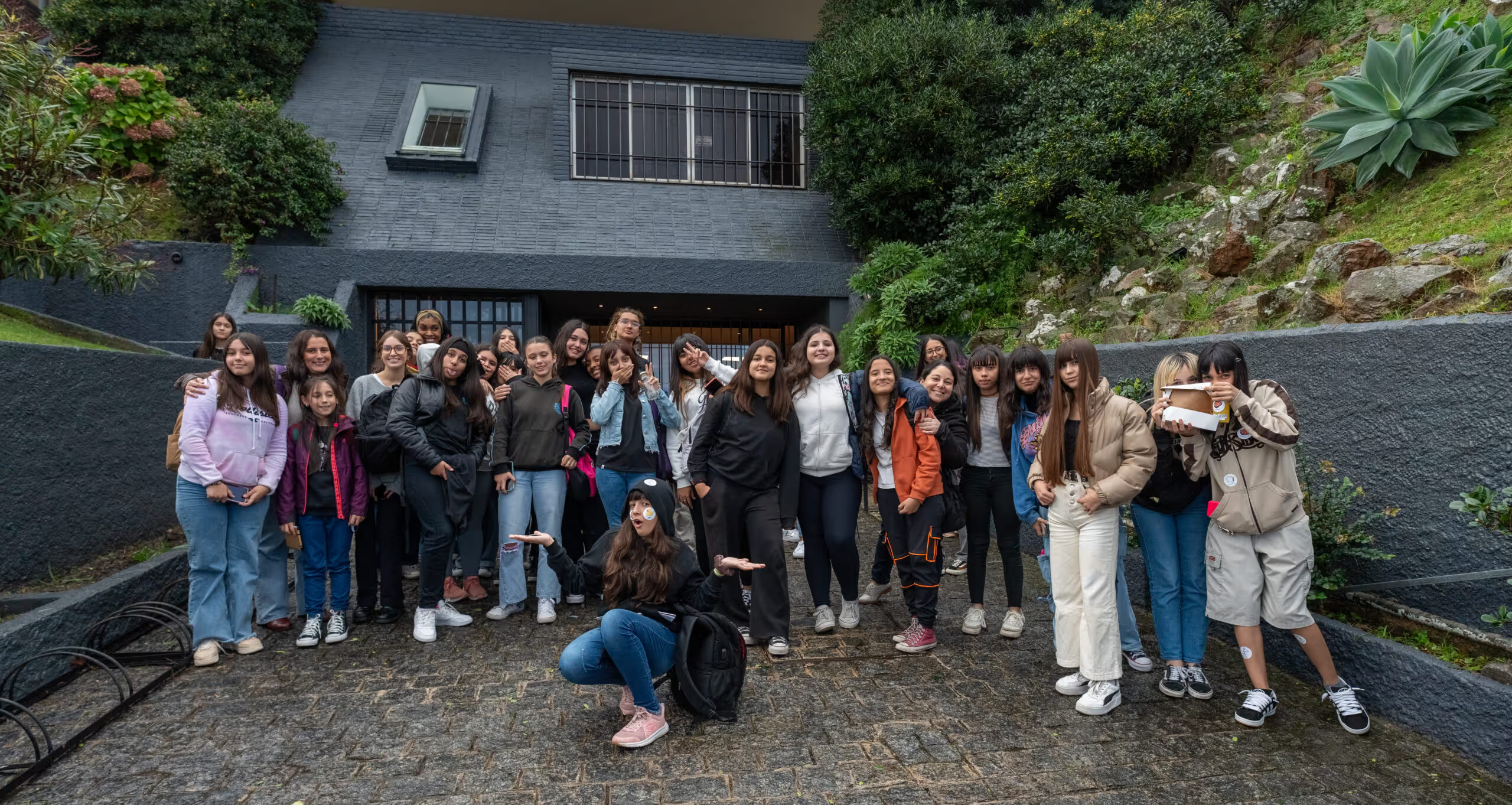
For the 10th year in a row, the Uruguayan Chamber of Information Technologies (CUTI) gathered Uruguayan tech companies to celebrate the “International Day of Women and Girls in Science” and inspire girls to explore tech careers. On April 25th, we welcomed over 30 girls aged 14 to 16 to our office.

In this blog post, I’ll share with you how “Techy por el Día” came about and how the day went in our office with the girls from Liceo 47.

The Gender Gap in Tech

Technology shapes our world in countless ways, from how we work and communicate to how we learn and understand the world around us. However, there’s a significant global challenge that we can’t ignore: the gender gap in tech. Women are often underrepresented in tech-related educational and professional fields, limiting their opportunities to contribute to and benefit from the industry (Píriz, 2024).

This disparity isn’t unique to any one country. Studies suggest that girls’ interest in technology tends to wane as they grow older due to a mix of cultural, social, institutional, and economic factors (ANEP, 2024). Uruguay stands out as a key player, being the largest per capita exporter of software in Latin America and the fourth-largest exporter in terms of dollars in Latin America (Uruguay XXI, 2021).

Bridging the Gender Gap: Initiatives in Uruguay

In 2015, the United Nations General Assembly declared February 11th as the International Day of Women and Girls in Science. The goal? Achieve full and equal access to and participation in science for women.

In Uruguay, institutions like the National Administration of Public Education (ANEP) are working to ensure girls and women have equal access to and participation in science and technology fields. This effort is crucial to reducing the gender gap and harnessing the diverse talents and perspectives that drive innovation.

According to ANEP (2024), “Promoting, encouraging, incentivizing, and inspiring the study of sciences and technology is essential to contribute to the personal and professional growth of girls, young women, and women, and key to enriching the scientific and technological field with diverse talents and creative and innovative perspectives to face current challenges and sustainable development.”

Our Experience Hosting Techy por el Día 2024

On Thursday, April 25th, we had the pleasure of welcoming over 30 girls aged 14 to 16 to our offices.

We kicked off the day with a shared lunch and an introductory talk about what we do at Kaizen Softworks, the meaning of our company’s name, our different teams, and introducing our horizontal and collaborative approach.

To introduce the following activities, we explained the process of creating a digital product: ideation, design, development, testing, and implementation. Then, we randomly divided the girls into four groups to carry out workshops on UX design, development, Quality Assurance (QA), and Information Technology (IT).

Workshops

  • IT Activity

This activity began in the entrance hall of our office, where we organized a comprehensive tour of our facilities. During this tour, we provided a detailed explanation of our infrastructure—its composition and why it’s crucial for the smooth functioning of the company. In the server room, we introduced the rack, the nerve center from which all information is distributed throughout the office.

Key concepts like access points, cabling, and smart devices present in different areas were discussed. In the workspaces, we highlighted the installed equipment and underscored its importance to ergonomics and the overall employee experience.

Apart from work areas, we toured common areas like the kitchen, barbecue zone, courtyard, and pool—essential spaces for leisure and downtime for our team members. Our People Care team took the opportunity to share information about our dynamics, benefits, and integration activities that contribute to making Kaizen’s culture unique.

  • UX Design Workshop

Our UX Design Workshop started off with an engaging presentation about our dedicated UX design team. We highlighted each team member’s unique roles and emphasized the importance of collaborative effort in crafting meaningful and user-friendly experiences.

Using real-life examples, we painted a vivid picture of how good and bad user experiences are part of our everyday lives. For the hands-on activity, we chose Instagram as a case study—being a widely recognized and used app among the participants. Together, we identified usability issues they encountered when using the app, and then collectively brainstormed solutions using creative techniques like the prioritization matrix and the “crazy 8” tool.

The fun activity served as a practical introduction to the subsequent stages that a design team would undertake, such as prototyping, testing, and implementing the design.

  • Development Workshop

In the Development Workshop, we aimed to provide a sneak peek into a developer’s daily life. We steered clear of overly advanced concepts, considering the participants’ basic or zero level of knowledge. Using an example of a project task board, we explained the significance of “To Do,” “In Progress,” “Testing,” and “Done”—fundamental for fostering collaboration within a development team.

To make the experience relatable to the participants, we turned once again to Instagram, exploring what new functionalities could be implemented or fine-tuned. We broke down several functions into small tasks that the participants could work on, making the experience interactive and engaging.

  • Quality Assurance (QA) Workshop

Our QA workshop aimed to demystify the functional tester role in a fun and practical way. We used a simple device—a calculator—as an example to facilitate understanding of more complex concepts. Various versions of the calculator with different bugs were projected on a screen for an interactive, hands-on experience.

Through collaboration and creating exploratory test cases together, we encouraged participants to identify bugs. We also used everyday examples to emphasize the importance of detecting and fixing bugs, highlighting how this improves the user experience.

Wrapping Up Techy por el Día

Finally, we gathered all the teams together to share experiences from the different activities they participated in. One of our goals was to ignite the girls’ interest in technology, so we also shared resources such as Ceibal, Jovenes a Programar, and INEFOP where they could further expand their knowledge if they wish.

We want to extend a big thank you to the girls and staff from Liceo 47, as well as those girls who came to participate in this edition with us. We hope this is just one of many opportunities where we can contribute our bit to stimulate interest and the development of local talent in our country!

For the 10th year in a row, the Uruguayan Chamber of Information Technologies (CUTI) gathered Uruguayan tech companies to celebrate the “International Day of Women and Girls in Science” and inspire girls to explore tech careers. On April 25th, we welcomed over 30 girls aged 14 to 16 to our office.

In this blog post, I’ll share with you how “Techy por el Día” came about and how the day went in our office with the girls from Liceo 47.

The Gender Gap in Tech

Technology shapes our world in countless ways, from how we work and communicate to how we learn and understand the world around us. However, there’s a significant global challenge that we can’t ignore: the gender gap in tech. Women are often underrepresented in tech-related educational and professional fields, limiting their opportunities to contribute to and benefit from the industry (Píriz, 2024).

This disparity isn’t unique to any one country. Studies suggest that girls’ interest in technology tends to wane as they grow older due to a mix of cultural, social, institutional, and economic factors (ANEP, 2024). Uruguay stands out as a key player, being the largest per capita exporter of software in Latin America and the fourth-largest exporter in terms of dollars in Latin America (Uruguay XXI, 2021).

Bridging the Gender Gap: Initiatives in Uruguay

In 2015, the United Nations General Assembly declared February 11th as the International Day of Women and Girls in Science. The goal? Achieve full and equal access to and participation in science for women.

In Uruguay, institutions like the National Administration of Public Education (ANEP) are working to ensure girls and women have equal access to and participation in science and technology fields. This effort is crucial to reducing the gender gap and harnessing the diverse talents and perspectives that drive innovation.

According to ANEP (2024), “Promoting, encouraging, incentivizing, and inspiring the study of sciences and technology is essential to contribute to the personal and professional growth of girls, young women, and women, and key to enriching the scientific and technological field with diverse talents and creative and innovative perspectives to face current challenges and sustainable development.”

Our Experience Hosting Techy por el Día 2024

On Thursday, April 25th, we had the pleasure of welcoming over 30 girls aged 14 to 16 to our offices.

We kicked off the day with a shared lunch and an introductory talk about what we do at Kaizen Softworks, the meaning of our company’s name, our different teams, and introducing our horizontal and collaborative approach.

To introduce the following activities, we explained the process of creating a digital product: ideation, design, development, testing, and implementation. Then, we randomly divided the girls into four groups to carry out workshops on UX design, development, Quality Assurance (QA), and Information Technology (IT).

Workshops

  • IT Activity

This activity began in the entrance hall of our office, where we organized a comprehensive tour of our facilities. During this tour, we provided a detailed explanation of our infrastructure—its composition and why it’s crucial for the smooth functioning of the company. In the server room, we introduced the rack, the nerve center from which all information is distributed throughout the office.

Key concepts like access points, cabling, and smart devices present in different areas were discussed. In the workspaces, we highlighted the installed equipment and underscored its importance to ergonomics and the overall employee experience.

Apart from work areas, we toured common areas like the kitchen, barbecue zone, courtyard, and pool—essential spaces for leisure and downtime for our team members. Our People Care team took the opportunity to share information about our dynamics, benefits, and integration activities that contribute to making Kaizen’s culture unique.

  • UX Design Workshop

Our UX Design Workshop started off with an engaging presentation about our dedicated UX design team. We highlighted each team member’s unique roles and emphasized the importance of collaborative effort in crafting meaningful and user-friendly experiences.

Using real-life examples, we painted a vivid picture of how good and bad user experiences are part of our everyday lives. For the hands-on activity, we chose Instagram as a case study—being a widely recognized and used app among the participants. Together, we identified usability issues they encountered when using the app, and then collectively brainstormed solutions using creative techniques like the prioritization matrix and the “crazy 8” tool.

The fun activity served as a practical introduction to the subsequent stages that a design team would undertake, such as prototyping, testing, and implementing the design.

  • Development Workshop

In the Development Workshop, we aimed to provide a sneak peek into a developer’s daily life. We steered clear of overly advanced concepts, considering the participants’ basic or zero level of knowledge. Using an example of a project task board, we explained the significance of “To Do,” “In Progress,” “Testing,” and “Done”—fundamental for fostering collaboration within a development team.

To make the experience relatable to the participants, we turned once again to Instagram, exploring what new functionalities could be implemented or fine-tuned. We broke down several functions into small tasks that the participants could work on, making the experience interactive and engaging.

  • Quality Assurance (QA) Workshop

Our QA workshop aimed to demystify the functional tester role in a fun and practical way. We used a simple device—a calculator—as an example to facilitate understanding of more complex concepts. Various versions of the calculator with different bugs were projected on a screen for an interactive, hands-on experience.

Through collaboration and creating exploratory test cases together, we encouraged participants to identify bugs. We also used everyday examples to emphasize the importance of detecting and fixing bugs, highlighting how this improves the user experience.

Wrapping Up Techy por el Día

Finally, we gathered all the teams together to share experiences from the different activities they participated in. One of our goals was to ignite the girls’ interest in technology, so we also shared resources such as Ceibal, Jovenes a Programar, and INEFOP where they could further expand their knowledge if they wish.

We want to extend a big thank you to the girls and staff from Liceo 47, as well as those girls who came to participate in this edition with us. We hope this is just one of many opportunities where we can contribute our bit to stimulate interest and the development of local talent in our country!

Related Articles

·

Jul 17, 2026

Generative UI: What it is, how it works, and when to use it

Generative UI lets AI build the screen each user needs, in real time. What it is, how it works, the trade-offs, and two working demos we built.

12 read time

Read more

Generative UI is a full-stack architecture that lets AI create, modify, and render user interfaces in real time, based on what each user needs at that exact moment. Instead of static, predefined screens, the interface assembles itself on the fly: a bar chart, a table, a comparison card when you're comparing things.

We've been building proofs of concept with it for the past few weeks. Most of what's written about generative UI is either too abstract or too exciting, so this is our attempt at neither: what it is, how it works, where it helps, where it doesn't, and what we learned from two demos we built.

The short version

  • Generative UI means the AI designs the screen that answers your question, not just the answer.
  • In production, most systems don't let the AI write code. It configures pre-built components. Safer, and good enough.
  • It shines in open-ended workflows like reporting and data exploration, where you can't pre-design every screen someone might need.
  • It complements standard UI. It doesn't replace it. Anyone telling you otherwise is selling something.

What is generative UI?

Generative UI is a full-stack architecture: the backend talks to the LLM, decides what the answer should look like, and picks the components, while the frontend renders them and handles how the user interacts with what’s on screen.

Compare that with how interfaces have always worked. A designer decides what goes on each screen, a developer builds it, and every user sees the same thing. Forever, or until the next redesign.

Generative UI flips that. The interface becomes dynamic and personal instead of static and universal. The AI doesn't just answer your question, it designs the screen that answers your question.

Dashboards and reporting are the most common use cases, but they're far from the only one. The same pattern works for dynamic forms, onboarding flows, and customer support, as it takes input just as easily as it presents output. It can even adjust font size, contrast, or layout for users with low vision, color blindness, or cognitive load.

The three types of generative UI

There are three levels of generative UI, from most constrained to most open (Google Cloud, 2026):

  1. Static. Everything is pre-built. The AI picks which screen to show you from a fixed library. Low risk, low flexibility.
  2. Declarative. The AI assembles a JSON tree that specifies which UI components to use, in what order, with what properties. It doesn't write code. It configures pre-designed widgets. This balances the AI's flexibility with the system's stability.
  3. Open. The AI generates completely new code from scratch and the frontend renders it. Maximum flexibility, maximum risk.

Most production systems today use the declarative approach, and that's what this post assumes from here on. The AI isn't writing HTML or CSS freestyle. It selects components, fills in pre-designed widgets, and composes them into the right screen.

How does generative UI work?

Generative UI works by turning a user request into structured data that describes an interface, then rendering that data as real components. The flow looks like this:

  1. The user asks for something, explicitly or inferred from context.
  2. An LLM analyzes the request. It invokes tools, pulls data, and makes the design decisions: what to show and how.
  3. The system generates structured data describing both the components and the information they'll display.
  4. That schema travels to the frontend through the AG-UI protocol, a standard for communication between agents and frontends. It defines events that keep the agent's state in the backend synchronized with the frontend framework.
  5. The frontend transforms the schema into actual widgets and renders them.

To the user, the result feels like magic. Behind the scenes, it's structured data flowing through a well-defined pipeline. We prefer the second description. It's the one you can build on.

Pros and cons of generative UI

Generative UI trades real personalization and faster development for added latency, inference costs, and less predictable layouts. That's the honest version. Here are the details.

What you gain

Benefit Why it matters
Real personalization Each user sees the view they need, not the view designed for the average user. When that happens, conversion follows.
Flexibility that scales A small set of components combines into thousands of screens, including views you never explicitly built.
Faster development You build the component library once. The system composes it, instead of your team coding endless specific screens.

What you pay for it

Trade-offs What to watch
Latency There's an LLM in the middle, and that adds response time.
Token costs Every generated screen has an inference cost attached.
Less muscle memory The same request won't always render the same layout. Users can't build habits around pixel positions.
Privacy Sending data through an LLM means thinking carefully about what you send and where it goes.

None of these are dealbreakers. There are known techniques to mitigate each one. 

Generative UI examples: two working demos

We built two demos. One with fictional data, one on top of a tool we use every day.

Aurora Goods: a conversational e-commerce dashboard

Aurora Goods is a fictional consumer e-commerce platform we created for the demo. The interface is simple: chat on the left, canvas on the right. You ask about the business, the LLM figures out what you need, pulls the data, and renders it visually.

Ask about 2025 sales and it shows the numbers on cards, with a short note on anything relevant. Ask it to break that down by region and it extends the same view instead of starting over, because it understands the second question builds on the first. This part took us a while to get right, and it's what makes the whole thing feel like a conversation rather than a search box.

The canvas isn't output-only either. You can click into any element and drill down: revenue by category, then inside electronics, then which products sold most.

You configure the widgets once. The system combines them and adds relevant commentary on the spot.

An internal reporting screen for our time-tracking tool

The second demo is closer to home: a generative reporting layer on top of the time-tracking tool we use every day at Kaizen. The questions in this demo are questions someone here has actually asked.

Instead of building dozens of hyper-specific reports, a small amount of code now handles virtually unlimited queries. How many hours were logged in May? Which anomalies showed up in April? How do billable and non-billable hours compare across two months? Who worked on a given project last month, and for how long? Each answer arrives as the right visualization: cards, lists, bar charts, plus a short summary that's easy to scan.

Two details won us over. The LLM suggests next steps, so exploring the data becomes a conversation. And when it's not sure, it asks instead of assuming. Ask for the hours of someone named Alex and, since we have more than one Alex on the team, it asks which one before answering.

Generative UI complements standard UI. That's the point.

Generative UI is a complement, not a replacement. Standard interfaces still win for stable, repetitive workflows where consistency matters. Nobody wants their checkout button to be creative. Generative UI wins where the workflow is complex and the questions are unpredictable.

It also changes what design systems are for. Beyond designing components and screens, teams will need to define semantic rules: how the AI should react to uncertainty, which interfaces match which intentions, and the guardrails that keep generated screens functional and safe.

That's a new kind of design work. And it's already starting.

Want to see generative UI applied to your own data? 

We build working proofs of concept in two weeks. Your data, your workflows, a real thing you can click.

Start a conversation.

·

Jul 16, 2026

AI is already reading your website. Do you know what it's finding?

We built an internal dashboard to track how AI crawlers like ChatGPT, Perplexity, Claude, and Google read our website. Here’s what it revealed about AI visibility, analytics blind spots, and the new risks facing B2B companies.

12 read time

Read more

Somewhere between a prospect Googling your company and a prospect never visiting your site at all, a new kind of visitor showed up.

It doesn't click. It doesn't scroll. It doesn't show up in Google Analytics. But it scans your website, decides what matters, and quietly influences whether your business gets mentioned the next time someone asks ChatGPT, Perplexity, or Google's AI Overviews for a recommendation.

We had no real way to know what these AI bots were finding on our own site. So, before telling anyone else what to do about it, we built something to find out for ourselves.

The blind spot in your analytics

Google Analytics tracks human sessions, not server-side crawler activity. That's the blind spot. A person searches, sees a list of links, clicks one, lands on your site; that's the journey it was designed to track.

That journey is changing. Fewer people start their research by typing a query into Google and scanning ten blue links. Most of them are asking an AI assistant directly: "who are good software partners for X," "what's the best tool for Y," and trusting the shortlist it hands back. To build that answer, the AI first sent something to read the web on its behalf: a bot with a name like GPTBot, PerplexityBot, or ClaudeBot, crawling pages much like search engines have for decades.

None of that shows up in your dashboards. Those bot visits don't count as sessions, don't trigger conversion tracking, and don't appear anywhere you're already looking. If your site is hard for those bots to read, poorly structured, or quietly blocking them without anyone realizing it, you're not losing a ranking position. You're being left out of a conversation you never knew was happening. It's a new kind of competitive risk. Not "we got outranked," but "we were never in the running, and nothing told us."

That's the gap we set out to close, starting with our own site.

Are AI bots even visiting our site? We stopped guessing.

Inside our Innovation Hub, the group that experiments with new tools and workflows before we bring them into client work, someone asked a simple question: are AI bots even visiting our site? And if they are, what are they actually able to see?

Nobody could answer that with confidence. Not because it's a hard problem to reason about, but because the tool to answer it didn't exist among the tools we already had. So instead of guessing, or buying something built for someone else's website, we built a small internal dashboard for our own.

What we built: a dashboard that tracks AI bot visits

The idea is simple, even if getting there wasn't: a small piece of code sits quietly in front of our website and notes every time a known AI bot stops by. It records which one it was, which page it looked at, whether it got a clean response or hit an error, and how deep into the site it went.

Right now we're tracking bots from OpenAI (the ones behind ChatGPT), Anthropic (Claude), Perplexity, Google, Microsoft's Bing, Meta, and Apple. That list will keep growing. New AI crawlers show up faster than anyone can keep a definitive catalog.

All of that gets pulled into a dashboard the team can check the same way we'd check any other business metric: how much of the site is actually getting crawled, where bots are hitting dead ends, whether they're respecting the instructions we leave for them, and how that changes over time.

Screenshot of an AI Visibility Dashboard showing traffic metrics and a crawl coverage table for AI bots like OpenAI, Anthropic, and Microsoft, tracking hits, unique paths, and service page visits by company.

What the dashboard caught in the first two weeks

We didn't have to wait long to see the point of building this. Two things came up in the first few weeks alone.

The file we thought was working

An llms.txt is a simple file some AI models look for to understand what a site is about. Like a lot of sites getting ready for an AI-driven web, we added one, checked it was live, and moved on, assuming that box was checked.

The dashboard said otherwise. Weeks in, not a single bot had requested it.

So we went digging, and read that crawlers rely on robots.txt to know an llms.txt file exists in the first place, and ours didn't reference it. We added the missing line. Bots still weren't picking it up.

Third attempt: we added plain, visible links to the file in the site's header and footer, the same way we'd link to any other page. That's what did it. Two weeks of zero requests, and on the exact day we shipped that change, the file got six requests from five different AI companies.

Before and after adding links to llms.txt.

The detail we only noticed because the dashboard breaks bots down by type: those six requests were all from indexer and training bots, the ones that crawl the web to build a general picture of it, not yet from retrieval bots, the ones that fetch a page in real time to answer someone's specific question right now. That's a useful distinction. It's the difference between "we're now on the map" and "we're being pulled up live," and it tells us what to check for next.

None of that would have surfaced anywhere else. Not in Analytics, not in Search Console. We would have gone on believing the file was doing its job, simply because we remembered adding it.

The high-value pages AI bots were quietly skipping

The second finding was less comforting: several of our most important pages, the ones describing what we actually do, were barely being crawled at all. Not blocked, not broken. Just quietly skipped by many bots.

We built a graphic on the dashboard specifically for this: crawl coverage per bot, broken down page by page. Now, instead of assuming coverage is even across the site, we can see exactly which high-value pages each AI bot is actually reading, and which ones it's ignoring.

The Crawl Coverage table breaks down how thoroughly each AI bot is reading the site: total hits, unique paths crawled, and whether key service pages are being reached.

We're still working on closing that gap. The first fix we tried didn't move things the way we expected, so for now the coverage graphic itself is doing the real work: telling us, page by page and bot by bot, whether the next attempt actually helps instead of just hoping it does.

Neither of these was something we could have reasoned our way into. We only found them because we were finally looking.

Before you optimize, measure

It's tempting to jump straight to fixes: restructure content, add an llms.txt file, rewrite pages to be more "AI-friendly." We did some of that too. But our own llms.txt sat unused for weeks and we had no idea, because we had nothing telling us otherwise. Without a baseline, you can do all the "right" things and still have no idea whether any of them worked.

Our approach here mirrors how we tend to approach any technology problem: understand what's actually happening before deciding what to change. It's a small dashboard, built quickly, answering one honest question. It's already paid for itself twice over, and we're still early.

We'll keep sharing what we find as the picture gets clearer. If you're curious what your own numbers might look like, that's a conversation we're happy to have.

llms.txt