Kaizen Teams

Dropdown

Table of Contents

Time to read

·

12

Published on

·

April 4, 2024

Last updated on

·

February 16, 2026

Pablo Manzoni, UX Lead at Kaizen Softworks

Pablo Manzoni

Professional non-conformist

UX Lead & Product Designer

The Price Tag of Not Doing UX Research

Published on

·

February 23, 2026

Last updated on

·

February 16, 2026

Time to read

·

12

Pablo Manzoni, UX Lead at Kaizen Softworks

Pablo Manzoni

UX Lead & Product Designer

In product management, the value of UX research often takes a backseat, with resources mainly focused on development. But skipping this step leads to unforeseen user experience challenges, resulting in increased project costs and delayed delivery timelines.

Clare-Marie Karat, a former IBM UX researcher, says that:

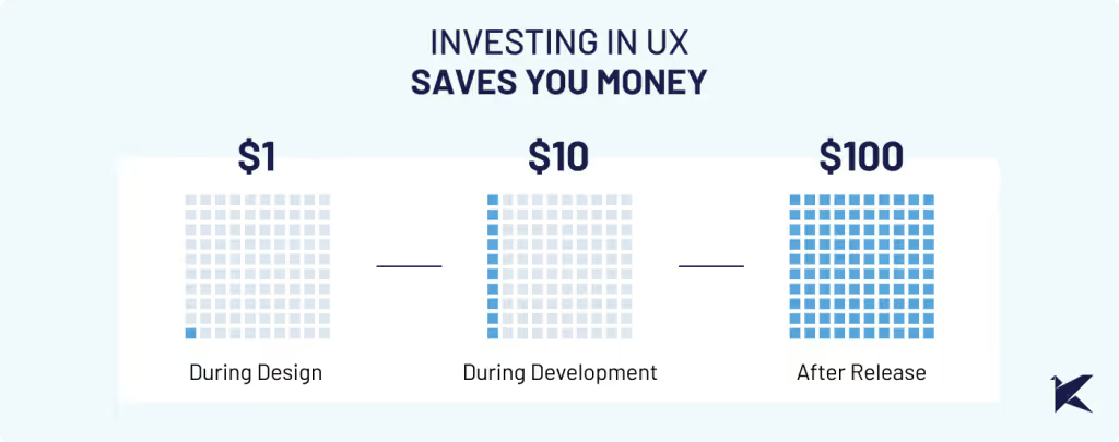
Spending $1 on UX research can save you $10 in development and $100 in maintenance.

Graphic showing three stages of cost savings using UX research: Spending $1 on UX research can save you $10 in development and $100 in maintenance.

Also, the Nielsen Norman Group found that 85% of usability issues can be found by testing with just five users.

Let's have a look at a real-life example with one of our clients to discuss why prioritizing UX research isn’t just a good practice– it’s absolutely crucial for your project’s success.

CHALLENGE: USABILITY PROBLEMS ON SMALL SCREENS

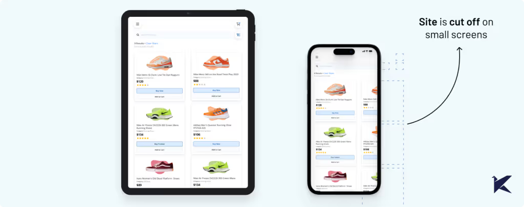
When we teamed up with our client, we quickly noticed many users were struggling to use their mobile app on small screens. Key features of the app were hard to access, leading to incomplete tasks and decreased productivity.

Comparison of UX/UI Design between tablet and smaller device screens, highlighting lack of customization for smaller screens.

Even though our client knew about the problem, they didn't realize how serious it was. But when we checked the metrics, we found out that a surprising 73% of users faced this problem.

This reinforced that we needed to dig deeper with UX research to fully understand the impact.

COSTS OF IGNORING UX RESEARCH IN SOFTWARE DEVELOPMENT

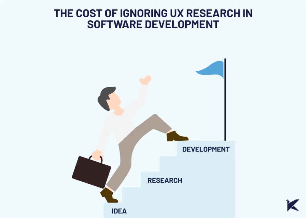
Graphic image of a person skipping a step on a staircase, symbolizing bypassing research for a business project idea and proceeding directly to development.

1. Wasted Time on Redesigns and Refactoring

When assumptions aren't validated through user feedback and usability testing, the development team rushes into production without proper validation. As a result, when the final product hits the market, usability issues arise, requiring rework from both design and development teams.

According to Usability.org at least 50% of a developers’ time during the project is spent doing rework that is avoidable.

Challenges in our client’s scenario included:

  • Users were unable to complete essential tasks due to small buttons.
  • Difficulty reading text because of small fonts and crowded layouts.
  • Increased user errors, such as accidental taps or misinterpretation of on-screen instructions.
  • Compatibility issues with small screen devices leading to inconsistent experiences.

Overlooking the UX of smaller screens caused unexpected technical challenges and required restructuring efforts, ultimately prolonging the development process and delaying release dates.

Despite our careful planning, significant time and effort were needed for design revisions and development rework, disrupting our laid-out roadmap. This not only increased costs but also resulted in setbacks for other planned features and milestones.

2. Increased Customer Support Costs

After experiencing the issues mentioned earlier, users continued to struggle with using the product and reached out to customer support for assistance. Our client's customer service team faced a heavy workload, constantly troubleshooting and seeking solutions for emerging usability problems.

This drained valuable time, and the workload costs on customer support staff increased.

3. Customer Dissatisfaction and Revenue Loss

Empathic design prioritizes understanding user needs and integrating them into the design process. This requires a clear understanding of the end users, their needs, and their experiences.

Without this understanding, achieving true empathy is impossible. When a product doesn't meet user expectations or fails to solve their problems effectively, it leads to customer dissatisfaction.

Usability problems can cause users to abandon the product, resulting in revenue loss from both existing and potential customers.

In our client's case, usability problems on smaller screens eroded trust among major clients who heavily relied on these devices, damaging their reputation as a reliable software provider.

SOLUTION: UX RESEARCH AND UX QUALITY ASSURANCE

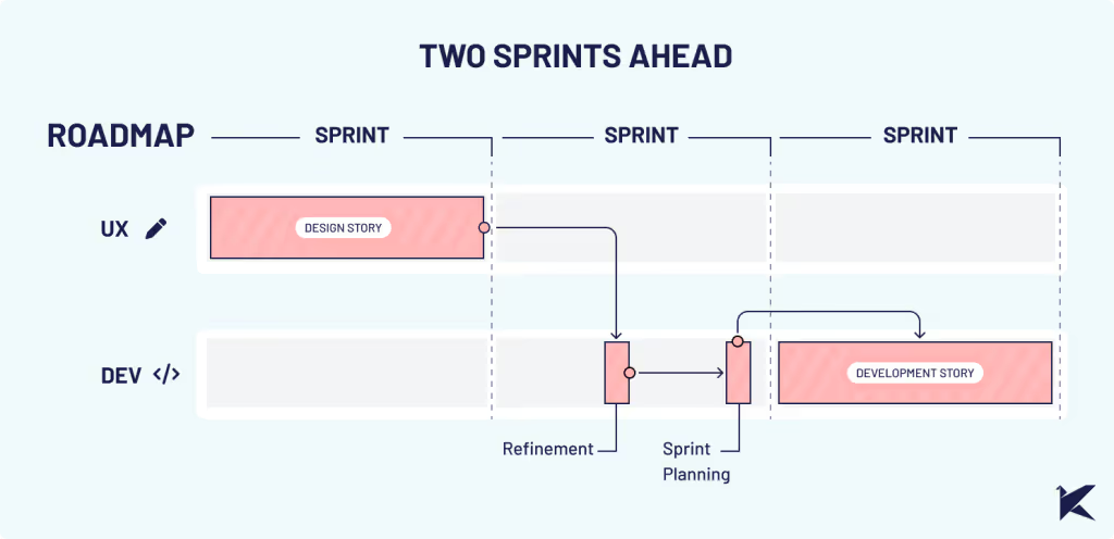
A visual representation of a roadmap showcasing the interdependencies between design and development processes. The roadmap highlights the importance of integrating user experience (UX) early in the process to streamline workflow and enhance communication among teams.

Step 1: Integrate UX Research

As a UX team, we proposed conducting empathetic research. This type of research focuses on understanding user needs, problems, preferences, and behaviors. Its goal is to gain critical insights into the end user, ensuring that the final product meets their expectations.

After conducting empathetic work, we realized that the impact on the usability of the features on small screens was significant. Not only was it uncomfortable to use, but in some cases, it didn't allow the functionality to be used at all.

This research uncovered many other unrelated problems with small screens, such as discrepancies between the original design and implementations. This demonstrates the value of investing in UX research in a project that is alive and not just in design stages.

By integrating UX research into our client's future development process, we can identify problems early on, guaranteeing that the final solution is user-friendly. This approach results in a streamlined development process and reduces unexpected costs associated with rework.

Step 2: Develop a UX QA Process

We recommended establishing a comprehensive UX quality assurance process to ensure a seamless user experience and detect usability problems before development.

To achieve this, we suggested purchasing and successfully integrated 4-inch screens into our design process and usability testing. By simulating the user journey on these smaller screens, we could identify usability problems more effectively.

Testing each product increment with devices that closely mirror the final user experience helped us improve the overall product quality and user satisfaction.

Step 3: Prioritize Design Stories & Implementation

With valuable insights from our research, we prioritized redesign efforts to focus on addressing the most critical usability problems first. This approach ensured that significant improvements were implemented fast, and development resources were allocated efficiently.

Following the creation of design stories, we meticulously monitored and tested the implementations.

CONCLUSION

This experience highlighted the critical lesson that developing without proper UX research and UX QA significantly increases costs and prolongs project timelines.

Investing in UX research not only improves user satisfaction but also optimizes development processes, ultimately saving businesses valuable time, resources, and headaches.

If you are facing similar challenges, we can help. Our experienced UX team is ready to collaborate with you to conduct comprehensive research and help you streamline your development process.

In product management, the value of UX research often takes a backseat, with resources mainly focused on development. But skipping this step leads to unforeseen user experience challenges, resulting in increased project costs and delayed delivery timelines.

Clare-Marie Karat, a former IBM UX researcher, says that:

Spending $1 on UX research can save you $10 in development and $100 in maintenance.

Graphic showing three stages of cost savings using UX research: Spending $1 on UX research can save you $10 in development and $100 in maintenance.

Also, the Nielsen Norman Group found that 85% of usability issues can be found by testing with just five users.

Let's have a look at a real-life example with one of our clients to discuss why prioritizing UX research isn’t just a good practice– it’s absolutely crucial for your project’s success.

CHALLENGE: USABILITY PROBLEMS ON SMALL SCREENS

When we teamed up with our client, we quickly noticed many users were struggling to use their mobile app on small screens. Key features of the app were hard to access, leading to incomplete tasks and decreased productivity.

Comparison of UX/UI Design between tablet and smaller device screens, highlighting lack of customization for smaller screens.

Even though our client knew about the problem, they didn't realize how serious it was. But when we checked the metrics, we found out that a surprising 73% of users faced this problem.

This reinforced that we needed to dig deeper with UX research to fully understand the impact.

COSTS OF IGNORING UX RESEARCH IN SOFTWARE DEVELOPMENT

Graphic image of a person skipping a step on a staircase, symbolizing bypassing research for a business project idea and proceeding directly to development.

1. Wasted Time on Redesigns and Refactoring

When assumptions aren't validated through user feedback and usability testing, the development team rushes into production without proper validation. As a result, when the final product hits the market, usability issues arise, requiring rework from both design and development teams.

According to Usability.org at least 50% of a developers’ time during the project is spent doing rework that is avoidable.

Challenges in our client’s scenario included:

  • Users were unable to complete essential tasks due to small buttons.
  • Difficulty reading text because of small fonts and crowded layouts.
  • Increased user errors, such as accidental taps or misinterpretation of on-screen instructions.
  • Compatibility issues with small screen devices leading to inconsistent experiences.

Overlooking the UX of smaller screens caused unexpected technical challenges and required restructuring efforts, ultimately prolonging the development process and delaying release dates.

Despite our careful planning, significant time and effort were needed for design revisions and development rework, disrupting our laid-out roadmap. This not only increased costs but also resulted in setbacks for other planned features and milestones.

2. Increased Customer Support Costs

After experiencing the issues mentioned earlier, users continued to struggle with using the product and reached out to customer support for assistance. Our client's customer service team faced a heavy workload, constantly troubleshooting and seeking solutions for emerging usability problems.

This drained valuable time, and the workload costs on customer support staff increased.

3. Customer Dissatisfaction and Revenue Loss

Empathic design prioritizes understanding user needs and integrating them into the design process. This requires a clear understanding of the end users, their needs, and their experiences.

Without this understanding, achieving true empathy is impossible. When a product doesn't meet user expectations or fails to solve their problems effectively, it leads to customer dissatisfaction.

Usability problems can cause users to abandon the product, resulting in revenue loss from both existing and potential customers.

In our client's case, usability problems on smaller screens eroded trust among major clients who heavily relied on these devices, damaging their reputation as a reliable software provider.

SOLUTION: UX RESEARCH AND UX QUALITY ASSURANCE

A visual representation of a roadmap showcasing the interdependencies between design and development processes. The roadmap highlights the importance of integrating user experience (UX) early in the process to streamline workflow and enhance communication among teams.

Step 1: Integrate UX Research

As a UX team, we proposed conducting empathetic research. This type of research focuses on understanding user needs, problems, preferences, and behaviors. Its goal is to gain critical insights into the end user, ensuring that the final product meets their expectations.

After conducting empathetic work, we realized that the impact on the usability of the features on small screens was significant. Not only was it uncomfortable to use, but in some cases, it didn't allow the functionality to be used at all.

This research uncovered many other unrelated problems with small screens, such as discrepancies between the original design and implementations. This demonstrates the value of investing in UX research in a project that is alive and not just in design stages.

By integrating UX research into our client's future development process, we can identify problems early on, guaranteeing that the final solution is user-friendly. This approach results in a streamlined development process and reduces unexpected costs associated with rework.

Step 2: Develop a UX QA Process

We recommended establishing a comprehensive UX quality assurance process to ensure a seamless user experience and detect usability problems before development.

To achieve this, we suggested purchasing and successfully integrated 4-inch screens into our design process and usability testing. By simulating the user journey on these smaller screens, we could identify usability problems more effectively.

Testing each product increment with devices that closely mirror the final user experience helped us improve the overall product quality and user satisfaction.

Step 3: Prioritize Design Stories & Implementation

With valuable insights from our research, we prioritized redesign efforts to focus on addressing the most critical usability problems first. This approach ensured that significant improvements were implemented fast, and development resources were allocated efficiently.

Following the creation of design stories, we meticulously monitored and tested the implementations.

CONCLUSION

This experience highlighted the critical lesson that developing without proper UX research and UX QA significantly increases costs and prolongs project timelines.

Investing in UX research not only improves user satisfaction but also optimizes development processes, ultimately saving businesses valuable time, resources, and headaches.

If you are facing similar challenges, we can help. Our experienced UX team is ready to collaborate with you to conduct comprehensive research and help you streamline your development process.

Related Articles

·

Jul 17, 2026

Generative UI: What it is, how it works, and when to use it

Generative UI lets AI build the screen each user needs, in real time. What it is, how it works, the trade-offs, and two working demos we built.

12 read time

Read more

Generative UI is a full-stack architecture that lets AI create, modify, and render user interfaces in real time, based on what each user needs at that exact moment. Instead of static, predefined screens, the interface assembles itself on the fly: a bar chart, a table, a comparison card when you're comparing things.

We've been building proofs of concept with it for the past few weeks. Most of what's written about generative UI is either too abstract or too exciting, so this is our attempt at neither: what it is, how it works, where it helps, where it doesn't, and what we learned from two demos we built.

The short version

  • Generative UI means the AI designs the screen that answers your question, not just the answer.
  • In production, most systems don't let the AI write code. It configures pre-built components. Safer, and good enough.
  • It shines in open-ended workflows like reporting and data exploration, where you can't pre-design every screen someone might need.
  • It complements standard UI. It doesn't replace it. Anyone telling you otherwise is selling something.

What is generative UI?

Generative UI is a full-stack architecture: the backend talks to the LLM, decides what the answer should look like, and picks the components, while the frontend renders them and handles how the user interacts with what’s on screen.

Compare that with how interfaces have always worked. A designer decides what goes on each screen, a developer builds it, and every user sees the same thing. Forever, or until the next redesign.

Generative UI flips that. The interface becomes dynamic and personal instead of static and universal. The AI doesn't just answer your question, it designs the screen that answers your question.

Dashboards and reporting are the most common use cases, but they're far from the only one. The same pattern works for dynamic forms, onboarding flows, and customer support, as it takes input just as easily as it presents output. It can even adjust font size, contrast, or layout for users with low vision, color blindness, or cognitive load.

The three types of generative UI

There are three levels of generative UI, from most constrained to most open (Google Cloud, 2026):

  1. Static. Everything is pre-built. The AI picks which screen to show you from a fixed library. Low risk, low flexibility.
  2. Declarative. The AI assembles a JSON tree that specifies which UI components to use, in what order, with what properties. It doesn't write code. It configures pre-designed widgets. This balances the AI's flexibility with the system's stability.
  3. Open. The AI generates completely new code from scratch and the frontend renders it. Maximum flexibility, maximum risk.

Most production systems today use the declarative approach, and that's what this post assumes from here on. The AI isn't writing HTML or CSS freestyle. It selects components, fills in pre-designed widgets, and composes them into the right screen.

How does generative UI work?

Generative UI works by turning a user request into structured data that describes an interface, then rendering that data as real components. The flow looks like this:

  1. The user asks for something, explicitly or inferred from context.
  2. An LLM analyzes the request. It invokes tools, pulls data, and makes the design decisions: what to show and how.
  3. The system generates structured data describing both the components and the information they'll display.
  4. That schema travels to the frontend through the AG-UI protocol, a standard for communication between agents and frontends. It defines events that keep the agent's state in the backend synchronized with the frontend framework.
  5. The frontend transforms the schema into actual widgets and renders them.

To the user, the result feels like magic. Behind the scenes, it's structured data flowing through a well-defined pipeline. We prefer the second description. It's the one you can build on.

Pros and cons of generative UI

Generative UI trades real personalization and faster development for added latency, inference costs, and less predictable layouts. That's the honest version. Here are the details.

What you gain

Benefit Why it matters
Real personalization Each user sees the view they need, not the view designed for the average user. When that happens, conversion follows.
Flexibility that scales A small set of components combines into thousands of screens, including views you never explicitly built.
Faster development You build the component library once. The system composes it, instead of your team coding endless specific screens.

What you pay for it

Trade-offs What to watch
Latency There's an LLM in the middle, and that adds response time.
Token costs Every generated screen has an inference cost attached.
Less muscle memory The same request won't always render the same layout. Users can't build habits around pixel positions.
Privacy Sending data through an LLM means thinking carefully about what you send and where it goes.

None of these are dealbreakers. There are known techniques to mitigate each one. 

Generative UI examples: two working demos

We built two demos. One with fictional data, one on top of a tool we use every day.

Aurora Goods: a conversational e-commerce dashboard

Aurora Goods is a fictional consumer e-commerce platform we created for the demo. The interface is simple: chat on the left, canvas on the right. You ask about the business, the LLM figures out what you need, pulls the data, and renders it visually.

Ask about 2025 sales and it shows the numbers on cards, with a short note on anything relevant. Ask it to break that down by region and it extends the same view instead of starting over, because it understands the second question builds on the first. This part took us a while to get right, and it's what makes the whole thing feel like a conversation rather than a search box.

The canvas isn't output-only either. You can click into any element and drill down: revenue by category, then inside electronics, then which products sold most.

You configure the widgets once. The system combines them and adds relevant commentary on the spot.

An internal reporting screen for our time-tracking tool

The second demo is closer to home: a generative reporting layer on top of the time-tracking tool we use every day at Kaizen. The questions in this demo are questions someone here has actually asked.

Instead of building dozens of hyper-specific reports, a small amount of code now handles virtually unlimited queries. How many hours were logged in May? Which anomalies showed up in April? How do billable and non-billable hours compare across two months? Who worked on a given project last month, and for how long? Each answer arrives as the right visualization: cards, lists, bar charts, plus a short summary that's easy to scan.

Two details won us over. The LLM suggests next steps, so exploring the data becomes a conversation. And when it's not sure, it asks instead of assuming. Ask for the hours of someone named Alex and, since we have more than one Alex on the team, it asks which one before answering.

Generative UI complements standard UI. That's the point.

Generative UI is a complement, not a replacement. Standard interfaces still win for stable, repetitive workflows where consistency matters. Nobody wants their checkout button to be creative. Generative UI wins where the workflow is complex and the questions are unpredictable.

It also changes what design systems are for. Beyond designing components and screens, teams will need to define semantic rules: how the AI should react to uncertainty, which interfaces match which intentions, and the guardrails that keep generated screens functional and safe.

That's a new kind of design work. And it's already starting.

Want to see generative UI applied to your own data? 

We build working proofs of concept in two weeks. Your data, your workflows, a real thing you can click.

Start a conversation.

·

Jul 16, 2026

AI is already reading your website. Do you know what it's finding?

We built an internal dashboard to track how AI crawlers like ChatGPT, Perplexity, Claude, and Google read our website. Here’s what it revealed about AI visibility, analytics blind spots, and the new risks facing B2B companies.

12 read time

Read more

Somewhere between a prospect Googling your company and a prospect never visiting your site at all, a new kind of visitor showed up.

It doesn't click. It doesn't scroll. It doesn't show up in Google Analytics. But it scans your website, decides what matters, and quietly influences whether your business gets mentioned the next time someone asks ChatGPT, Perplexity, or Google's AI Overviews for a recommendation.

We had no real way to know what these AI bots were finding on our own site. So, before telling anyone else what to do about it, we built something to find out for ourselves.

The blind spot in your analytics

Google Analytics tracks human sessions, not server-side crawler activity. That's the blind spot. A person searches, sees a list of links, clicks one, lands on your site; that's the journey it was designed to track.

That journey is changing. Fewer people start their research by typing a query into Google and scanning ten blue links. Most of them are asking an AI assistant directly: "who are good software partners for X," "what's the best tool for Y," and trusting the shortlist it hands back. To build that answer, the AI first sent something to read the web on its behalf: a bot with a name like GPTBot, PerplexityBot, or ClaudeBot, crawling pages much like search engines have for decades.

None of that shows up in your dashboards. Those bot visits don't count as sessions, don't trigger conversion tracking, and don't appear anywhere you're already looking. If your site is hard for those bots to read, poorly structured, or quietly blocking them without anyone realizing it, you're not losing a ranking position. You're being left out of a conversation you never knew was happening. It's a new kind of competitive risk. Not "we got outranked," but "we were never in the running, and nothing told us."

That's the gap we set out to close, starting with our own site.

Are AI bots even visiting our site? We stopped guessing.

Inside our Innovation Hub, the group that experiments with new tools and workflows before we bring them into client work, someone asked a simple question: are AI bots even visiting our site? And if they are, what are they actually able to see?

Nobody could answer that with confidence. Not because it's a hard problem to reason about, but because the tool to answer it didn't exist among the tools we already had. So instead of guessing, or buying something built for someone else's website, we built a small internal dashboard for our own.

What we built: a dashboard that tracks AI bot visits

The idea is simple, even if getting there wasn't: a small piece of code sits quietly in front of our website and notes every time a known AI bot stops by. It records which one it was, which page it looked at, whether it got a clean response or hit an error, and how deep into the site it went.

Right now we're tracking bots from OpenAI (the ones behind ChatGPT), Anthropic (Claude), Perplexity, Google, Microsoft's Bing, Meta, and Apple. That list will keep growing. New AI crawlers show up faster than anyone can keep a definitive catalog.

All of that gets pulled into a dashboard the team can check the same way we'd check any other business metric: how much of the site is actually getting crawled, where bots are hitting dead ends, whether they're respecting the instructions we leave for them, and how that changes over time.

Screenshot of an AI Visibility Dashboard showing traffic metrics and a crawl coverage table for AI bots like OpenAI, Anthropic, and Microsoft, tracking hits, unique paths, and service page visits by company.

What the dashboard caught in the first two weeks

We didn't have to wait long to see the point of building this. Two things came up in the first few weeks alone.

The file we thought was working

An llms.txt is a simple file some AI models look for to understand what a site is about. Like a lot of sites getting ready for an AI-driven web, we added one, checked it was live, and moved on, assuming that box was checked.

The dashboard said otherwise. Weeks in, not a single bot had requested it.

So we went digging, and read that crawlers rely on robots.txt to know an llms.txt file exists in the first place, and ours didn't reference it. We added the missing line. Bots still weren't picking it up.

Third attempt: we added plain, visible links to the file in the site's header and footer, the same way we'd link to any other page. That's what did it. Two weeks of zero requests, and on the exact day we shipped that change, the file got six requests from five different AI companies.

Before and after adding links to llms.txt.

The detail we only noticed because the dashboard breaks bots down by type: those six requests were all from indexer and training bots, the ones that crawl the web to build a general picture of it, not yet from retrieval bots, the ones that fetch a page in real time to answer someone's specific question right now. That's a useful distinction. It's the difference between "we're now on the map" and "we're being pulled up live," and it tells us what to check for next.

None of that would have surfaced anywhere else. Not in Analytics, not in Search Console. We would have gone on believing the file was doing its job, simply because we remembered adding it.

The high-value pages AI bots were quietly skipping

The second finding was less comforting: several of our most important pages, the ones describing what we actually do, were barely being crawled at all. Not blocked, not broken. Just quietly skipped by many bots.

We built a graphic on the dashboard specifically for this: crawl coverage per bot, broken down page by page. Now, instead of assuming coverage is even across the site, we can see exactly which high-value pages each AI bot is actually reading, and which ones it's ignoring.

The Crawl Coverage table breaks down how thoroughly each AI bot is reading the site: total hits, unique paths crawled, and whether key service pages are being reached.

We're still working on closing that gap. The first fix we tried didn't move things the way we expected, so for now the coverage graphic itself is doing the real work: telling us, page by page and bot by bot, whether the next attempt actually helps instead of just hoping it does.

Neither of these was something we could have reasoned our way into. We only found them because we were finally looking.

Before you optimize, measure

It's tempting to jump straight to fixes: restructure content, add an llms.txt file, rewrite pages to be more "AI-friendly." We did some of that too. But our own llms.txt sat unused for weeks and we had no idea, because we had nothing telling us otherwise. Without a baseline, you can do all the "right" things and still have no idea whether any of them worked.

Our approach here mirrors how we tend to approach any technology problem: understand what's actually happening before deciding what to change. It's a small dashboard, built quickly, answering one honest question. It's already paid for itself twice over, and we're still early.

We'll keep sharing what we find as the picture gets clearer. If you're curious what your own numbers might look like, that's a conversation we're happy to have.

llms.txt