You've said it in a meeting recently. "With AI, could we just build this ourselves?" It's a fair question. And for the first time in a long time, the answer might be yes, but not for the reasons most people think.
AI has changed the cost equation in two ways: custom software is faster and cheaper to build, and teams can test an idea earlier before committing to a full production build. Together, those shifts make building worth reconsidering in situations where it would have been dismissed a few years ago.
TL;DR
AI made custom software faster and cheaper to build. Projects that used to take six months can now take weeks, at half the cost.
It also made it much cheaper to test an idea, get feedback, and refine what you need before committing to a production system.
Together, those changes open the build vs. buy decision to more companies. The most common mistake is still the same: committing too early, in either direction, before you've tested the problem and the path you're considering.
The old paradigm
For most of the 2000s and 2010s, the standard advice was simple: when in doubt, buy.
Building custom software meant a technical team, months of development, and an upfront investment, typically $100,000 or more, without knowing whether the result would solve the problem. SaaS subscriptions were cheaper, faster, and someone else's problem to maintain. For commodity workflows like payroll, email, accounting, and basic CRM, the math almost never favored building.
This logic was sound. And it still is, for those categories. Mature SaaS tools in commodity categories come with ecosystem value: documentation, integrations, training resources, community support. Building your own payroll system doesn't create competitive advantage. It creates infrastructure you have to maintain.
The problem is that companies applied this rule too broadly, including to the workflows that determine how they compete. The cost of building made that feel reasonable. It wasn't worth it.
For many mid-sized companies, that left an uncomfortable gap: generic tools were no longer enough for the way they operated, but custom software still looked like an enterprise-level investment.
That assumption deserves a second look.
AI changed both sides of the equation
Most of the conversation around AI and software has focused on one thing: building got faster and cheaper. That's true, but incomplete.
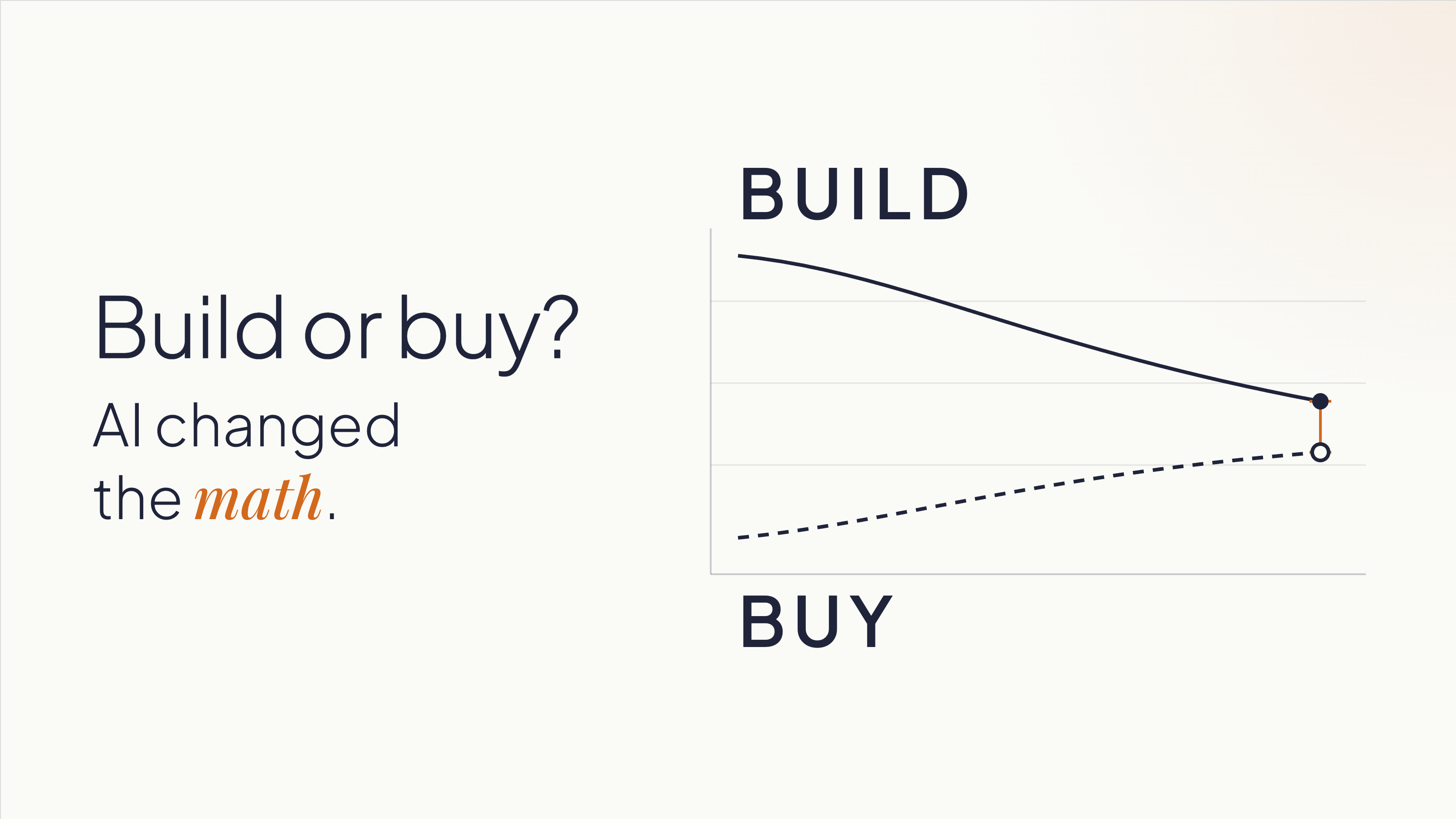
The cost of building dropped. A development project that took six to twelve months can now be completed in six to ten weeks. Costs that ran $100,000 or more have come down to $30,000-50,000 for comparable scope, and in some cases less. At Kaizen, our development teams work two to four times faster than before AI-assisted development became part of our process. The cost of the AI is marginal when teams work with clear requirements and structured context. When they iterate without direction, costs add up, but that's a process problem, not a technology one.
The cost of buying is going up. This part gets less attention, but it matters just as much. SaaS companies are embedding AI capabilities into their products and charging for them, separately. A platform that cost $12,000 per year is now $30,000-40,000 once you add the AI tier, the analytics add-on, and the integrations your operations need. For niche tools serving specialized industries, the pricing was already high and the functionality already limited. Add AI tiers on top and the three-year cost comparison starts to look different than it did when you last ran the numbers.
The result is that the two lines are crossing. Custom software is getting cheaper. SaaS, especially for complex or industry-specific use cases, is getting more expensive.
Most companies are still making this decision based on what building cost three years ago.
There's one more thing AI changed that doesn't get enough credit. It lowered the cost of being wrong early. A functional prototype that used to take weeks of development time can now be assembled in days.
That gives teams something concrete to react to, learn from, and change before deciding whether a full build makes sense.
When building makes sense now
The conditions for building have shifted, but the logic hasn't changed entirely. Building still makes most sense when two things are true:
- The workflow is part of how you differentiate.
- You understand it well enough to start defining what you need.
That second condition doesn't mean having every requirement figured out upfront. It means knowing the business and the process well enough to test assumptions, get feedback, and make increasingly specific decisions.
Companies that start building without that understanding can build the wrong thing faster. The speed advantage AI creates doesn't help if it's pointed in the wrong direction.
Some indicators that a workflow is worth owning:
You're working around your SaaS tools. Spreadsheets patching gaps in a platform. Manual re-entry because two systems don't talk. A Zapier automation that everyone is afraid to touch. These are signals that the tool is containing your problem, not solving it. You're paying the SaaS subscription and building a workaround on top of it. At that point, you're paying twice.
The workflow is where your competitive advantage lives. A logistics company with a particular, high-complexity routing and load assignment process is in a different situation than one that needs basic route planning. The first company's process is their edge, and owning that software means no vendor can change the pricing, pivot the product, or get acquired and leave them exposed. A standard CRM, by contrast, is rarely where a sales organization wins. Salesforce's roadmap reflects the priorities of thousands of customers. If your competitive advantage depends on a process that no SaaS vendor will prioritize, you can't buy your way there.
You shouldn't be adapting your processes to fit a tool. The tool should fit your processes. This is a signal for building: when a company has spent years reshaping how it operates around what a SaaS product can and can't do. That's the opposite of what software is supposed to accomplish. Custom software eliminates that inversion. It's built on domain expertise: knowledge of how your business operates. The software adapts to you.
Vendor dependency is a strategic risk. If a price increase, product pivot, or acquisition could disrupt your operations, you're already exposed. Ownership changes that exposure. It also changes your negotiating position if you stay with a vendor: companies that can credibly leave get better terms.
When buying still makes sense
None of this makes custom software the default answer.
For commodity workflows, buying is still faster and lower-risk. Payroll, basic CRM, email, project management, accounting: these categories have mature tools with strong ecosystems. Build a custom solution here and you've committed to recreating the documentation, integrations, training, and community support that already exist in the products you'd replace. That's rarely worth it.
When your process is still maturing, buying can teach you. A company implementing HubSpot is also adopting a structured methodology for sales, one they can refine as they learn. If you don't know what your ideal process looks like yet, building locks you into one version of it before you've earned the right opinions. Sometimes the right move is to buy, learn, and build later with better information.
When you can't realistically own what you'd build, buying is still the right answer. Custom software is an asset with ongoing maintenance requirements: security patches, library updates, performance monitoring, and someone accountable when things break. If your organization doesn't have that capacity internally, or doesn't have a committed external partner, a build will depreciate without upkeep. Be honest about this before you start.
What AI doesn't change
Two things remain constant, and underestimating either one is expensive.
A prototype is not a production system. AI makes it possible to build a working one in days, but its value is simpler than most people assume: it gives your team something concrete to react to, and those reactions reveal what you need.
One of the most expensive problems in software projects is teams discovering, weeks or months in, that they never agreed on what they were building. Everyone had a mental model. Nobody had tested whether those models matched each other. Show someone a working screen and they'll tell you five things they didn't know they thought until they saw it. That conversation, the one that surfaces the implicit assumptions, the disagreements, the things everyone knew but nobody said, is what the prototype is for.
Building from the requirements that come out of those conversations is a different project than building from initial assumptions. The prototype's purpose is to get you to better requirements faster. Production is a separate project, built from what you learned.
What AI doesn't do is replace the expertise required to architect a system that's secure, scalable, and maintainable over time. Security, data structure, integration design, and long-term ownership decisions don't go away because a prototype came together quickly. A fast prototype that moves to production without rethinking those decisions can accumulate technical debt that costs more than the original development savings. Moving fast into the wrong architecture isn't a win.
AI still needs context. Most teams carry knowledge that's never been written down: how things work, why a decision was made three years ago, what the exception to the rule is. AI doesn't pick that up. Neither does a development partner who starts building without asking the right questions. Explicit requirements matter more now, not less, because the tools that execute on those requirements are faster.
How to decide
Before committing to either direction, three questions are worth working through.
1. Is this process differentiating, and do you know it well enough to define it?
If your answer to the first part is yes, make sure your answer to the second part is honest.
You don't need every requirement upfront. But you do need enough domain knowledge to describe the process, identify what makes it different, and use prototypes or other forms of validation to refine what the system needs to do.
If the answer is "we know how it works but we've never written it down," that work comes first, regardless of whether you build or buy.
2. What does the cost comparison look like over three years?
Include SaaS licensing at realistic price growth (most contracts escalate), implementation, training, integrations, and the cost of the workarounds your team already maintains. Then include the cost to build, plus what realistic ongoing maintenance looks like. The gap is usually narrower than the initial subscription price implies. If you've never run this comparison for your situation, you're deciding without the information you need.
3. Do you have the capacity to own what you'd build?
This means a specific person or team is accountable for what happens after launch, not "we'll figure it out" or "the vendor will handle it." If that accountability isn't concrete and named, the risk profile of building shifts, and buying may still be the right answer even if the cost comparison favors building.
Before you build or buy, validate the path
You don’t need to start building to find out whether building is the right path.
An AI Validation Sprint helps you evaluate the problem, the workflow, and the options before committing significant time or budget. Depending on what you already have, that might include reviewing your current process, comparing existing products, testing key assumptions, or building a lightweight prototype where seeing the workflow in action would help answer an open question.
The goal is to answer questions like:
- Is the problem clear enough to solve?
- Could an existing product meet the need without forcing major compromises?
- What would custom software need to do differently?
- Which assumptions should we test before making a larger investment?
- What are the main technical and operational risks?
- Does the evidence point toward building, buying, or doing more validation first?
Sometimes the answer is to build. Sometimes it’s to buy. We’ve recommended products like Shopify when an existing platform was the better fit, even when custom development was an option.
And if you already have an AI-built prototype, the same process can assess what’s solid, what only works under demo conditions, and what would need to change before it could become a production system.
The goal is not to justify a build. It’s to give you enough evidence to choose the path that makes sense for your business.
Ready to evaluate your options? Start with an AI Validation Sprint.