



Generative UI: what it is, how it works, and when to use it
Generative UI lets AI build the screen each user needs, in real time. What it is, how it works, the trade-offs, and two working demos we built.

12 min read
Read more
Insights, stories, and experiments from our team.
AI
UX Design
Generative UI lets AI build the screen each user needs, in real time. What it is, how it works, the trade-offs, and two working demos we built.

Santiago Chiappa
·

Jul 17, 2026
·
12 min read
Generative UI is a full-stack architecture that lets AI create, modify, and render user interfaces in real time, based on what each user needs at that exact moment. Instead of static, predefined screens, the interface assembles itself on the fly: a bar chart, a table, a comparison card when you're comparing things.
We've been building proofs of concept with it for the past few weeks. Most of what's written about generative UI is either too abstract or too exciting, so this is our attempt at neither: what it is, how it works, where it helps, where it doesn't, and what we learned from two demos we built.
Generative UI is a full-stack architecture: the backend talks to the LLM, decides what the answer should look like, and picks the components, while the frontend renders them and handles how the user interacts with what’s on screen.
Compare that with how interfaces have always worked. A designer decides what goes on each screen, a developer builds it, and every user sees the same thing. Forever, or until the next redesign.
Generative UI flips that. The interface becomes dynamic and personal instead of static and universal. The AI doesn't just answer your question, it designs the screen that answers your question.
Dashboards and reporting are the most common use cases, but they're far from the only one. The same pattern works for dynamic forms, onboarding flows, and customer support, as it takes input just as easily as it presents output. It can even adjust font size, contrast, or layout for users with low vision, color blindness, or cognitive load.
There are three levels of generative UI, from most constrained to most open (Google Cloud, 2026):
Most production systems today use the declarative approach, and that's what this post assumes from here on. The AI isn't writing HTML or CSS freestyle. It selects components, fills in pre-designed widgets, and composes them into the right screen.
Generative UI works by turning a user request into structured data that describes an interface, then rendering that data as real components. The flow looks like this:
To the user, the result feels like magic. Behind the scenes, it's structured data flowing through a well-defined pipeline. We prefer the second description. It's the one you can build on.
Generative UI trades real personalization and faster development for added latency, inference costs, and less predictable layouts. That's the honest version. Here are the details.
None of these are dealbreakers. There are known techniques to mitigate each one.
We built two demos. One with fictional data, one on top of a tool we use every day.
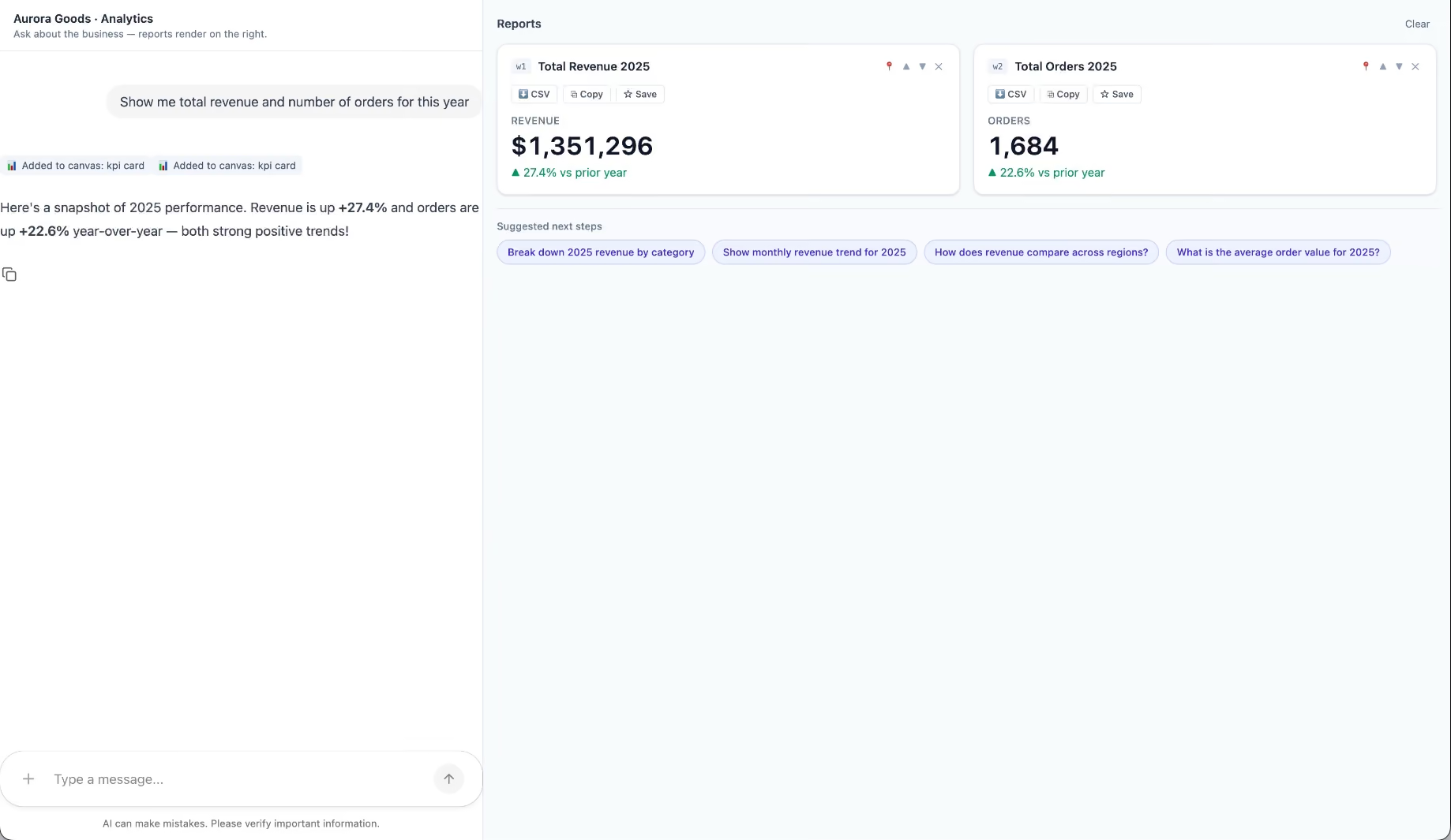
Aurora Goods is a fictional consumer e-commerce platform we created for the demo. The interface is simple: chat on the left, canvas on the right. You ask about the business, the LLM figures out what you need, pulls the data, and renders it visually.
Ask about 2025 sales and it shows the numbers on cards, with a short note on anything relevant. Ask it to break that down by region and it extends the same view instead of starting over, because it understands the second question builds on the first. This part took us a while to get right, and it's what makes the whole thing feel like a conversation rather than a search box.
The canvas isn't output-only either. You can click into any element and drill down: revenue by category, then inside electronics, then which products sold most.
You configure the widgets once. The system combines them and adds relevant commentary on the spot.
The second demo is closer to home: a generative reporting layer on top of the time-tracking tool we use every day at Kaizen. The questions in this demo are questions someone here has actually asked.
Instead of building dozens of hyper-specific reports, a small amount of code now handles virtually unlimited queries. How many hours were logged in May? Which anomalies showed up in April? How do billable and non-billable hours compare across two months? Who worked on a given project last month, and for how long? Each answer arrives as the right visualization: cards, lists, bar charts, plus a short summary that's easy to scan.
Two details won us over. The LLM suggests next steps, so exploring the data becomes a conversation. And when it's not sure, it asks instead of assuming. Ask for the hours of someone named Alex and, since we have more than one Alex on the team, it asks which one before answering.
Generative UI is a complement, not a replacement. Standard interfaces still win for stable, repetitive workflows where consistency matters. Nobody wants their checkout button to be creative. Generative UI wins where the workflow is complex and the questions are unpredictable.
It also changes what design systems are for. Beyond designing components and screens, teams will need to define semantic rules: how the AI should react to uncertainty, which interfaces match which intentions, and the guardrails that keep generated screens functional and safe.
That's a new kind of design work. And it's already starting.
We build working proofs of concept in two weeks. Your data, your workflows, a real thing you can click.
Generative UI lets AI build the screen each user needs, in real time. What it is, how it works, the trade-offs, and two working demos we built.
12 min read

About Us

·
Jun 29, 2026
How we pick the next UX Tiny Knowledge Byte speaker, with a spinning wheel and a Magic 8 Ball.
12 read time
A while ago we noticed something pretty common: everyone wanted to share more knowledge internally, but nobody wanted another heavy corporate ritual.
Internal talks usually start with good intentions and slowly disappear. They take time, preparation, and energy. And at some point people start feeling like they need to be experts before presenting anything.
So we tried the opposite.
15 minute talks.
Small topics.
Low pressure.
And one important rule: every session had to leave something useful behind. A tool, a workflow, an idea, a shortcut, a new way to approach a problem. Something people could actually use after the talk ended.
We didn’t want theory that went nowhere.
Somehow, that ended up working much better than we expected.
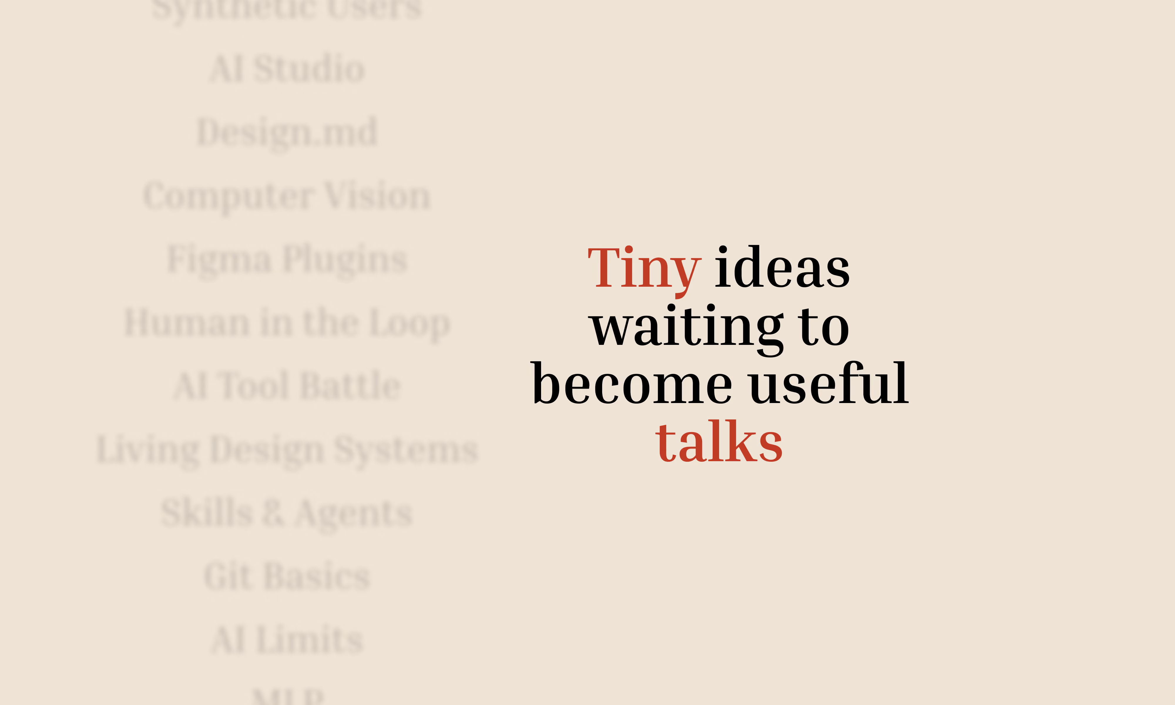
Tiny Knowledge Bytes is intentionally simple:
The goal was making knowledge sharing feel lightweight instead of exhausting.
Some of the best talks start with:
“I tried this yesterday and it was weird.”
Over time, topics started coming from everywhere.
Sometimes someone took a course and used a Tiny Knowledge Byte as a way to give something back to the team. Other times, a client problem triggered research into new tools, workflows or AI approaches.
A lot of sessions start from curiosity or necessity more than planning.
The pool slowly filled up with things like:
And honestly, the mix is part of what makes it interesting.
Sometimes a UX session drifts into Computer Vision. Sometimes someone technical shares a visual workflow that half the design team ends up adopting later.
There’s not much curation. It behaves more like a constant exploration system.
And this is where things became unnecessarily dramatic.
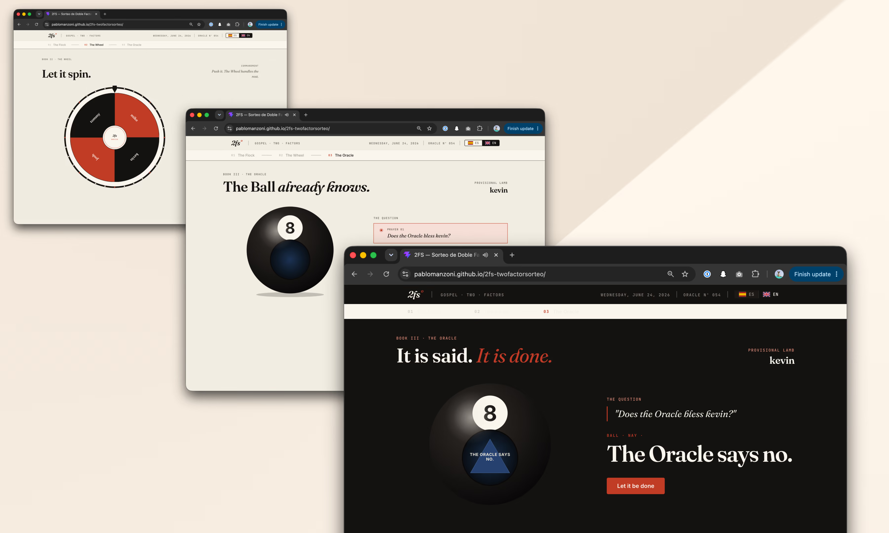
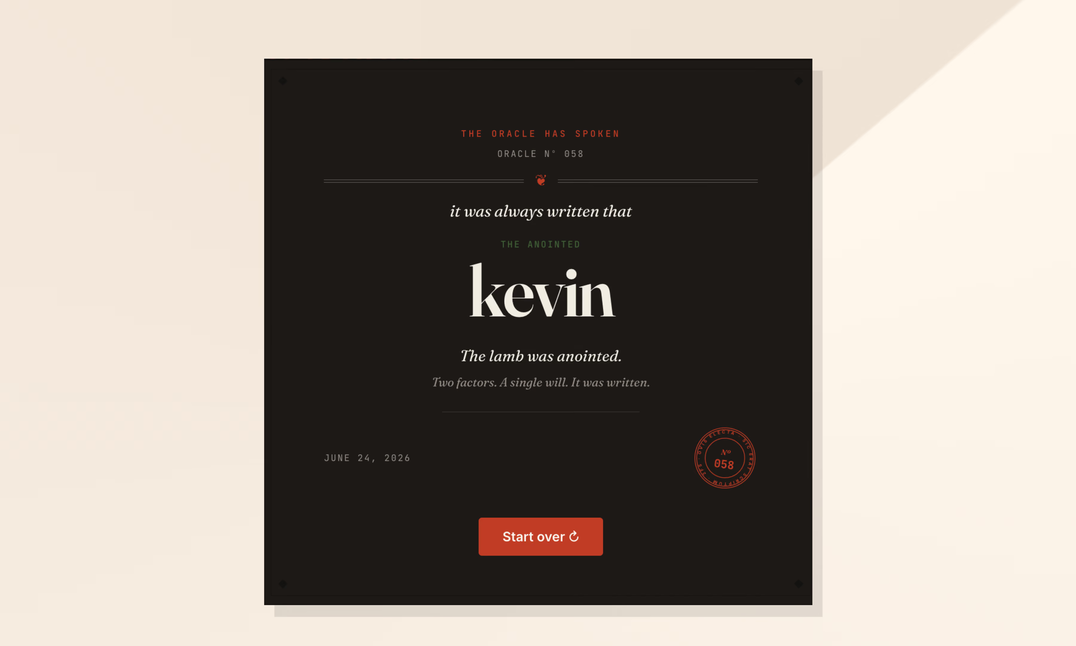
Nobody wanted to be “the person who chooses”. So we started adding absurd layers of randomness until we somehow ended up building a full internal app called 2FS.
Two Factor Sorteo.
Yes, it’s real.
The logic is simple.
First, a wheel picks someone.
Then a Magic 8 Ball decides whether destiny approves the selection.
If the oracle rejects the person, the process starts again.
That’s it.
2FS originally started as an excuse to experiment with:
Eventually those same explorations turned into future Tiny Knowledge Bytes.
The tool we used to select speakers started generating new topics itself.
One of the most interesting side effects is that people started building things outside their usual role because of previous Tiny Knowledge Bytes.
2FS itself is a good example. A designer saw sessions about Claude tooling and AI workflows and thought:
“Maybe I can actually build this.”
What started as a ridiculous speaker selection tool became a real product experiment involving Claude Code, interface systems and interaction design.
Then it came back into the Tiny Knowledge Bytes circuit as a new talk.
That loop became surprisingly valuable:
someone learns something,
tries it,
builds something with it,
and eventually inspires someone else to do the same.
Over time we realized knowledge sharing works much better when:
At that point, it stops feeling like another internal obligation and starts feeling like something people genuinely want to keep alive.

UX Design
AI

·
May 27, 2026
What happens when you build a design system from v0, Figma, and Windsurf, and let AI handle the speed while you keep the judgment.
12 read time
Just this month, I built a full design system in about 20 hours.
What used to take weeks, sometimes months, is now dramatically faster. So… what actually changed? And more importantly: what didn’t?
Design systems take time. On complex platforms, they can take hundreds of hours.
We were working with a large and complex product where inconsistencies had started to pile up. Different modules had evolved in isolation, teams were making independent decisions, and there were no shared guidelines. The answer was clear: we needed a design system.
AI tools were just starting to emerge back then. They were mostly useful for simple tasks as they tended to hallucinate when things got complex. Developers had started using them earlier than designers, MCP didn't exist yet, and Figma plugins were the best automation we had.
But the context has changed. Fast.
We did what most teams did. We stopped, and we built it. Manually.
Picture two designers, a mountain of inconsistencies, and no map. We had to cross-reference information manually, digging through the code, detecting what could be merged, agreeing on naming conventions, deciding how to name components. Hours and hours of discussion until we finally landed on a solution.
In the end, we got there. A cleaner system, faster workflows, and for the first time, both teams speaking the same visual language. Hard-won, but it worked.
But now every month a new AI model seems to be released. Design is finally catching up with what developers faced about two years ago. New tools arose, and with that, the scope of our work as designers completely changed.
For an internal project, I used our Kaizen site as a reference, combined with documentation from industry leaders as a guideline.
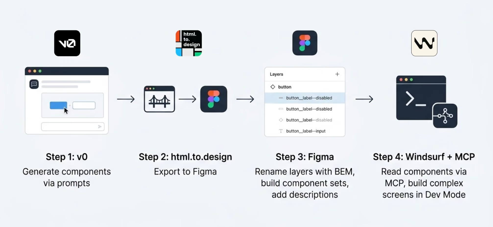
I started in v0, which is essentially a chat interface where you can generate UI components through prompts. I fed it the colors, typographies, and a reference image, and from there it was a back-and-forth: the AI generated, I reacted, adjusted, and pushed until the output matched what I had in my head. And just like that, I started prompting my way through a Design System.
Once a component was ready, I used the html.to.design plugin to bring it into Figma (yes, plugins are still alive!). Think of it as a bridge: the plugin exports designs directly from the browser into a Figma file.
Inside Figma, the intervention was more hands-on. First, I checked that everything was visually consistent with what was defined in v0: colors, typography, styles. Then I used Figma's built-in AI to rename all the component layers using BEM convention (something that would have taken a significant amount of time to do so manually).
BEM, which stands for Block Element Modifier, is a widely adopted naming convention in CSS. It structures layer names hierarchically and predictably, for example: button__label--disabled.
Using it keeps the code clean, readable, and consistent, especially when you're working alongside a developer who needs to understand what came out the other side.
Beyond naming, I also made sure the layer structure would generate the right properties when building component sets in Figma, so that all the variants would be correctly exposed and usable. My team also pointed out that adding descriptions to components and variants was key as context for any agent using them through an MCP.
The last step was connecting everything to Windsurf via MCP. With a frame selected in Dev Mode, Windsurf could read the Figma file and use the components to build more complex screens.
We worked closely with a developer throughout this phase. Not just for the technical knowledge, but because having someone who reads code fluently meant catching things we wouldn't have spotted otherwise. The design role here was direction and supervision: making sure the AI used the components correctly and didn't invent solutions where context was missing.
Every step of the process had a human decision behind it.
At one point, before we had any of the naming conventions figured out, I selected a frame and asked Windsurf to build a form using the components inside it, styled to match a specific card. The developer next to me was skeptical until he saw the result, and then he was just as surprised as I was.
What we realized is that the MCP wasn't reading layer names to understand context. It was reading everything inside the frame, even the loose text sitting alongside the components. Good naming is still worth doing. But the MCP doesn't need it to understand what it's looking at.
The more specific and contained your prompt, the better the outcome. We started with the most atomic component: the button, and worked outward from there. Each approved component became context for the next one, so the system gradually picked up the visual language we were building.
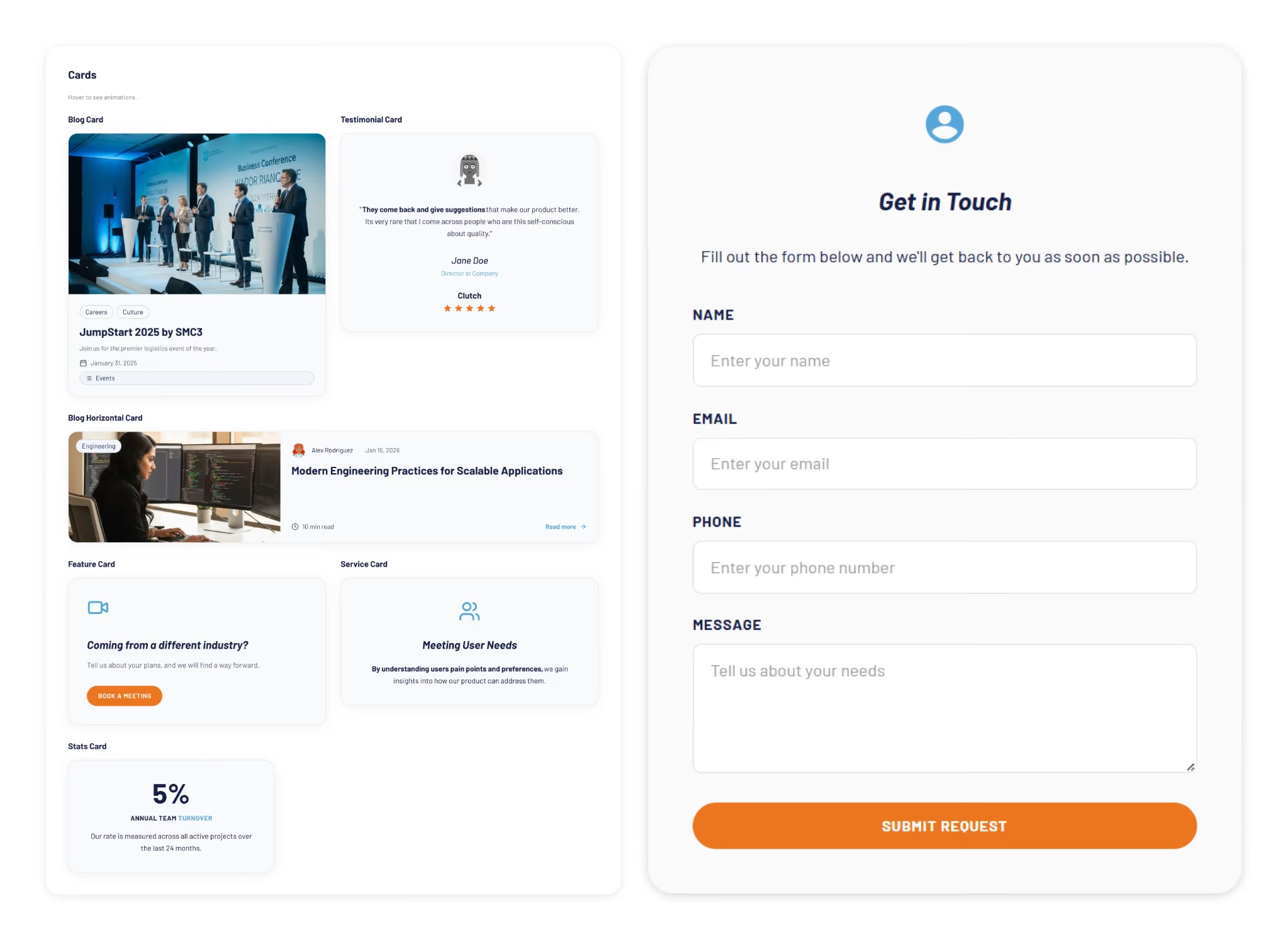
At some point I got ambitious and asked for five cards in a single prompt: blog card, service card, testimonial card, stats card, feature card… structures, states and all. The AI delivered.
Visually, everything looked fine. Then the developer looked at the code and pointed out that all five cards were independent components instead of variants of one. For a design system, that breaks everything.
One correction prompt fixed it. But it was a good reminder: the AI does exactly what you ask, not what you mean. And fixing it after the fact can cost more than getting it right from the start.
Through all of this, a few things became very clear. These are the parts that didn’t change:
The tools changed, and that gave me the chills, but throughout this experience I found that the designer's role is more alive than ever.
What once took a team weeks can now be prototyped in hours. That’s not a threat; it’s an invitation to get curious.
I'm still figuring a lot of this out, and I suspect most of us are. There's no right workflow yet, and honestly, that's fine. We are in a transition where tools change faster than standards. The best thing you can do is experiment. Don't wait for a "definitive" workflow, it might be obsolete by next month.
Go ahead, try prompting your way through a component. You might be surprised how fast the system starts to take shape.
AI
Technology

·
May 15, 2026
AI can update microservices safely, but only when it understands the system’s architecture, ownership, and service relationships.
12 read time
Applying changes across microservices is difficult because business logic is distributed across multiple services, each with its own data, contracts, and responsibilities.
In our experiment at Kaizen Softworks, we tested whether an AI system could safely apply coordinated changes across a microservices architecture using only minimal input.
Short answer: Yes, but only when the AI has enough architectural context.
In distributed systems, a single business change rarely affects just one service.
It often requires:
The complexity is not in the code, it’s in the relationships between components.
We designed a controlled experiment to test whether an AI model could apply system-wide changes with limited information.
In other words, the AI had to behave like a software architect, not just a code generator.
The biggest challenge was not technical, it was contextual.
.avif)
Instead of descriptive names like:
Our services were named:
This removed any semantic clues about responsibility.
Result: The AI could not infer which service owned which domain logic.
To solve this, we introduced a simple but powerful structure:
This created a clear relationship between domain concepts and system components.
Once ownership was explicit, the architecture became understandable.
Instead of building this mapping manually, we used AI to analyze the codebase and extract:
The result was a machine-readable architecture map.
In practice, we used AI to generate the context that AI itself needed.
With the architecture map in place, the AI was able to:
While not perfect, the system worked reliably as a proof of concept.
The main limitation of AI is not code generation, it’s architectural understanding.
Without knowing:
AI cannot safely modify a distributed system.
AI performance depends more on context quality than model capability.
Simple rule: If the architecture is clear, AI can reason. If not, it guesses.
This experiment revealed something important:
AI doesn’t fail because it can’t write code.
It fails because it can’t see the system.
As teams move toward AI-assisted development, the focus will likely shift from:
Writing better code to Designing better systems for machines to understand
At Kaizen Softworks, we see this as a foundational shift.
Because when AI can understand architecture, it doesn’t just generate code, it helps evolve systems.

About Us

·
Mar 13, 2026
We don’t have traditional managers. This is how we make decisions and keep things moving.
12 read time
There's a myth that in flat organizations, everyone decides on everything.
That's not how it works. At least not at Kaizen.
When people hear "no managers," they often picture one of two extremes: either total chaos where nobody is accountable, or endless meetings where 80 people vote on which coffee to buy. The reality is neither.
Not everyone decides on everything. Not everyone votes. What we do have is a clear set of decision-making methods that we choose based on context.
Before choosing how to decide, we ask ourselves a few questions:
These dimensions help us pick the right method. Not every decision deserves the same process.
Over the years, we've landed on a few methods that we use depending on the situation:
Some decisions belong to a specific role. If someone owns a responsibility, say, office logistics or hiring for a team, they decide within that domain. No committee needed. The key is that roles are transparent: everyone knows who owns what, and the scope of each role's authority is clear.
When a decision doesn't clearly belong to one role, or when it crosses boundaries, we use the advice process. Here's how it works:
The decision-maker is not a committee. It's one person (or a small group) who takes responsibility. But they don't decide in isolation, they bring in the perspectives that matter.
We sometimes call this "Team Advice" when a working group forms around an issue that doesn't naturally fall into anyone's area, and "Area Advice" when a team opens up a topic that exceeds their own scope.
Consent is not "everyone agrees." Consent means "no one has a strong enough objection to block this." We do use a poll, but not to count votes — we use a 1-to-5 scale to measure the level of agreement and surface objections, not to let the majority rule.
We use it in two flavors:
Not everything needs participation. When a decision has already been made through a legitimate process, the right move is to inform, not to fake-consult. One of the fastest ways to kill self-management is to ask for feedback and then ignore it. If you're not going to change course based on input, don't ask for it, just be transparent about the decision and the reasons behind it.
We didn't adopt these methods because they're trendy. We adopted them because they solve real problems:
Transparency is the foundation. Every method we use, from role-based decisions to high-participation consent, works because information flows openly. People know what's being decided, who's deciding it, and how they can participate.
Horizontal doesn't mean structureless. It means fewer hierarchical levels, clearer roles, and intentional decision-making processes that match the weight of each decision.
Not everyone decides on everything. But everyone knows how things get decided.

AI

·
Mar 4, 2026
LLMs can break in weird ways. Guardrails are what keep things usable in production.
12 read time
In 2026, building AI-powered features has become relatively easy. While working on AI initiatives within the Innovation Hub at Kaizen Softworks, we kept running into the same pattern: PoCs worked, demos looked impressive, and stakeholders were happy. But production hit red flags.
When you move from an internal prototype to production, uncomfortable questions start showing:
AI guardrails and evaluations have shifted from "extra safety work" to core product concerns.
AI Guardrails are secondary checks that sit between the user and the Large Language Model (LLM). They act as a validation checkpoint, monitoring, filtering, and validating both the input (prompts) and the output (responses) to ensure they meet safety, accuracy, and brand standards.
Instead of trusting the model blindly, you are defining the boundaries of "valid behavior, which usually means:
We’ve already seen public cases of large AI-powered products responding to almost any topic-not because the models were bad, but because clear boundaries weren’t defined. As systems become more agentic (taking actions on behalf of users), these risks only grow.
The value of these patterns, which are covered in the DeepLearning.ai "Safe and Reliable AI" course, is that they provide a model for building responsible AI.
Guardrails aren't a silver bullet, but they are the difference between a prototype that "looks cool" and a system you can actually trust with your brand and your users' data. At Kaizen Softworks, this way of thinking is becoming increasingly important as we explore and ship AI-driven solutions.
To move beyond the demo, we recommend implementing these four technical validation layers:
In a RAG (Retrieval-Augmented Generation) system, a hallucination is usually a lack of grounding. A way to verify that every statement is explicitly supported by trusted source text is through Natural Language Inference (NLI).
Instead of asking "Does this answer look right?", we use a secondary, smaller model to ask if the output is logically entailed by the source context. This makes hallucinations something you can programmatically reason about and block in real-time.
Another common problem is the "Everything Bot"—that answers questions about your business, but also gives recipes or writes poetry if asked.
While you can try to "prompt" an LLM to stay on topic, it’s expensive and slow. We prefer Zero-Shot Classification. It’s a dedicated layer that categorizes the intent before it even hits the expensive LLM. It’s:
Data privacy is the #1 reason AI projects stall in legal. PII (Personally Identifiable Information) handling is easy to ignore in demos but is a dealbreaker in production.
Tools like Microsoft Presidio allow you to:
This makes data privacy risks very tangible, especially when working with third-party LLM providers.
There are also examples of guardrails for:
Again, the focus is not on theory, but on patterns you can actually apply.
To dig deeper into this topic, I took the short course “Safe and Reliable AI via Guardrails” by DeepLearning.ai.
This course is not about training models or prompt engineering. It’s about everything that surrounds the LLM when you want to ship an AI feature safely and reliably.
You won’t leave this course as a “guardrails expert”. What you will get:
It’s a very good entry point, especially for engineers who are starting to ship AI features beyond PoCs.
For me, the biggest takeaway was a mindset shift. When you think in PoC mode, many questions don’t even come up:
In production, those questions stop being theoretical. The course reinforces the idea that once an AI feature goes to prod, “it works” is not enough.
You start designing:
And once you start thinking this way, you don’t really go back.

AI

·
Mar 2, 2026
If someone on our team asked where to learn AI today, these are the courses we’d point them to.
12 read time
Learning AI engineering is about developing judgment: knowing when to use models, how to control them, and where they actually add value.
At our Innovation Hub, we’ve been actively experimenting, building, breaking, and refining AI-powered systems in real-world environments. Based on that hands-on experience, we curated this list of AI engineering courses we’d confidently recommend to our own team.
This list is for software engineers, tech leads, and AI practitioners who already ship production code and want to learn how to build AI systems that are reliable, maintainable, and usable.
TABLA
Standard LLMs are constrained by static training data and context limits. In real products, that’s a deal-breaker. Retrieval-Augmented Generation (RAG) has become the industry standard for connecting AI systems to private, real-time, and domain-specific data.
What You’ll Learn:
How do you test a system that doesn’t always give the same answer? Traditional unit tests break down when applied to LLMs. TestGenAI tackles that problem head-on by showing how AI can be used to test AI systems themselves, across UI, APIs, databases, and workflows.
What You’ll Learn:
As AI systems become user-facing, safety is no longer optional. Guardrails are programmable layers that sit between users and LLMs to prevent harmful, non-compliant, or simply incorrect outputs.
What You’ll Learn:
For engineers working in larger organizations, this certification is one of the most complete overviews of how AI systems live inside real enterprise infrastructure.
It goes beyond models and into architecture, governance, and deployment constraints.
What You’ll Learn:
We’re moving from copilots to agents.
Windsurf is an AI-native IDE that allows agents to autonomously refactor, search, debug, and modify code across an entire codebase. This course shows how to work with those agents instead of fighting them.
What You’ll Learn:
Claude Code brings AI directly into your terminal, allowing it to read, reason about, and modify your local codebase. It’s one of the most practical examples of LLMs as real development tools, not chatbots.
What You’ll Learn:
There’s no single “best” path. The right course depends on what you’re building, who your users are, and how close you are to production.
If you’re deciding where to start:
.avif)
AI
UX Design
·
Feb 20, 2026
Synthetic users are AI-driven test agents that help reveal where a design creates doubt, confusion, or unnecessary friction.
12 read time
Karen has no patience.
If a button is disabled without explanation, she gets annoyed.
If an empty state looks like an error, she assumes the system is broken.
If a loading spinner doesn’t explain what’s happening, she asks for the manager.
Karen isn’t a real person.
She’s a synthetic user.
And she might be one of the most useful ways I’ve found to stress-test a design before putting it in front of real users.
A synthetic user is a constrained AI decision agent embedded in a controlled simulation framework.
It is not just a profile. It is a structured behavioral model with:
It operates only within what is defined and cannot compensate for ambiguity, missing signals, or structural gaps in the interface.
A synthetic user is not:
A synthetic user interacts strictly with what is visible in the interface and nothing more. It does not infer intent, fill gaps, or compensate for ambiguity. When the path forward is unclear, it hesitates. That hesitation is not failure. It is the signal that reveals structural friction.
.avif)
If you want this to be more than “ChatGPT pretending to be someone,” you need structure. You must define:
Synthetic users don’t validate whether something “works.” What they actually do is expose where a design forces users to interpret instead of confirming things explicitly. They surface structural ambiguity that often goes unnoticed in internal reviews and help distinguish between friction that affects everyone and friction that only impacts less experienced users.
In practice, they make design discussions more concrete because you’re no longer debating opinions, you’re observing constrained behavior. They don’t replace usability testing, but they significantly improve how prepared you are before running it.
If you want to try it today:
If the synthetic user never hesitates, your constraints are too weak
I’ve pulled together the exact resources I use:
Agent-based simulation is not a new idea.
What is still underdeveloped is how to apply it in a structured, practical way inside UX workflows. There is no widely adopted standard yet. No clear implementation pattern most teams follow.
What I’m sharing here is not an academic breakthrough. It’s a working implementation.
It can evolve. It can scale into automation.
But even in its current form, it has helped me detect structural friction before running formal usability testing, that alone makes it worth exploring.
.avif)
Events
·
Feb 18, 2026
If you're planning your 2026 logistics strategy, these are the U.S. events actually worth showing up to.
12 read time
This is our curated roadmap of the most influential U.S. logistics conferences in 2026. If you are planning your professional calendar and investment for the coming year, these are the dates you need to save.
SMC³ JumpStart is a high-density event for freight leaders seeking a clear pulse on the 2026 market. The agenda focuses heavily on Applied AI for automated billing, revenue models, and final-mile strategy.
With over 7,000 attendees, Manifest is where supply chain technology meets global operations. In 2026, the event features a dedicated Cold Chain Program, making it a non-negotiable for teams managing temperature-sensitive networks.
Organized by S&P Global, TPM26 is the primary venue for negotiating global container contracts. The 2026 edition centers on risk management across three tracks: TPM Cold Chain, TPM Tech, and TPM Academy.
An invite-only summit where 80% of attendees represent Fortune 100 companies. This is not a vendor-heavy trade show; it is a curated environment for VPs and C-level executives to solve geopolitical risks and supply chain resilience challenges.
TIA Capital Ideas is the primary North American event dedicated exclusively to 3PL leadership and brokerage-based logistics. This conference addresses the core financial and operational drivers of the sector, including brokerage economics, margins, and sales growth strategy.
The Georgia Logistics Summit provides a direct look at multimodal operations within one of the largest logistics hubs in the U.S. The event focuses on the practical intersection of ports, rail, and trucking, moving beyond typical "trade show fluff."
FTR is a data-centric conference focused on market forecasts and economic analysis. It provides direct access to analysts and peer intelligence to guide long-term planning across three specific tracks:
Intermodal EXPO is the central meeting point for the intermodal freight ecosystem, connecting rail, ocean, and trucking leaders. Built for those dealing with the coordination challenges of moving freight across different modes of transport.
The logistics industry is currently navigating a tectonic shift driven by Generative AI, multimodal visibility, and fluctuating trade tariffs. Attending these forums is no longer just about networking; it is about updating your competitive edge.
At Kaizen Softworks, we help logistics leaders turn the insights gained at these summits into robust software solutions, from AI-driven route optimization to automated compliance systems.

AI
·
Feb 13, 2026
We built a visual novel app to make AI basics easier to understand, turning concepts like LLMs, RAG, and agents into a story you can play.
12 read time
At Kaizen Softworks, AI is already part of our daily work. But adoption doesn’t happen at the same speed across every team, and that's normal. To keep our evolution strategic, we wanted every team member to have a solid understanding of AI concepts.
To do that, our Innovation Hub (our internal AI R&D team) built a learning tool that actually looks like something you’d want to use. Instead of more slides or long docs, we built an interactive web app with a visual novel style.
It was built in React in just two weeks and uses a branching, story-driven approach to learning.
The experience puts you in the role of Kai, a character moving through a story where your decisions shape what happens next. As the story unfolds, you can explore core AI concepts in a way that feels practical and easy to follow:
The goal of this MVP is to level the technical vocabulary across the entire organization, fostering a culture of responsible autonomy. We believe that when we understand the deep logic behind the technology, we can build solutions that offer real, lasting value to our clients.
This platform isn’t meant to replace technical workshops or 1:1 coaching. It’s an accessible entry point. And for anyone who wants to go deeper after finishing the story, we included a curated set of advanced resources recommended by our technical team.
We’re opening up this first module so anyone can try the tool, meet Kai, and sharpen their AI understanding in just a few minutes.
This is an early version, and your feedback will play a big role in how we continue evolving this storytelling engine.
No blogs matched this category, try applying different filters.