



Generative UI: what it is, how it works, and when to use it
Generative UI lets AI build the screen each user needs, in real time. What it is, how it works, the trade-offs, and two working demos we built.

12 min read
Read more
Insights, stories, and experiments from our team.
AI
UX Design
Generative UI lets AI build the screen each user needs, in real time. What it is, how it works, the trade-offs, and two working demos we built.

Santiago Chiappa
·

Jul 17, 2026
·
12 min read
Generative UI is a full-stack architecture that lets AI create, modify, and render user interfaces in real time, based on what each user needs at that exact moment. Instead of static, predefined screens, the interface assembles itself on the fly: a bar chart, a table, a comparison card when you're comparing things.
We've been building proofs of concept with it for the past few weeks. Most of what's written about generative UI is either too abstract or too exciting, so this is our attempt at neither: what it is, how it works, where it helps, where it doesn't, and what we learned from two demos we built.
Generative UI is a full-stack architecture: the backend talks to the LLM, decides what the answer should look like, and picks the components, while the frontend renders them and handles how the user interacts with what’s on screen.
Compare that with how interfaces have always worked. A designer decides what goes on each screen, a developer builds it, and every user sees the same thing. Forever, or until the next redesign.
Generative UI flips that. The interface becomes dynamic and personal instead of static and universal. The AI doesn't just answer your question, it designs the screen that answers your question.
Dashboards and reporting are the most common use cases, but they're far from the only one. The same pattern works for dynamic forms, onboarding flows, and customer support, as it takes input just as easily as it presents output. It can even adjust font size, contrast, or layout for users with low vision, color blindness, or cognitive load.
There are three levels of generative UI, from most constrained to most open (Google Cloud, 2026):
Most production systems today use the declarative approach, and that's what this post assumes from here on. The AI isn't writing HTML or CSS freestyle. It selects components, fills in pre-designed widgets, and composes them into the right screen.
Generative UI works by turning a user request into structured data that describes an interface, then rendering that data as real components. The flow looks like this:
To the user, the result feels like magic. Behind the scenes, it's structured data flowing through a well-defined pipeline. We prefer the second description. It's the one you can build on.
Generative UI trades real personalization and faster development for added latency, inference costs, and less predictable layouts. That's the honest version. Here are the details.
None of these are dealbreakers. There are known techniques to mitigate each one.
We built two demos. One with fictional data, one on top of a tool we use every day.
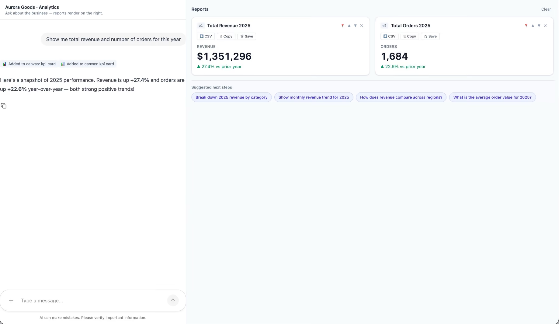
Aurora Goods is a fictional consumer e-commerce platform we created for the demo. The interface is simple: chat on the left, canvas on the right. You ask about the business, the LLM figures out what you need, pulls the data, and renders it visually.
Ask about 2025 sales and it shows the numbers on cards, with a short note on anything relevant. Ask it to break that down by region and it extends the same view instead of starting over, because it understands the second question builds on the first. This part took us a while to get right, and it's what makes the whole thing feel like a conversation rather than a search box.
The canvas isn't output-only either. You can click into any element and drill down: revenue by category, then inside electronics, then which products sold most.
You configure the widgets once. The system combines them and adds relevant commentary on the spot.
The second demo is closer to home: a generative reporting layer on top of the time-tracking tool we use every day at Kaizen. The questions in this demo are questions someone here has actually asked.
Instead of building dozens of hyper-specific reports, a small amount of code now handles virtually unlimited queries. How many hours were logged in May? Which anomalies showed up in April? How do billable and non-billable hours compare across two months? Who worked on a given project last month, and for how long? Each answer arrives as the right visualization: cards, lists, bar charts, plus a short summary that's easy to scan.
Two details won us over. The LLM suggests next steps, so exploring the data becomes a conversation. And when it's not sure, it asks instead of assuming. Ask for the hours of someone named Alex and, since we have more than one Alex on the team, it asks which one before answering.
Generative UI is a complement, not a replacement. Standard interfaces still win for stable, repetitive workflows where consistency matters. Nobody wants their checkout button to be creative. Generative UI wins where the workflow is complex and the questions are unpredictable.
It also changes what design systems are for. Beyond designing components and screens, teams will need to define semantic rules: how the AI should react to uncertainty, which interfaces match which intentions, and the guardrails that keep generated screens functional and safe.
That's a new kind of design work. And it's already starting.
We build working proofs of concept in two weeks. Your data, your workflows, a real thing you can click.
Generative UI lets AI build the screen each user needs, in real time. What it is, how it works, the trade-offs, and two working demos we built.
12 min read
Events

·
Feb 14, 2025
Manifest 2025 showed how AI, automation, resilience, and sustainability are shaping the next stage of logistics and supply chain.
12 read time
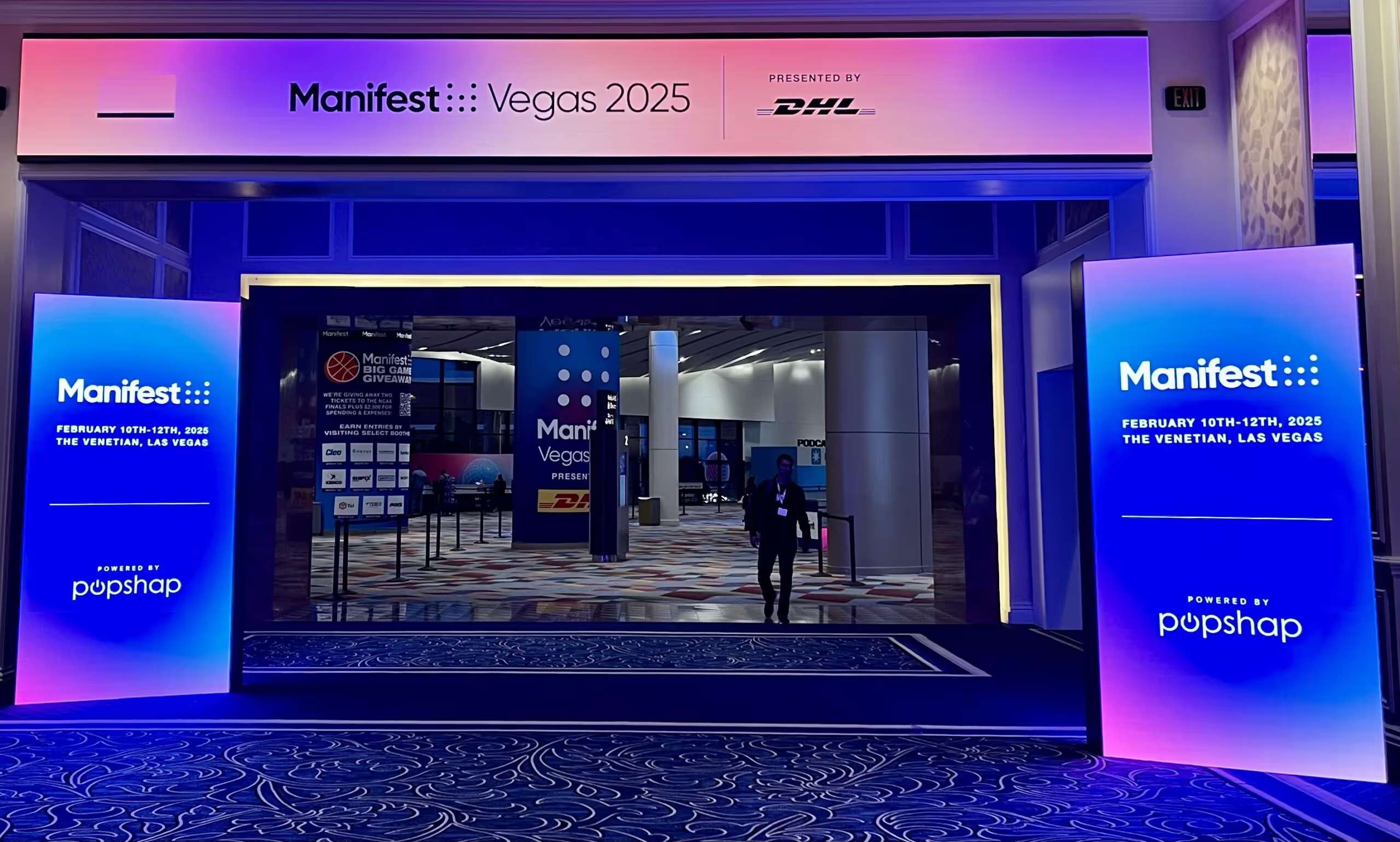
Manifest 2025 by DHL brought together over 7,000 industry leaders from top logistics, technology, and retail companies, solidifying its status as one of the most influential supply chain events of the year. Held at The Venetian in Las Vegas over two days, the conference featured insightful keynotes, expert panels, and hands-on tech showcases, addressing the most pressing challenges and innovations shaping the industry.
The message was loud and clear: AI and automation are now a necessity, not a luxury. Companies that fail to integrate AI-driven analytics, robotics, and automated workflows risk falling behind.
The past few years have proven that supply chains must be prepared for disruptions—whether from pandemics, geopolitical tensions, or climate events. The most resilient companies are focusing on:

Sustainability is no longer just a corporate responsibility—it’s a business imperative. Customers and regulators are demanding greener solutions, and companies that take action are gaining a competitive edge.
Real-time data and analytics are empowering businesses to make smarter, faster decisions across the entire supply chain.
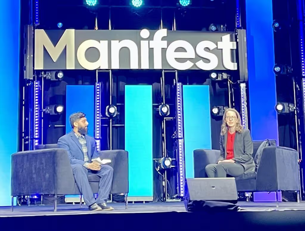
Despite rapid technological advancements, human expertise remains critical. Workforce training, change management, and leadership in digital transformation were recurring themes at the event.
Manifest 2025 made it clear: the future of logistics and supply chain is tech-driven, resilient, sustainable, and data-powered. Companies that embrace these trends will lead the industry forward.
Want to know exactly how software can help in logistics? Check out our projects to see how we're driving innovation in the industry.

Events
·
Feb 1, 2025
We looked into JumpStart 2025. Here’s what to expect from this logistics-focused event.
12 read time
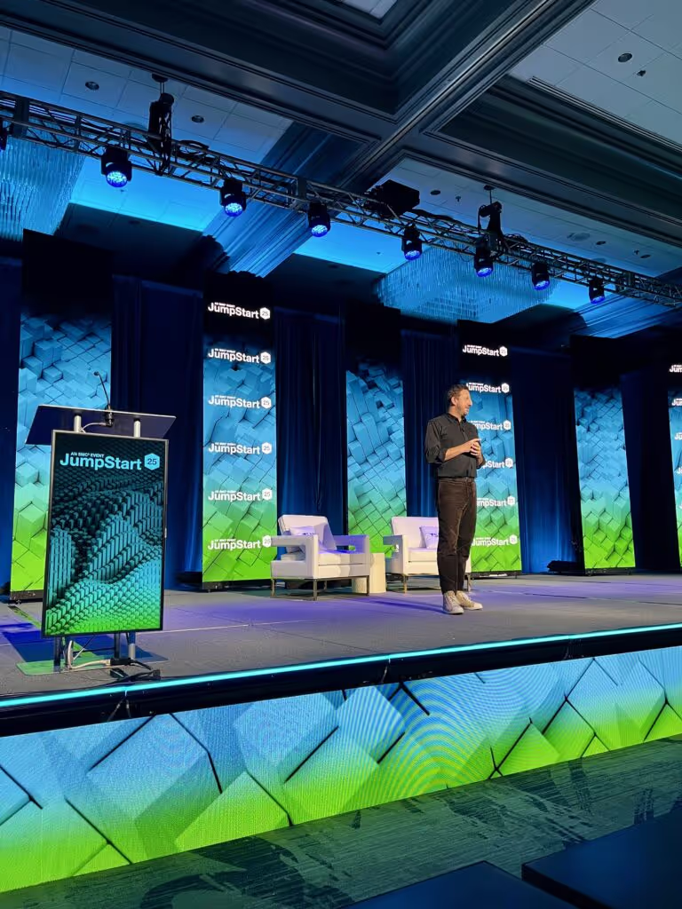
I had the chance to attend JumpStart 2025, organized by SMC³, in Atlanta from January 27-29. It was an amazing event that brought together professionals from all parts of the supply chain—carriers, shippers, logistics service providers, and tech innovators. I wanted to share a few key insights from the event that really stood out to me.
A major theme at the event was the growing role of AI and automation in the industry. The keynote by Zack Kass, an AI futurist and former Head of Go-To-Market for OpenAI, highlighted how artificial intelligence is transforming supply chains. And it wasn’t just in the keynote; this topic came up in several other sessions.
What I found particularly interesting is that AI and automation aren’t being used to cut jobs—they’re being used to free up employees so they can focus on higher-value tasks. The cost savings from these technologies are being reinvested into improving processes and creating new opportunities for people.
One cool example I saw was how companies are using AI to turn unstructured data, like emails, into structured data. This really helps businesses manage the huge amounts of information they deal with on a daily basis.
It was also clear that AI is no longer just used externally (like chatbots talking to customers). Companies are now applying AI internally, too.
For example, some are using it to speed up onboarding for new salespeople by analyzing past customer interactions. Others are using AI for route optimization or forecasting shipment volumes, and these systems continuously learn and improve over time.
I also noticed a shift in the way 3PL (third-party logistics) clients view their service providers. Everyone’s using a TMS (Transport Management System) these days, so it’s no longer a differentiator. What clients are really looking for now is a more consultative approach—a service provider who can offer strategic insights and solutions beyond just the basic operational needs.

In the past, there’s been some tension between 3PLs and carriers, but that’s starting to change. Now, both sides are learning to collaborate more effectively. One panelist even mentioned that 3PLs now represent a third of a carrier’s transport bookings, showing just how much the relationship has evolved.
When it comes to the top concerns of shippers, it hasn’t changed much: it’s all about making sure goods arrive on time and in one piece. Despite all the advancements in tech, reliability and service quality are still at the forefront of everyone’s minds.
One of the most valuable insights from the event was the reminder that you need to understand and optimize your processes before implementing new technology. A speaker made a point that really hit home: if you automate a broken process, all you’re doing is making mistakes faster. Technology needs to be integrated thoughtfully to improve workflows, not just speed them up.
The LTL (Less Than Truckload) sector is making progress with digitalization, but there’s still a long way to go. For example, one major carrier shared that they only receive about one-third of their Bill of Lading (BOL) documents digitally. But the trend is moving in the right direction, and those who don’t adopt technology will likely face higher costs in the future.

JumpStart 2025 was an incredible event that gave me a deeper understanding of where the logistics and supply chain industry is headed. The discussions around AI, automation, and digital transformation were eye-opening, and it’s clear that major changes are on the horizon. For anyone in the supply chain space, the insights gained from this event are crucial for staying ahead of the curve.
If you want to stay on top of the trends shaping the future of logistics, I’d definitely recommend attending events like JumpStart. It’s a great way to stay informed and connect with others who are driving change in the industry.
Project Management
UX Design

·
Jan 16, 2025
Design and dev don’t always click. This workshop helped us close that gap and work better together.
12 read time
Keeping product, design, and development teams aligned can be challenging. Even with the best intentions, teams often have different goals, methods, and definitions of success, which can lead to disconnects that ultimately impact the product’s ability to meet user needs.
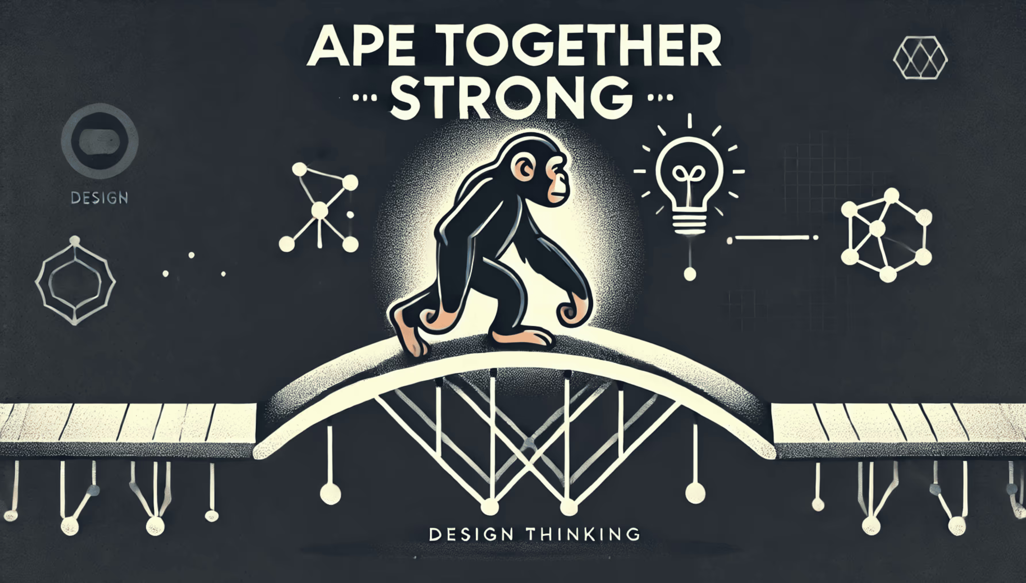
At Kaizen Softworks, I recently led a Design Thinking workshop focused on improving collaboration among cross-functional teams by aligning their goals and reducing misalignments. We used one of our client’s product teams as a case study to apply Design Thinking. Here’s a breakdown of how we approached each stage, with examples and takeaways.
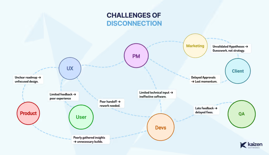
Cross-functional disconnects can arise from unclear roadmaps, limited technical input, and delayed feedback loops. Product may envision one outcome, design may prioritize another, and development faces technical constraints in between. To kick off, we discussed these challenges openly, exploring how they impact alignment, feature quality, and user experience.
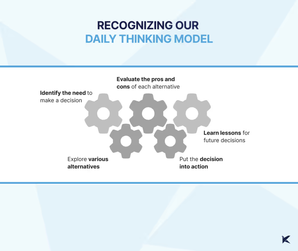
Every team member brings a unique thinking style to the table, shaped by their daily challenges and responsibilities: product might focus strategically, design zeros in on details, and development leans towards solution-oriented thinking. This awareness helps us understand each other’s perspectives
In this workshop, we each shared how we approach decision-making in our roles. This awareness helped us see where our natural modes might cause friction and allowed us to step into each other’s shoes, fostering empathy and a willingness to adapt our thinking for the collective goal.
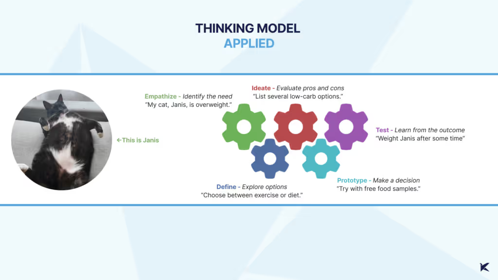
Here’s how each stage played out in our client’s project
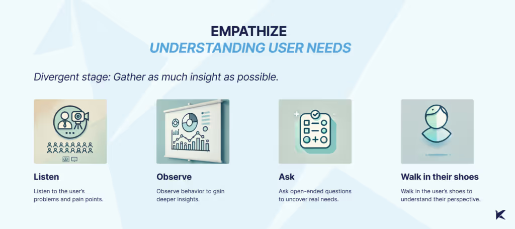
What We Did: We started gathering data on device usage by app users, allowing the UX team to conduct a Design Review. This uncovered issues with the UI on smaller screens, which hadn’t been fully considered. The result? Usability problems and frustration for users who needed to complete tasks on smaller devices.
What Could Have Been Improved: Earlier metric analysis could have highlighted these usability issues sooner, leading to a more user-focused approach from the start.
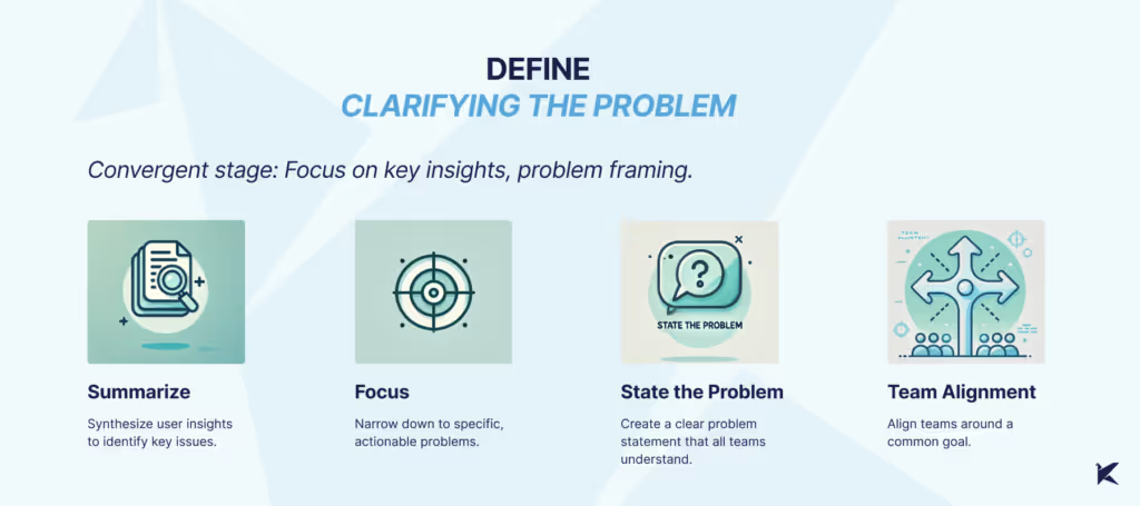
What We Did: With a clearer view of user pain points, we pinpointed specific issues, such as tasks left incomplete on smaller screens, which resulted in penalties and manual fixes. We defined the problem as a need for a feature allowing managers to exclude certain tasks from reports—a clear problem statement that helped all teams align on a common purpose.
What Could Have Been Improved: Better communication across teams could have surfaced this problem earlier, minimizing the need for manual workarounds
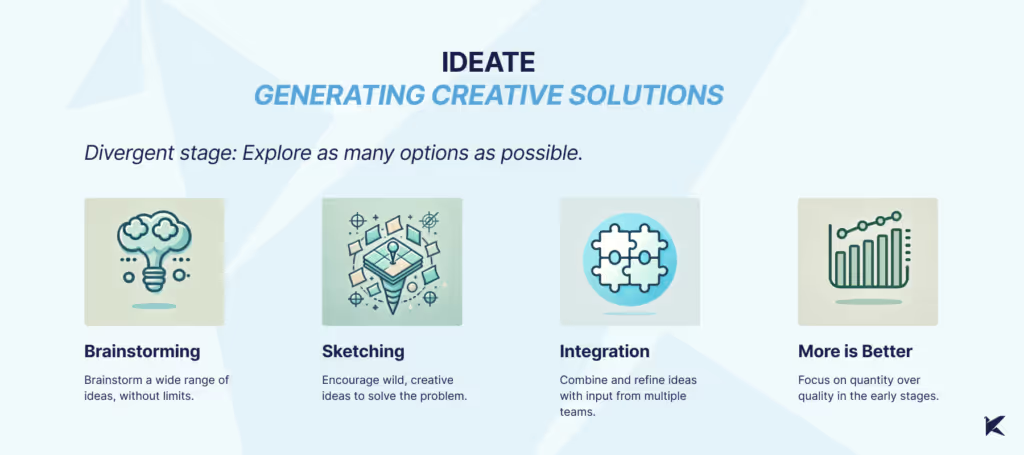
What We Did: We used techniques like Crazy 8s and mind mapping to generate a wide array of ideas, fostering a creative environment where all perspectives were valued. By the end, we had a solid list of potential solutions and a better cross-team understanding.
What Could Have Been Improved: Gathering more user feedback at this stage could have helped us focus on user-centered ideas. Cross-team ideation sessions could have further enriched our perspectives.
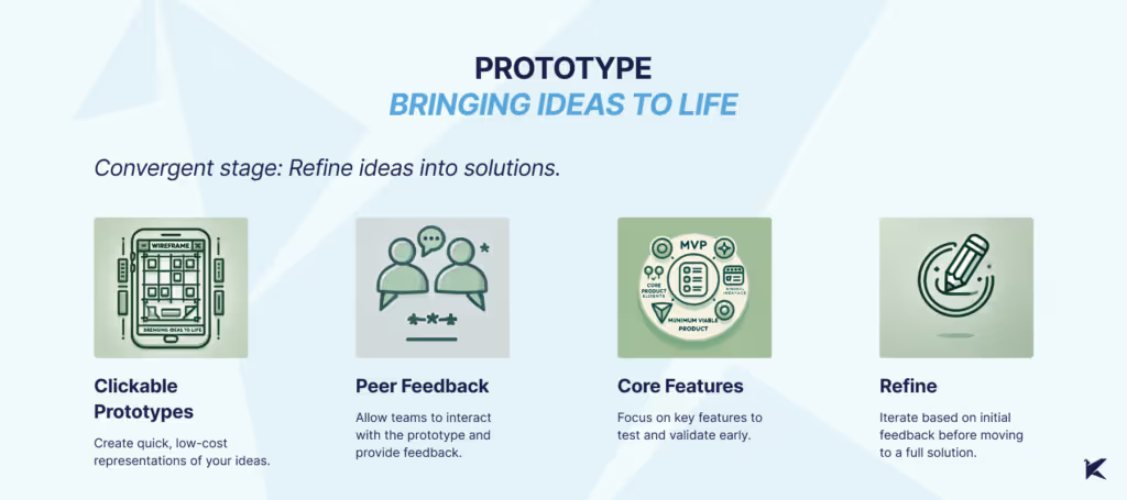
What We Did: Our UX team created low-fidelity prototypes, enabling early testing and feedback without heavy resource commitment. This gave each team a tangible starting point to discuss and refine.
What Could Have Been Improved: Staying in low-fidelity longer could have allowed for more experimentation, helping us catch usability issues before moving to high-fidelity designs.
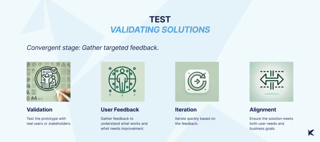
What We Did: Finally, we tested our prototypes with users, which surfaced usability issues on smaller screens that might have otherwise gone unnoticed. This feedback was essential in fine-tuning the design to meet both user and technical requirements.
What Could Have Been Improved: More in-depth testing during the Empathize phase could have brought some of these issues to light earlier, leading to a more robust and user-friendly solution.
The idea behind this workshop wasn’t just to solve a problem—it was to understand the structure of how we think. Thinking often feels automatic, something that happens so quickly we barely notice it. By breaking it down into clear, identifiable stages, we created a way to not only recognize our own thought processes but also align as a team.
Technology
Business
·
Jan 6, 2025
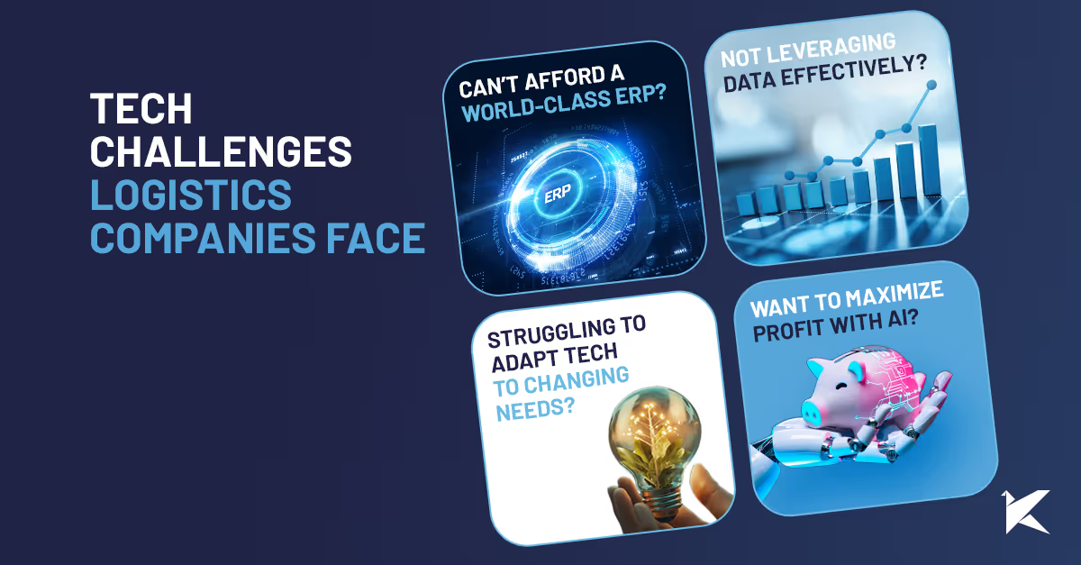
Most small logistics companies run into the same tech issues: these are the ones we keep seeing again and again.
12 read time
Running a logistics business is tough—tight margins, unpredictable demand, and evolving customer expectations make it even harder. Outdated technology only adds to the challenge.
At Kaizen Softworks, we’ve spent years helping logistics leaders like Livingston, Smartborder and SmartSense by Digi tackle these issues. Here are the most common tech pain points and how we can help.
If you’ve ever looked into off-the-shelf software, you know the deal: it’s expensive, bloated with features you’ll never use, or missing the key ones you need most. So, what’s the alternative?
The fix:
Custom software can give you the functionality of a world-class ERP without the hefty price tag.
Outdated systems that don’t talk to each other are more than just frustrating—they hold your business back. You’ve probably seen it: siloed data, manual workarounds, and delays that cost you time and money. And let’s face it, no off-the-shelf solution truly fits your unique and evolving needs.
The fix:
This hybrid approach gives you the stability of your legacy systems while providing the flexibility to adapt and grow.
The logistics industry generates vast amounts of data, and even more with IoT. But many companies struggle to make sense of it, leading to missed opportunities for optimization and cost savings.
The fix:
The right data-driven solutions help you make smarter decisions and boost efficiency.
Every dollar counts in logistics, and your tech investments should be pulling their weight. But are they?
The fix:
The right tech investments pay for themselves by reducing waste and improving efficiency.
When your services are a mix of in-house resources and third-party logistics (3PL) providers, keeping everything running smoothly can feel like a constant uphill battle. How do you ensure seamless communication, transparency, and accountability across different teams and systems?
The fix:
When integration is done right, you’ll feel like your 3PLs are part of your own team—reducing inefficiencies and improving performance.
Staying compliant with environmental regulations, customs requirements, and other industry standards is critical—and complex. Non-compliance can cost you big time in penalties and damage your reputation.
The fix:
Custom solutions can help you manage compliance seamlessly and avoid costly mistakes.
AI and machine learning aren’t just for big companies with endless budgets—they can make a real difference for logistics companies of any size. From predicting demand to optimizing routes, these tools can help you save money and improve customer satisfaction.
The fix:
The result? Smarter decisions, lower costs, and a competitive edge.
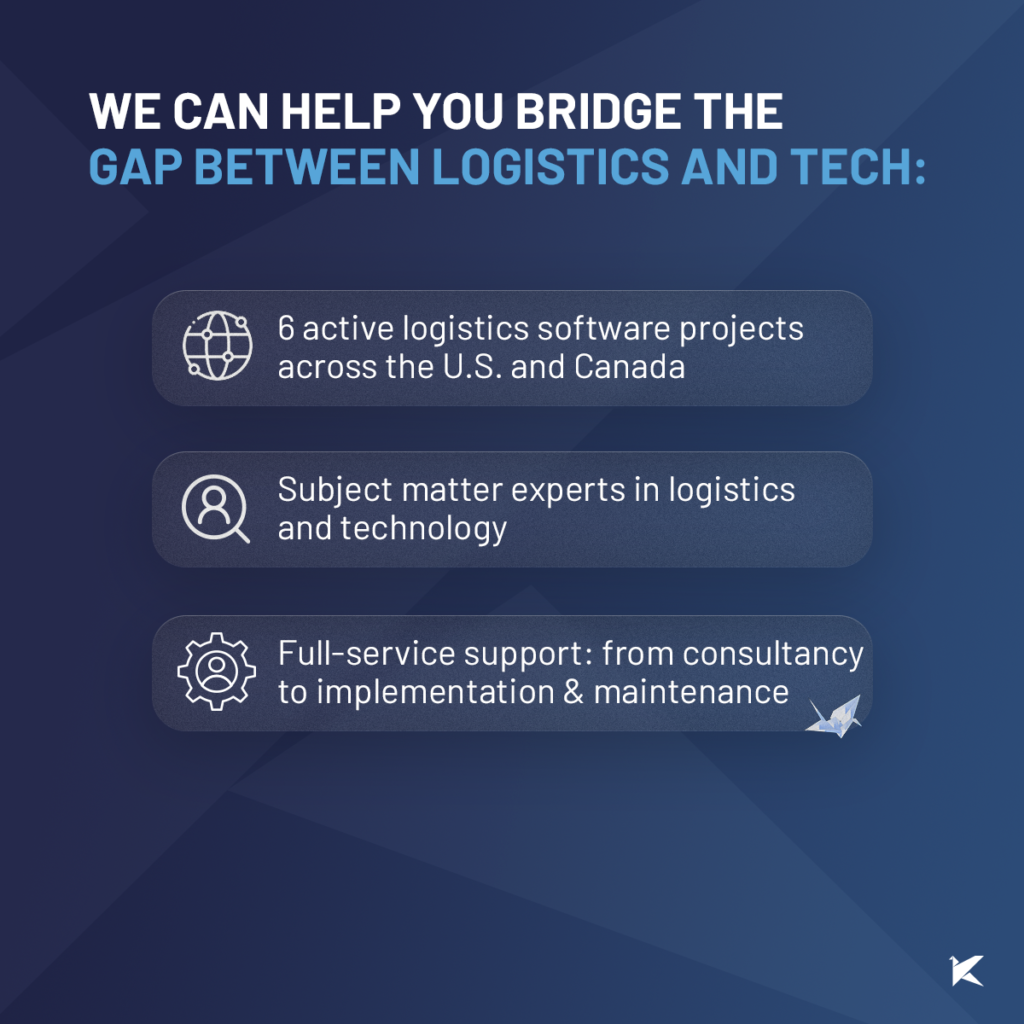
We understand logistics and the tech challenges you face. At Kaizen Softworks, we specialize in custom software solutions that solve your unique problems. Whether it’s integrating 3PLs, modernizing systems, or leveraging AI, we’re here to help you take your logistics operations to the next level.

About Us

·
Dec 19, 2024
10 years in, this is what the journey has really looked like from our side.
12 read time
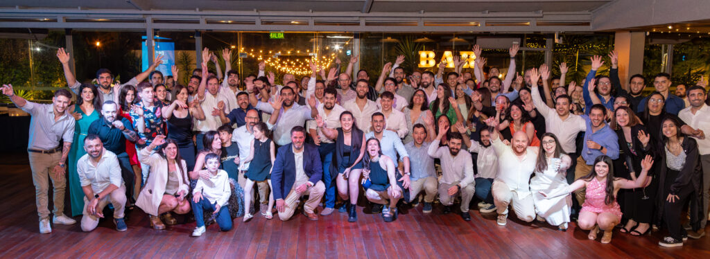
Last December 1st we celebrated our 10-year anniversary. Reaching a milestone like that is no small feat. It’s a moment to pause, reflect, and celebrate the journey we’ve taken together. Today, I’m honored to share some personal reflections, as I addressed our team during our celebration party.
Today, I want to share some thoughts that came to mind when I was asked to say a few words at this very special event. Ten years don’t come around every day, and I think it’s worth taking a moment to look back.
When I started thinking about these 10 years, so many memories came flooding in—different kinds of memories. From client conversations to the time I got thrown into a pool. And, of course, many anecdotes that are now immortalized on Kaizen’s t-shirts, full of boldness and humor.
I also reflected on how we’ve grown—through crises, the pandemic, and challenging moments—and how we navigated those challenges together.
I won’t dive into every single memory, but I felt the need to categorize them, to see what they tell us.
Through this exercise, I noticed that while our journey has been diverse, certain elements consistently stand out and define us as a company. I grouped them into four categories:

What ties these categories together? It’s not about being better or worse but about reflecting our priorities and how we do things.
If I think about what these categories have in common, the word that comes to mind is different. At Kaizen, we don’t strive to be different just for the sake of it—it’s our priorities and values that naturally lead us in that direction.
This difference is not better or worse, but it’s ours. It’s reflected in how we build relationships, how we think about solutions for our clients, and how we work together.
What do we want to protect at Kaizen? We want to protect our relationships and our ability to make a positive impact.
Our relationships with clients, where trust and respect are our top priorities. And our internal relationships, where we aim to create an environment that allows us to grow as professionals and as people.
This focus on relationships is reflected in their longevity. It’s easy to measure how long a relationship lasts, and we’ve seen and measured this over the years. But longevity isn’t the only thing that matters—it’s also about the depth of those relationships and what they leave behind.
For me, Kaizen has been so much more than a workplace. It’s been a space for learning, challenges, and personal growth. The last 10 years have transformed me not only as a professional but also as a person. And as part of this personal reflection, I invite you to ask yourselves:
What do you take away from Kaizen?
How do you imagine Kaizen 10 years from now?
Where can we go together?
I’m confident that the future we build will be as unique as the journey we’ve taken so far. Thank you for being part of co-creating this story.
And as a small example of what makes us different, would it be possible to sing ‘Happy Birthday’ the Kaizen way?

Project Management

·
Nov 18, 2024
A practical look at how a small AI and automation contest helped one software team share ideas, break routine, and boost engagement.
12 read time
After working with the same software development team for over 5 years, keeping morale high, maintaining motivation, and ensuring commitment can be challenging. If you want to know how a small internal contest on the use of artificial intelligence, automation, and best practices can help revitalize team spirit, I invite you to continue reading this article.
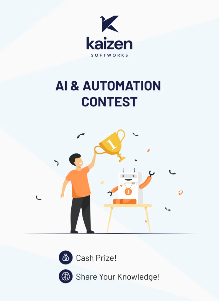
Within the constant search to keep team morale high and break the routine of tasks that a software developer usually does, one day I had the inspiration to organize a contest. But we’re not talking about just any contest; it had to consider the following points:
With these characteristics, the first internal contest for the team on the use of automation and/or artificial intelligence was created, with a prize of USD 100 for the winner.
Carrying out this idea might seem complicated, but in practice, it isn’t. Simply send out a nicely designed announcement with the theme, the prize, the rules, and an invitation to participate.
It’s important to explain the evaluation rules for the contest as well as who will be the jury. For this first case, I was responsible for selecting the winner and established the following criteria:
Each participant has 5 minutes to present. If they have time left, it can be used for questions from the audience. If there is no time left, the event moderator can allow extra time for questions, considering the total time allocated for the presentations.
In our case, we allocated 1 hour and 30 minutes for the presentation day. There were 8 participants in the contest and some additional presentations outside the contest. These out-of-contest presentations can usually be from the jury to show another good practice to the team. But it is important that everyone respects the time limits so that the entire activity can be completed within the total allocated time.
Based on this original idea, small changes can be made to make this activity even more fun. For example, listeners who are not participating in the contest can have a voting sheet similar to the jury to keep track of their favorites. This way, another winner can be added to the contest besides the one selected by the jury. It should be noted that this other winner should also receive a prize
Before diving into this initiative, I recommend talking to your peers and supervisors. They can provide even better ideas and much more reach. But be careful. If you’re doing this for the first time, I suggest conducting a fairly limited proof of concept with your closest team members. After this experience, you can evaluate taking it to other teams or globally within your workplace.
At this point, you’re probably thinking this is great, but you have doubts about how to get sponsorship for the money. However, that’s very simple… you ask your company by showing them this article detailing the benefits of this idea!
And as the cherry on top, I suggest writing an article about the experience and sharing it with the company. Even better, it can be a good article to publish on the company blog to show the rest of the world what is being done internally. This can attract the attention of new developers and also clients who find you through web searches.

Our first contest was a complete success. Everyone enjoyed it and learned a lot. We discovered many tools and ideas that people were using on their own and had not shared. Even customized tools that were very similar and could be combined to achieve something even better.
As for me, I can say that I was more than satisfied with that first trial. The presentations were so good that I had a bittersweet feeling. On one hand, I was happy for the winner, but on the other, I was sad because others also deserved a prize for what they had accomplished.
To conclude, I also want to mention that I was able to secure a bit more money for the winner of the popular vote, so we had at least two winners. But beware, not everything is rosy. I leave some questions to be evaluated:
Good luck, and let me know how it goes.
ScrumJedi, November 2024
Events
Startups
·
Nov 13, 2024
Key takeaways from DC Startup & Tech Week 2024 on startup growth, funding, AI, and the value of building real community connections.
12 read time
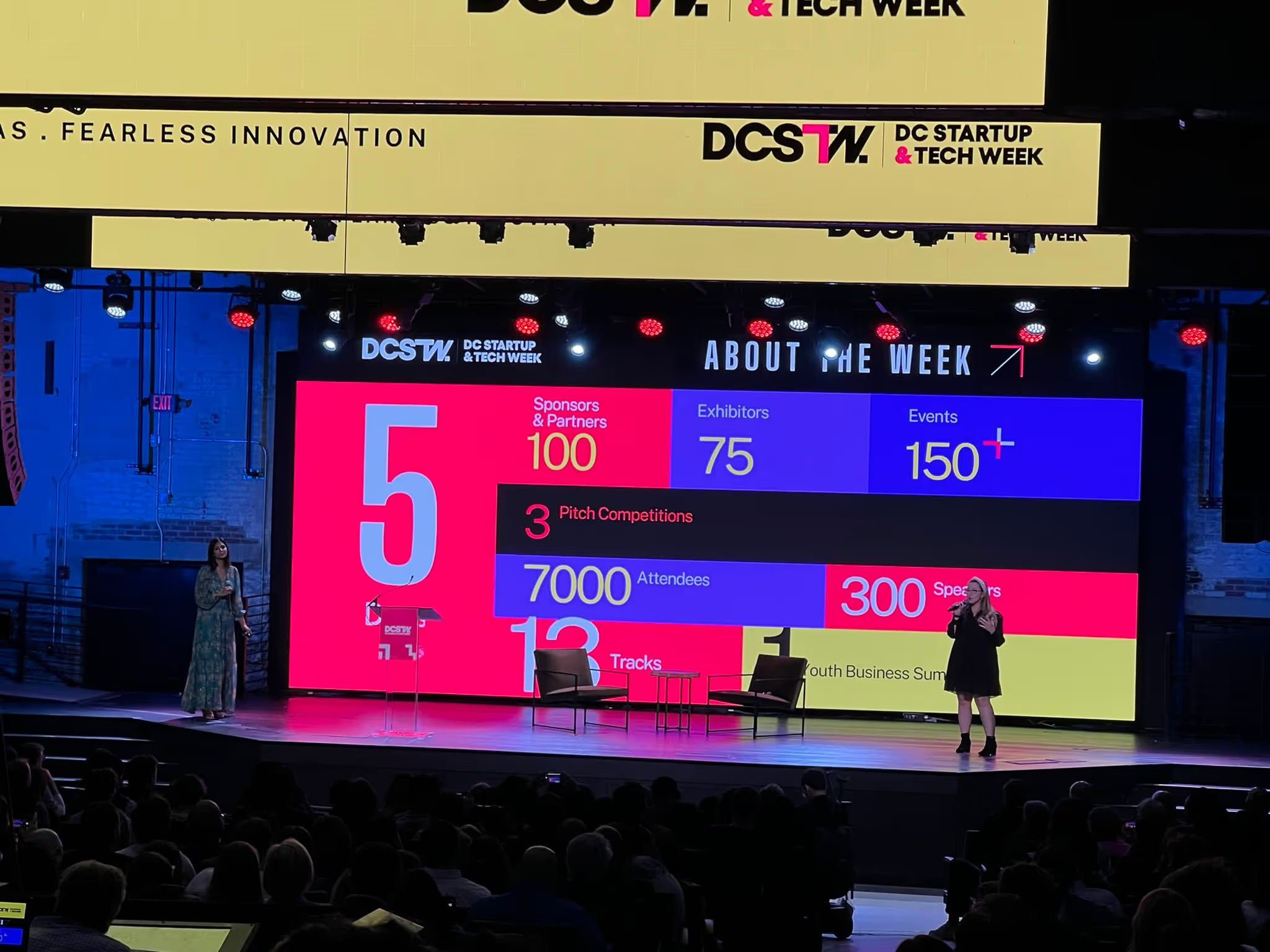
DC Startup & Tech Week (DCSTW) 2024 was a dynamic gathering of over 7,000 participants from across the globe, held from October 21-25, 2024.
This year’s event offered 13 core tracks and specialized sub-tracks, designed for startups at every growth stage—from ideation to growth—providing a prime opportunity to explore trends, sharpen strategic skills, and build connections within the startup ecosystem.
DCSTW 2024 catered to a broad mix of attendees, including founders at all stages, investors, venture capitalists, community organizers, and service providers, along with newcomers keen to dive into tech and startup culture.
Whether just starting out or scaling, the event offered valuable insights and opportunities for startups to interact directly with potential mentors, partners, and clients.
DCSTW 2024 offered a range of ticket options to make the event accessible to different audiences. I purchased the Investor, Resource, and Services Early Bird ticket for $97, which provided access to all public DCSTW events from October 21-25.
This ticket was specifically for non-founder attendees, including investors, service providers, and business development professionals. It covered entry to public sessions, networking events, and the chance to connect with startups and peers across the startup ecosystem.
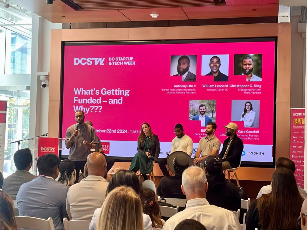
DCSTW was organized around 13 core tracks designed to guide startups at every growth stage:
In addition to the main tracks, DCSTW offered sub-tracks diving into specialized topics, such as:
Life Science Sub-Track
Cannabis Sub-Track
Government & Innovation Sub-Track
Web 3 Sub-Track
Female Founders and Funders Sub-Track
-Mental Health Sub-Track
Climate and Sustainability Sub-Track
Developer Sub-Track
These sub-tracks enriched the core topics, allowing attendees to explore niche areas and connect with experts and entrepreneurs within their specific fields. For further information on sessions and opportunities, you can check the DC Startup & Tech Week Schedule
Pitch competitions were a standout feature of DCSTW, allowing both early-stage and growth-focused startups to present their ideas before expert judges and an engaged audience.
For many founders, these competitions provided valuable feedback, industry exposure, and the possibility of investor interest. Youth innovators and consumer packaged goods (CPG) disruptors were also given the chance to showcase their ideas, adding diversity and energy to the competition.
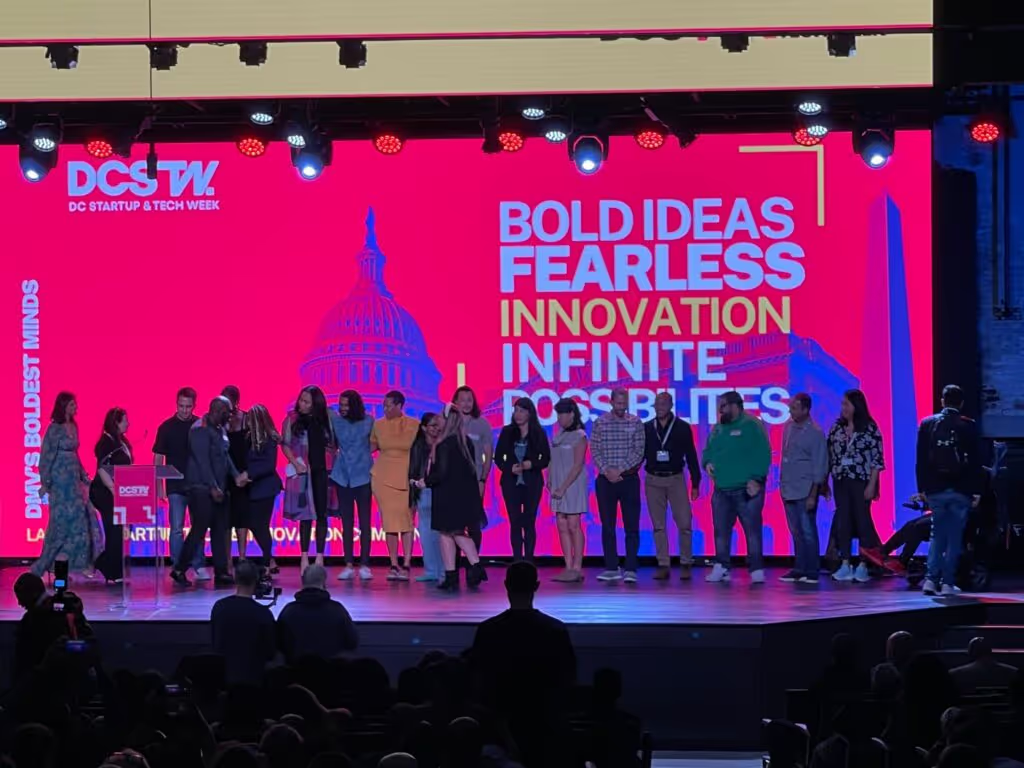
For startups, DCSTW 2024 was a prime opportunity to gain actionable insights, grow networks, and access funding expertise. Key takeaways included:
Funding and Pitch Guidance: Venture capitalists and angel investors shared practical advice on preparing pitches, navigating funding rounds, and understanding the latest investment trends.
Learning from Leaders: Sessions featured strategies from seasoned entrepreneurs on scaling challenges, customer retention, and effective marketing.
Networking with Purpose: Numerous networking sessions, including happy hours and lunch events, created valuable opportunities to form partnerships, seek mentorship, and build relationships essential for scaling a startup.
One of the best parts of DCSTW was connecting with people who are passionately working on all sorts of innovative projects. I met founders building solutions for real estate management, AI-powered lobbying, blockchain-based IP management, a secondary marketplace for golf course tee times, buy-side private equity valuation, IP law, and more.
Each conversation added new perspectives, and I left the event energized by the potential to collaborate and create with such a talented community.
For any startup team or aspiring entrepreneur, it’s definitely an event worth attending for the insights, connections, and inspiration it provides.
Project Management

·
Oct 23, 2024
A simple guide to product discovery and how it helps startups validate ideas, reduce risk, and build what users actually need.
12 read time
Bringing a software product to market—or taking an existing product to the next level—can be a thrilling adventure filled with opportunities and challenges. Whether you’re launching something new or refining a current offering, there’s a critical question every startup must ask: Are we building the right thing, or improving in the right way?
Success isn’t about gut instincts or chasing the latest trends—it comes from truly understanding the problem you’re solving for your users. That’s where product discovery becomes a game-changer. This process helps startups—both new and established—build or improve products that resonate with users and address real needs.
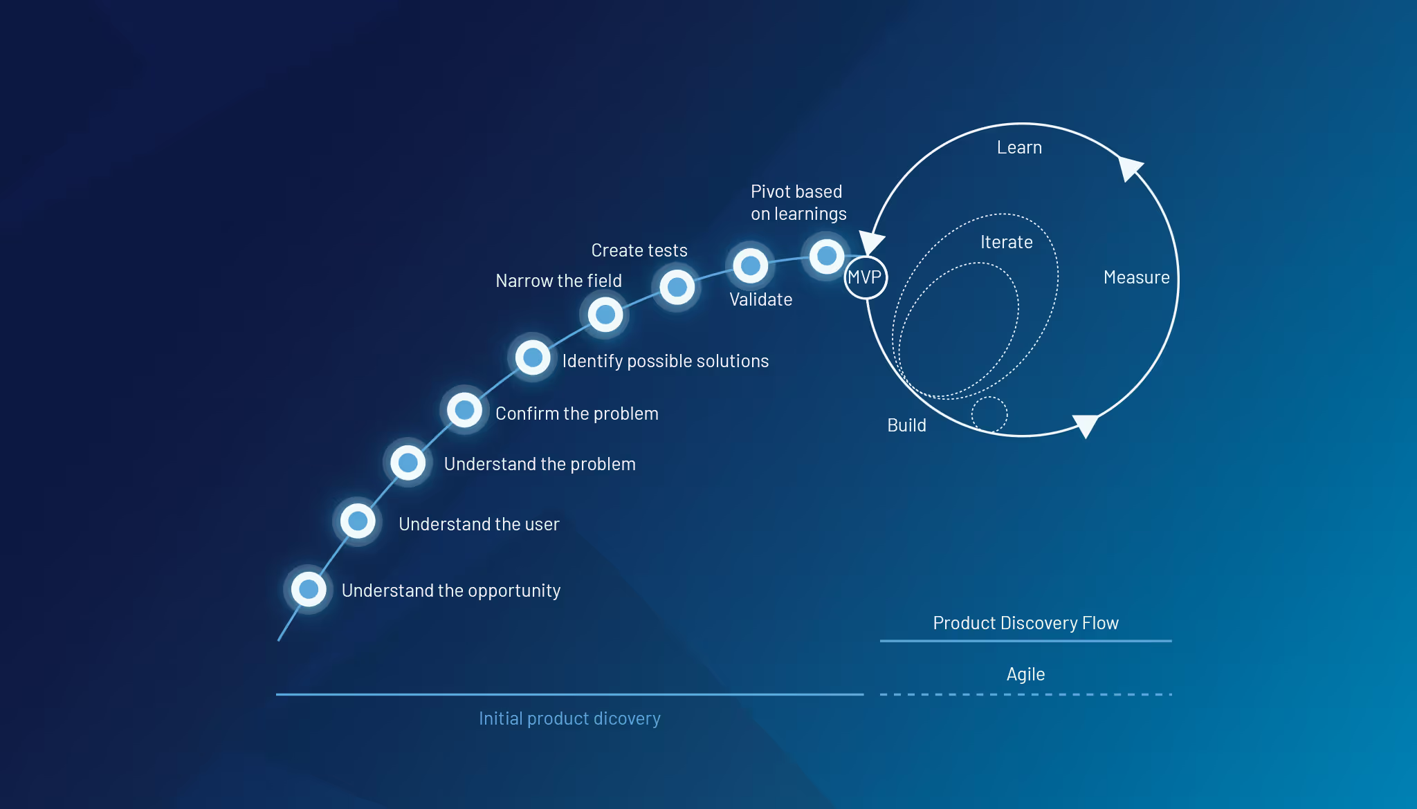
Product discovery is an iterative process of validating ideas, deeply understanding user needs, and defining a clear path for development or improvement. It ensures that whether you’re building from scratch or refining an existing product, you’re solving the right problem in the right way.
A common pitfall for startup founders is falling in love with the solution they’ve envisioned rather than the problem they set out to solve. This mindset can blind you to new opportunities for growth or make you resistant to necessary changes. Product discovery shifts your focus back to the problem, allowing you to adapt and pivot as needed.
For startups looking to grow, this is especially crucial—your product must evolve with your users. Falling in love with the problem means staying flexible and constantly evaluating whether you’re still addressing your users’ biggest pain points.
Dig deeper into the problem through user research. Use qualitative and quantitative methods to gather insights about users’ behaviors, needs, and frustrations. Tools like user interviews, observation, and empathy maps help you understand their context.
Remember, understanding your users is the foundation of effective product discovery.
Clarify your business objectives and define what success looks like. This can involve setting clear goals for your product and determining how to measure the impact. These metrics will guide the rest of the discovery process and keep you focused on what truly matters.
Once you understand the problem, gather your team to brainstorm possible solutions. Encourage creative thinking and diverse perspectives to ensure a broad set of ideas. Keep an open mind and explore various approaches, remembering that collaboration can spark innovative ideas.
Out of the many ideas generated, prioritize them based on feasibility, user value, and business impact. This step helps you focus on the most promising solutions to prototype or test, ensuring that your resources are spent wisely.
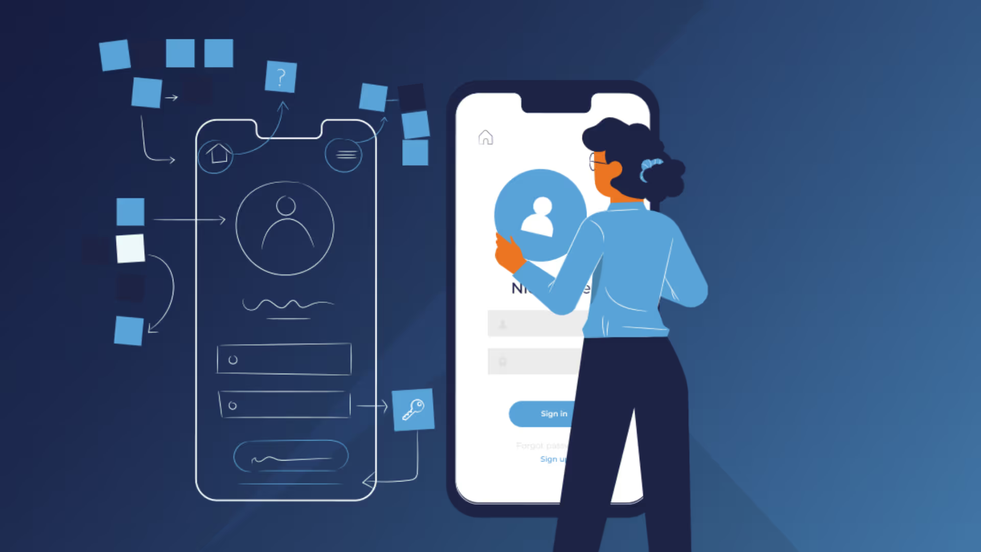
Develop low-fidelity prototypes or mockups of the most viable solution ideas. Test these prototypes with real users to gather feedback. The goal is to validate the solution early before investing significant resources in development. This step can save you time and money down the line.
Use the feedback from testing to refine the solution. Iterate multiple times, improving the product idea with each round of user insights. This helps ensure you’re solving the right problem in the best possible way.
Once the solution is validated, map out the steps for bringing it to life. This includes defining the key features, timelines, and milestones needed to develop, launch, and continuously improve the product. A clear roadmap will guide your team and keep everyone aligned.
At Kaizen Softworks, we understand the journey of building or refining a product can feel overwhelming. That’s why we specialize in guiding startups through the product discovery process.
Let’s connect and talk about how we can help turn your vision into reality.
Project Management
Startups
UX Design
·
Sep 22, 2024
A practical guide to UX audits and heuristic evaluations, and how they help teams find usability issues before they hurt growth.
12 read time
Building a product that stands out in the market isn't just about features or innovation—it’s about delivering a seamless, user-friendly experience. But how do you ensure your product is intuitive, usable, and enjoyable for your users? This is where UX audits and usability heuristic evaluations come into play.
A UX audit focuses on assessing the strengths and weaknesses of your product’s user experience (UX). It’s about identifying what's working well in your interface and what may cause frustration or confusion for your users. Ultimately, the process provides actionable insights to improve usability.
By taking an objective look at areas like interaction design, navigation, and visual consistency, you gain a clearer understanding of how user-friendly your product really is.
At Kaizen Softworks, we use industry-recognized principles like Jakob Nielsen’s 10 Usability Heuristics to evaluate your product systematically and objectively.
We know how hectic startup life can be—juggling timelines, investor expectations, and ensuring your product stands out. Here’s why UX audits and heuristic evaluations are crucial, especially for startups:
A heuristic evaluation benchmarks your design against established usability principles (heuristics). It involves analyzing how well your system aligns with widely accepted usability standards, helping to pinpoint areas for improvement.
Let’s break down 10 usability principles (heuristics) that we apply in our designs reviews, and how they can highlight opportunities for improvement in your product:
Once we’ve identified strengths and weaknesses in your product’s design, the next step is to create a prioritized list of improvements using a framework like RICE (Reach, Impact, Confidence, Effort). This allows your team to focus on the most critical changes that can make the biggest difference for users.
After implementing these changes, validating the improvements through user testing or feedback loops ensures your modifications truly enhance the user experience.
At Kaizen Softworks, we specialize in helping startups and product teams enhance their product’s user experience through expert UX Audits. They can typically take anywhere from a few hours to a full day, depending on the complexity and scope of your product.
Let’s talk about how a usability review can help your product be the best it can— intuitive, efficient and built for long-term success.
No blogs matched this category, try applying different filters.