Kaizen Teams

Dropdown

Table of Contents

Time to read

·

12

Published on

·

March 5, 2024

Last updated on

·

August 18, 2026

Pablo Manzoni, UX Lead at Kaizen Softworks

Pablo Manzoni

Professional non-conformist

UX Lead & Product Designer

Project Management

Project Management

UX Design

UX Design

Why Projects Get Delayed? The Role of UX in Planning

Published on

·

August 18, 2026

Last updated on

·

August 18, 2026

Time to read

·

12

Pablo Manzoni, UX Lead at Kaizen Softworks

Pablo Manzoni

UX Lead & Product Designer

In the busy world of software development, delays can derail even the most promising projects. Often, these delays happen because UX design isn't properly included in the process.

This blog post looks at this common issue and shares how our team turned a problematic project around to become a success.

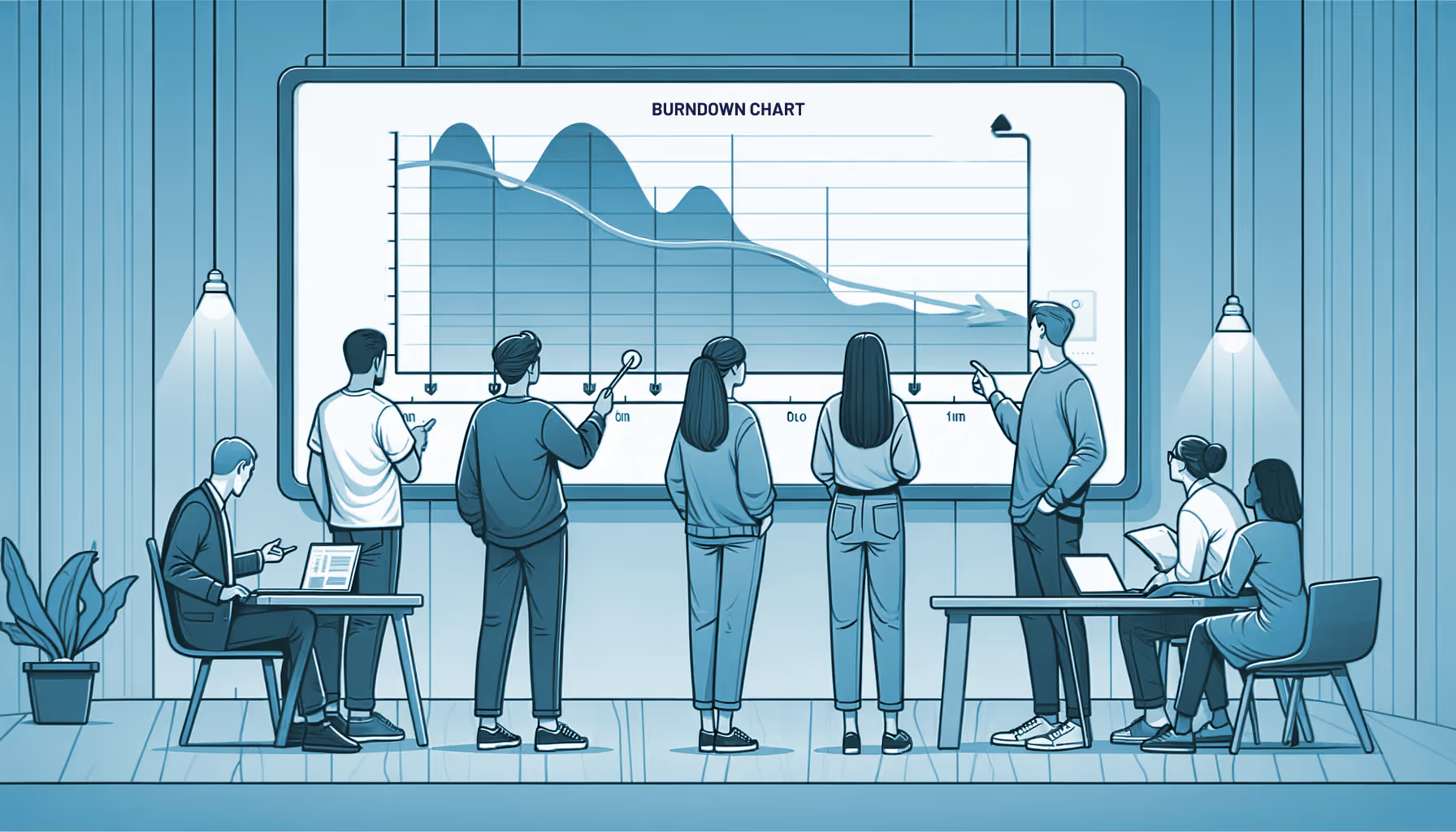
Featured image generated by DALL-E 2.

Challenge: Not Including UX Design in Sprint Plannings

In our experience, project managers often face the dilemma of balancing heavy demands with realistic timelines. This imbalance can lead to missed deadlines and an uneven workload. A common issue is the neglect of UX design early in the planning stages, causing significant delays later on.

Constantly changing designs during development sprints pose a challenge to product teams, causing frustration, prolonged feedback loops, and eventual project delays.

⚠️ Key Problems We Noticed

  • Lack of UX Integration in Planning: The development plan often skips detailed UX input, resulting in vague project scopes and uncertain estimates.

  • Frequent Development Blockers: During sprints, developers often face UX-related blockers, leading to unplanned meetings and task imbalances.

When it’s time to implement a feature, two tho issues can arise:

  • Developers sometimes end up designing the visuals for the story, which might not result in a top-notch user experience.

  • During sprints, developers frequently voice concerns, leading to conversations with the Project Manager or UX team. While, sometimes these blockers are solved quickly, this can often result in hurdles, unequal task distribution, and unexpected team pressures.

👁️ Commonly Used But Less Effective Solutions

  • Project Managers Designing Features: While this gives a broad view of the product, it often ignores the UX team’s principles. The result? Inconsistent platforms and overlooked user paths.

  • Designing All Screens Before Development: Starting with fully designed screens sounds ideal but lacks flexibility. This approach fails to account for alternative user flows and hinders adjustments based on feedback or shifting priorities.

Implementing a Solution: Strategic Changes for Success

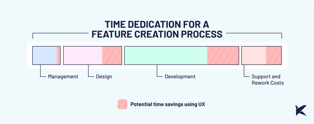
We made a significant change by incorporating UX design early on in our process. Our workflow was simplified using the Kanban system to reflect the progress of work done in UX, and we fostered regular discussions between the Project Manager and Development team.

Crucially, we established a clear gap between the design and development stages. As our Project Manager noted: "Ensuring a sufficient gap between design and development was crucial for our progress.”

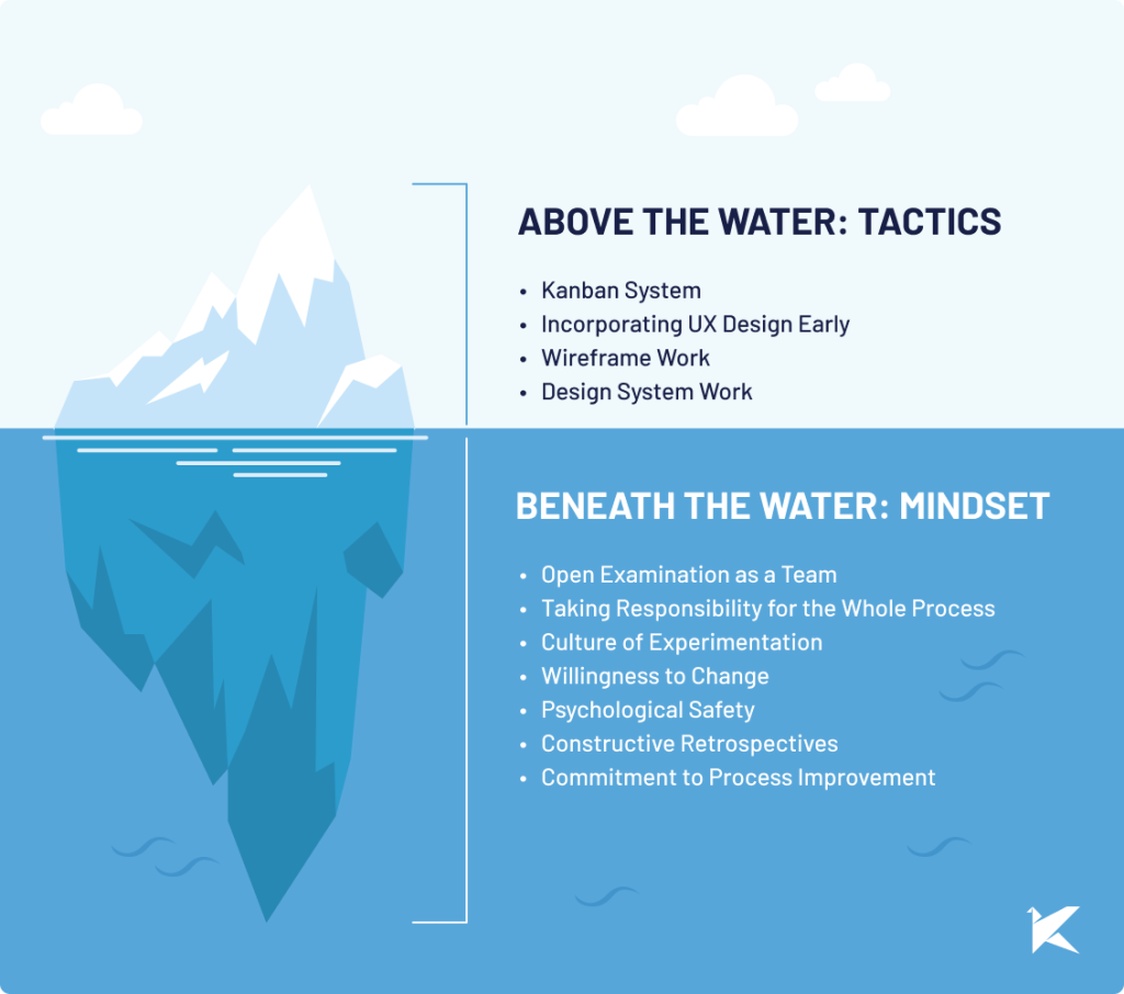
The "Above the Water" section outlines the strategies and tools you see in action. The "Beneath the Water" section represents the cultural and attitudinal foundation that supports the successful implementation of those tactics.

👁️ Kaizen Mindset: Key Ingredients for Positive Change

Implementing new approaches seems easy in theory, but the real test is creating a team that can:

  • Openly examine as a team what's working and what's not, allowing everyone to recognize and address inefficiencies.

  • Take responsibility for the whole process, not just their individual tasks.

  • Create a culture that encourages trying new ways of doing things. Quick iterative cycles let the team see what works and what doesn't.

  • Be willing to let go of old habits in favor of new ones, while keeping everyone focused on the same goal.

  • Start the necessary constructive discussions to make these changes happen.

Process Improvement that Brought Results

The changes brought about a remarkable effect. Projects that were previously delayed were now completed on schedule, and we managed to cut our design and development costs by half compared to our previous approach. One developer noted: "The smooth progress of the project, free from continuous alterations, was a relief for both our team and our clients."

The changes reduced unnecessary back-and-forth between the Design and Development teams during a sprint. However, it's important to maintain some level of collaboration within a sprint. The key is finding a balance between doing enough design work upfront to guide development, while remaining flexible enough to adjust as needed within a sprint.

Conclusion: Embracing UX for Timely Success

Including UX design early on is crucial to prevent project delays and ensure a smoother development process. This case study emphasizes that for successful outcomes in software development, it's essential to coordinate UX and development from the start.

Ready to Ensure Timely Project Success? Contact us and let's explore how our teams can collaborate together.

In the busy world of software development, delays can derail even the most promising projects. Often, these delays happen because UX design isn't properly included in the process.

This blog post looks at this common issue and shares how our team turned a problematic project around to become a success.

Featured image generated by DALL-E 2.

Challenge: Not Including UX Design in Sprint Plannings

In our experience, project managers often face the dilemma of balancing heavy demands with realistic timelines. This imbalance can lead to missed deadlines and an uneven workload. A common issue is the neglect of UX design early in the planning stages, causing significant delays later on.

Constantly changing designs during development sprints pose a challenge to product teams, causing frustration, prolonged feedback loops, and eventual project delays.

⚠️ Key Problems We Noticed

  • Lack of UX Integration in Planning: The development plan often skips detailed UX input, resulting in vague project scopes and uncertain estimates.

  • Frequent Development Blockers: During sprints, developers often face UX-related blockers, leading to unplanned meetings and task imbalances.

When it’s time to implement a feature, two tho issues can arise:

  • Developers sometimes end up designing the visuals for the story, which might not result in a top-notch user experience.

  • During sprints, developers frequently voice concerns, leading to conversations with the Project Manager or UX team. While, sometimes these blockers are solved quickly, this can often result in hurdles, unequal task distribution, and unexpected team pressures.

👁️ Commonly Used But Less Effective Solutions

  • Project Managers Designing Features: While this gives a broad view of the product, it often ignores the UX team’s principles. The result? Inconsistent platforms and overlooked user paths.

  • Designing All Screens Before Development: Starting with fully designed screens sounds ideal but lacks flexibility. This approach fails to account for alternative user flows and hinders adjustments based on feedback or shifting priorities.

Implementing a Solution: Strategic Changes for Success

We made a significant change by incorporating UX design early on in our process. Our workflow was simplified using the Kanban system to reflect the progress of work done in UX, and we fostered regular discussions between the Project Manager and Development team.

Crucially, we established a clear gap between the design and development stages. As our Project Manager noted: "Ensuring a sufficient gap between design and development was crucial for our progress.”

The "Above the Water" section outlines the strategies and tools you see in action. The "Beneath the Water" section represents the cultural and attitudinal foundation that supports the successful implementation of those tactics.

👁️ Kaizen Mindset: Key Ingredients for Positive Change

Implementing new approaches seems easy in theory, but the real test is creating a team that can:

  • Openly examine as a team what's working and what's not, allowing everyone to recognize and address inefficiencies.

  • Take responsibility for the whole process, not just their individual tasks.

  • Create a culture that encourages trying new ways of doing things. Quick iterative cycles let the team see what works and what doesn't.

  • Be willing to let go of old habits in favor of new ones, while keeping everyone focused on the same goal.

  • Start the necessary constructive discussions to make these changes happen.

Process Improvement that Brought Results

The changes brought about a remarkable effect. Projects that were previously delayed were now completed on schedule, and we managed to cut our design and development costs by half compared to our previous approach. One developer noted: "The smooth progress of the project, free from continuous alterations, was a relief for both our team and our clients."

The changes reduced unnecessary back-and-forth between the Design and Development teams during a sprint. However, it's important to maintain some level of collaboration within a sprint. The key is finding a balance between doing enough design work upfront to guide development, while remaining flexible enough to adjust as needed within a sprint.

Conclusion: Embracing UX for Timely Success

Including UX design early on is crucial to prevent project delays and ensure a smoother development process. This case study emphasizes that for successful outcomes in software development, it's essential to coordinate UX and development from the start.

Ready to Ensure Timely Project Success? Contact us and let's explore how our teams can collaborate together.

Related Articles

View all articles

·

Aug 14, 2026

Running Synthetic Users Into Claude Code

A synthetic user research framework, turned into a Claude Code plugin that runs automated UX tests with AI agents, step by step.

12 read time

Read more

A synthetic user is a constrained AI decision agent defined by twelve fields, from functional role and context to assumptions and abandonment rules.

In the previous post I built an early, working implementation, and the next question was whether the same rules could hold up in a repeatable, automated test.

This post is that next step: how I turned the framework into a Claude Code plugin, and the technical decisions behind adapting methods designed for people into something an AI can execute without cheating.

Why “find the usability issues” is not enough

Give a model a URL and ask it to “find the usability issues.” It works halfway. And the “halfway” is the interesting part, It gives you a generic list, correct in the abstract, useless in practice.

A usability issue matters because of who encounters it and under what conditions.

Using an app from bed is not the same as using it on a factory floor. Urgency changes, lighting changes, attention changes, previous knowledge changes. The same confusing button can be irrelevant to a power user and an abandonment point for an operator wearing gloves.

The whole design comes from that observation: the AI does not evaluate the interface. It acts as a specific person in front of the interface.

The person brings the context with them. And the context turns a list of defects into a list of priorities.

Anatomy of a simulation

An orchestrator controls the browser through Playwright MCP. It reads each screen as an accessibility snapshot: text, roles, states, no guessing pixels. Then it acts on specific elements.

The decision on each screen is made by an isolated subagent, which returns a JSON for each step:

{

  "action": "...",

  "clarityLevel": "High|Medium|Low",

  "doubtDetected": true,

  "reason": "...",

  "abandoned": false,

  "estimatedTimeSeconds": 40,

  "emotionalState": "...",

  "memory": "..."

}

Two rules make this look more like a person and less like an oracle.

1. The evaluator never sees the end.

The evaluator receives one screen at a time, without knowing how many are left or what comes next in the flow.

If the interface leaves room for a mistake, the synthetic user makes the mistake. It clicks where a person would click, not where it is convenient to click in order to complete the test. This is where the framework’s forbidden assumptions live. The agent cannot assume backend logic or mentally complete what the screen does not show.

2. Emotion is memory, not decoration.

The memory field travels from one step to the next. The emotional state is inherited and accumulates. A frustration +1 persists. This detects something that is structurally invisible to any test that evaluates screens separately.

Screen five does not necessarily fail because of screen five. It fails because the user gets there with accumulated frustration.

Evaluated alone, that screen passes. Evaluated by someone carrying three doubts and one broken promise, it triggers abandonment. In the first post, I wrote that doubt is not failure. It is the signal that reveals structural friction.

Emotional memory is that idea turned into architecture.

Eight subagents, one job each

Each subagent gets a clean context. It knows the minimum required to do its job.

That ignorance is deliberate.

The agent acting as the user does not know what the orchestrator knows. It cannot compensate for bad design with knowledge a real person would not have.

Subagent

What it does

Subagent What it does
synthetic-screen-evaluator Acts as the user on one screen and returns the JSON for that step
synthetic-flow-synthesizer Reads the complete run and writes the report. It never simulates again
synthetic-profile-generator Generates a complete profile from an approved spec, choosing from a controlled vocabulary
synthetic-autopilot-synthesizer Consolidates N runs and classifies findings by convergence across users
heuristic-persona-generator Creates the 3 persona raters based on the business being evaluated
heuristic-expert-evaluator Detects violations of the 10 heuristics using forced enumeration
heuristic-persona-rater Scores each finding from the experience of ONE persona. It runs ×3
heuristic-report-synthesizer Builds the final report using the already computed numbers

Adapting a human test: the heuristic evaluation

A textbook heuristic evaluation uses three to five human evaluators because each human finds different problems.

My first experiment was literal, and it went meh.

I iterated until I reached two synthetic detection runs with different agents, coverage was extremely high, but it exposed another problem: an unmanageable list. Dozens of valid issues, very few important ones.

The final design separates those two jobs.

1. An expert finds violations.

Based on Nielsen’s literature, an expert goes through each screen and is forced to produce a verdict for every heuristic: 

  • Violation
  • Clean
  • Not observable

Each verdict includes textual evidence from the snapshot, forced enumeration breaks the habit of reporting only the things that stand out.

2. Three synthetic personas decide what matters based on what they bring with them: context, emotions, urgency, and constraints.

Three synthetic personas are generated according to the business being evaluated: 

  • power user
  • average user
  • low digital literacy

They score the findings without seeing the expert’s conclusions. The same issue can matter very differently depending on what each persona brings to it.

The formula is business impact × usability impact, with agreement between personas as the tiebreaker.

This keeps issue detection and user impact as separate jobs: the expert identifies the violations, and the personas help determine which ones deserve attention first.

Three modes, and a tool for building users

The plugin currently has three modes.

simulation-run (custom)

You build a profile field by field in the Synthetic User Builder, the tool I built to materialize the framework.

First come the attributes: 

  • Role in relation to the product
  • Boundaries
  • Initial emotional state
  • Context
  • Forbidden assumption

Only after that, and separately, comes the task.

The profile describes how someone decides, never what they have to do. That is why the same profile can be reused across tests.

simulation-auto (inferred)

You only give it the URL.

It researches the business, infers the typical roles, proposes users with tasks, and you adjust that proposal in natural language before anything runs.

heuristic-test (inspection)

The heuristic test described above, for one screen, one flow, or the entire site.

Everything run becomes a file

Every run leaves Markdown artifacts inside the project:

user-simulation-tests/

├── simulation/

│   ├── profiles/    ← users: the .md used for simulation + a .builder.json

│   │                   that can be imported back into the Builder and edited manually

│   └── results/     ← one report per run + the consolidated report from auto mode

└── heuristic/

    ├── personas/    ← the 3 raters + business research, reused across runs

    └── results/     ← reports with the prioritized findings table

Simulation reports include the full step by step flow, the emotional arc, risks, and a single “Fix this first.”

The consolidated report classifies findings by convergence: did one user suffer from this, or did all of them?

The decision to keep everything as accumulating .md files is strategic.

These are different runs, using different lenses, that can be analyzed together later, crossing heuristic violations with simulated emotions answers something no individual test gives us:

Of everything that is wrong, what actually matters?

Models and costs

What worked for me for the synthesis subagents:

  • For reports, consolidation, and the heuristic expert, the best available model makes sense. That is where the judgment lives.
  • For the screen evaluator, a medium and fast model is enough. There are many short, constrained calls, and the profile already restricts the decision.
  • The raters are the lightest case.

A complete run consumes between 100k and 400k tokens, depending on the model and mode, in around 20 minutes.

That is the cost of a test that previously required coordinating the schedules of three professionals, and that can now run against every iteration of the product.

See it in action

Here's a complete run against our site, kzsoftworks.com: a skeptical "Business Leader" profile, five live browser steps, and a full Markdown audit in under three minutes that names the exact moment the executive persona lost trust.

It is still early, but it already runs

Every rule in the framework became an architectural constraint: clean context, one screen at a time, emotional memory, forbidden assumptions.

The plugin is open source: github.com/PabloManzoni/user-simulation.

Three commands, and the inferred mode only needs your URL.

If you try it and your synthetic user abandons on screen three, you already know what it means:

It is not failure. It is the signal.

·

Aug 14, 2026

Generative UI: How to keep the experience under control

Generative UI can adapt interfaces to each user, but it adds risks around reliability, latency, cost, security, and accessibility. Learn the architecture that keeps those risks under control.

12 read time

Read more

Generative UI assembles the interface around what each user is trying to do, instead of showing everyone the same fixed screen. That flexibility comes with real considerations: keeping the experience consistent, secure, and easy to support once it's live. This post covers what generative UI is worth building for, what it costs, and how teams keep it under control.

Generative UI works best when the experience is dynamic, but the system behind it stays tightly controlled.

Start by defining which parts of the interface can change, which cannot, and what must be validated before anything reaches the user.

TL;DR

  • Interfaces can adapt to user context, support more variations without designing every screen by hand, and reduce unnecessary steps in a workflow.
  • The trade-offs include inconsistent experiences, unreliable or unsafe output, added latency and infrastructure cost, and harder analytics and debugging.
  • Better prompting can reduce unwanted behavior, but it cannot guarantee reliability, security, or consistency. Those controls need to exist around the model: a stable interface shell, a closed component catalog, validation of model output, session-level logging, and model routing with fallback options.
  • Every control introduces a trade-off. No architecture maximizes flexibility, reliability, privacy, performance, and cost at the same time.

What does generative UI make possible?

Interfaces that adapt to context

The interface can adapt to what a person is trying to do instead of relying only on a persona defined at design time. Steps can reorder or disappear based on intent. It can change how much information it shows and what it emphasizes. Copy can adapt to the user's locale and context instead of relying on literal translation.

More interface variations with less custom development

A small set of components can support many variations without designing each screen separately. The system can also support workflows the team did not design as individual screens, as long as the required components and actions already exist.

Fewer steps between intent and action

The interface can hide controls a task does not need, reducing the number of steps required to complete it. Generative UI can also help teams test different ways of presenting the same task. Whether that improves completion or conversion depends on the workflow.

What can go wrong with generative UI?

Experience consistency risks

When layouts change between users or sessions, they can break muscle memory and make support harder. They can also drift from the design system or disrupt accessibility patterns that depend on consistent structure.

Reliability and security risks

The system should not trust model output by default. A model can render a button that does nothing, display fabricated data in a component, or produce a state the team never tested. Prompt injection can push it toward components, content, or actions the system should not allow. Weak controls can expose sensitive data or allow actions and interface states the product should block.

Performance and infrastructure risks

A generative interface also inherits the model layer's latency, cost, and availability risks. Waiting on an LLM to generate a layout adds delay before a page renders. Each generation uses processing resources, and hosted models usually add usage-based cost. Relying on one provider also exposes your product to outages, API changes, price increases, and deprecations.

Analytics and debugging risks

Standard analytics often assume a fixed set of screens. Heatmaps and funnels become harder to compare when users see different layouts. Reproducing a bug also gets harder when you cannot reopen the exact screen the user saw.

How do you control these risks?

Prompts can reduce unwanted behavior, but they cannot enforce which components the system may render or which actions it may allow. Those limits need to be enforced in the architecture around the model.

What parts of a generative interface should remain fixed?

Keep global navigation, account and security controls, primary actions, critical transaction controls, and accessibility-critical structure fixed. Let the model modify only the content and controls that benefit from adaptation.

Fixed navigation preserves familiar interaction patterns. A stable structure also makes accessibility testing, branding, and support more predictable.

How do you stop generative UI from creating broken interfaces?

Do not let the model generate arbitrary UI code. Have it return structured configuration instead. The schema should specify the component, its data, and its position. Validate that output against a closed catalog before rendering it.

The model should not write HTML, CSS, or JavaScript or choose anything outside that catalog. This reduces invalid layouts and unsupported combinations. This is the declarative approach we covered in Part 1.

How should teams test and secure generative UI?

Treat model output as untrusted input. Validate it against the schema and component allowlist, sanitize content, and keep authorization outside the model.

Add content security policies and prompt-injection defenses based on what the model can access and what actions it can trigger. Pay particular attention to user-provided content, privileged actions, sensitive data, and external tools.

Limit valid component combinations, then use visual regression and property-based tests to exercise unexpected inputs and edge cases.

Minimize sensitive data sent to the model. Mask or anonymize it before generation when the task does not require the original values.

How do you monitor a UI that looks different for every user?

Record enough context to reconstruct each generated interface. That includes detected intent, model version, generated configuration, rendered components, task completion, and errors, all tied to the session.

That record lets teams segment analytics by generated experience and reconstruct what a user saw during a specific session.

How do you control latency, cost, and outages?

Cache reusable results where freshness and privacy allow. Show a skeleton layout immediately and stream the rest in. Route simpler requests to smaller or local models, and reserve larger ones for complex requests. Put providers behind the same integration layer so you can switch models or fall back to a static experience during an outage.

What it controls Risks it mitigates
Stable interface shell Keeps navigation, account controls, and primary actions fixed Muscle memory loss, brand drift, accessibility gaps, support friction
Component-based UI Model outputs configuration, not code UI hallucinations, broken layouts, brand inconsistency, testing complexity
Untrusted-input handling Schema validation, allowlists, sanitization, sensitive-data controls Prompt injection, unsafe states, fabricated actions, privacy exposure
Session-level logging Records intent, generated configuration, rendered components, and outcome Fragmented analytics, hard-to-reproduce bugs, support friction
Model routing and fallback Caching, streaming, model routing, provider switching Latency, model cost, provider downtime, difficulty switching providers

What do these controls cost you?

Keeping more of the interface fixed protects consistency but limits personalization. Limiting combinations makes the system easier to test but reduces how much it can vary. Caching lowers cost, but cached output can go stale.

Running models locally can reduce how much sensitive data leaves your infrastructure, but it adds systems your team has to operate and maintain. Detailed session logs can make support easier, but they also create storage, retention, and privacy requirements.

No architecture maximizes flexibility, reliability, privacy, performance, and cost at once. You need to decide which trade-offs matter most for each workflow and design around them.

llms.txt